As part of a Junior Graphic Designer role application with Lucky Egg, we were tasked with redesigning their existing party game, Sloshed. Here is my interpretation.
Software used: Adobe Illustrator + Photoshop

Design Process
To start the re-design process for Sloshed, I began by delving into some background research.
This involved gathering key details such as the target demographic (those aged 18 and above/legal drinking age), the visual style and brand identity of Sloshed, as well as looking into existing games from Lucky Egg.
This involved gathering key details such as the target demographic (those aged 18 and above/legal drinking age), the visual style and brand identity of Sloshed, as well as looking into existing games from Lucky Egg.
Through this exploration, I considered that Sloshed’s aesthetic appealed to a range of individuals, predominantly younger adults to those in their
mid-30s, who often engage in house parties and drinking games. I felt this demographic gravitated towards a playful and simplistic design approach.
After considering all of those points, I was able to generate fresh ideas grounded in research insights. My objective was to maintain the essence of Lucky Egg’s playful style, evident in existing games like ‘Bake it Happen’, ‘Step Right Up’, and ‘Cereal Snap’, while giving Sloshed a renewed visual identity.
Given Sloshed’s nature as a drinking game, I initially explored the effects of alcohol consumption on behaviour, particularly its impact on cognition and speech. While considering the possibility of developing the existing Sloshed faces, I felt compelled to push the boundaries further, and never stop at the first idea.
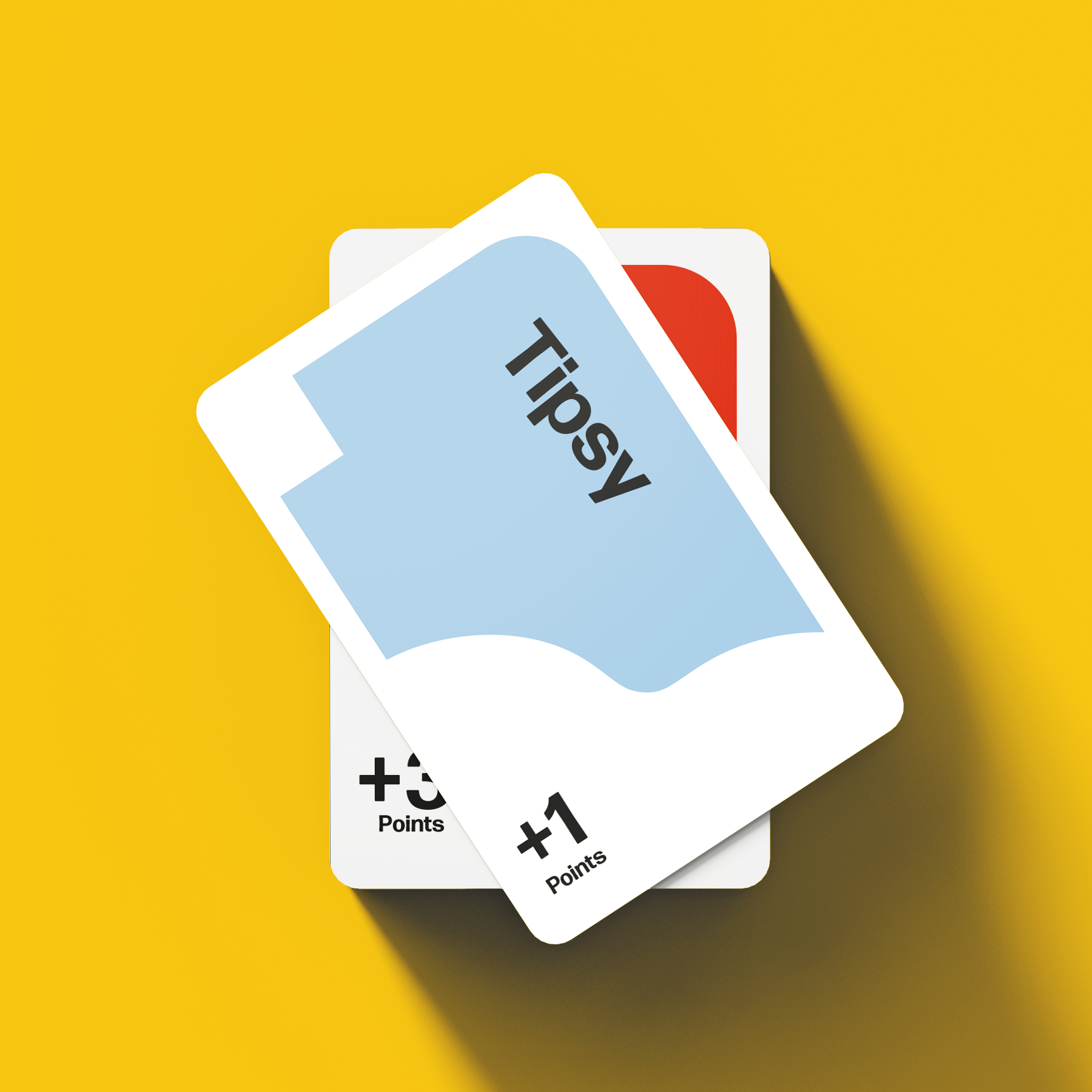
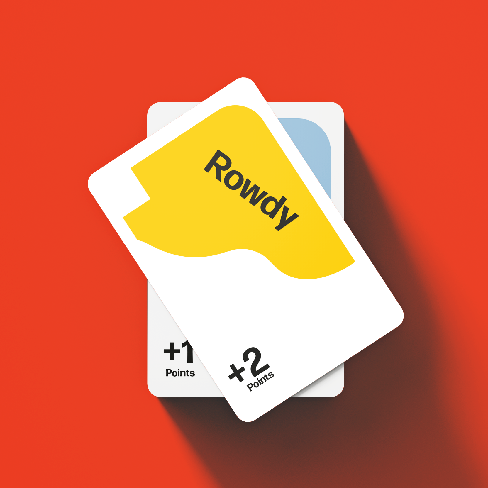
Exploring various concepts, I contemplated illustrating mouths that progressively enlarge with increasing drink levels (e.g., Tipsy, Rowdy, Sloshed), but I wanted something more innovative.
Typography manipulation, such as blurred text to simulate the effects of being drunk, was another avenue I explored, but it lacked the visual impact on its own.
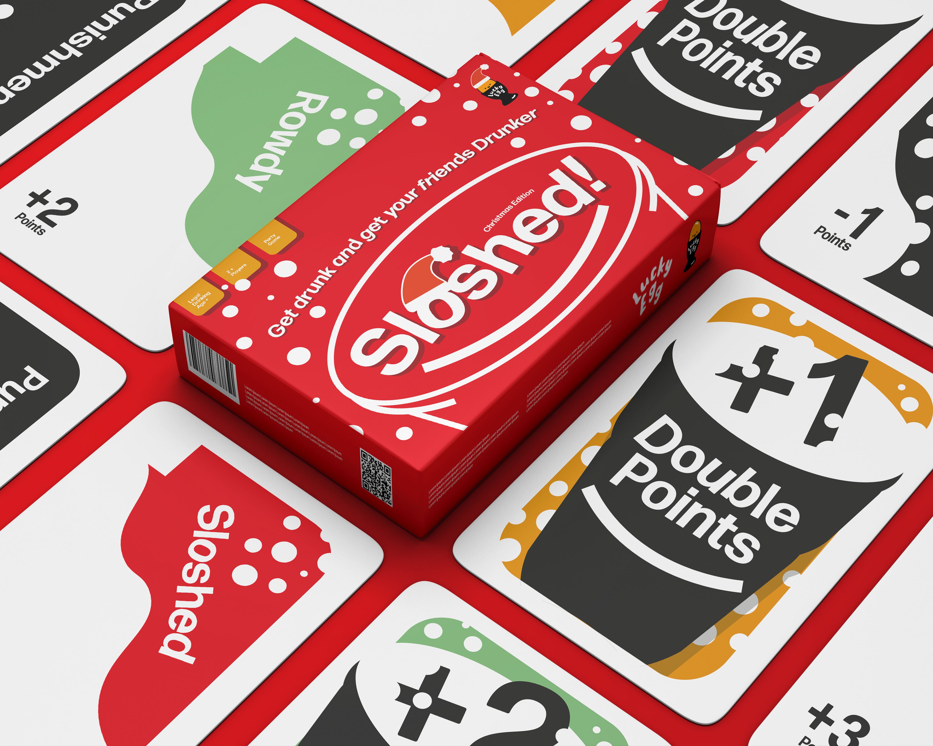
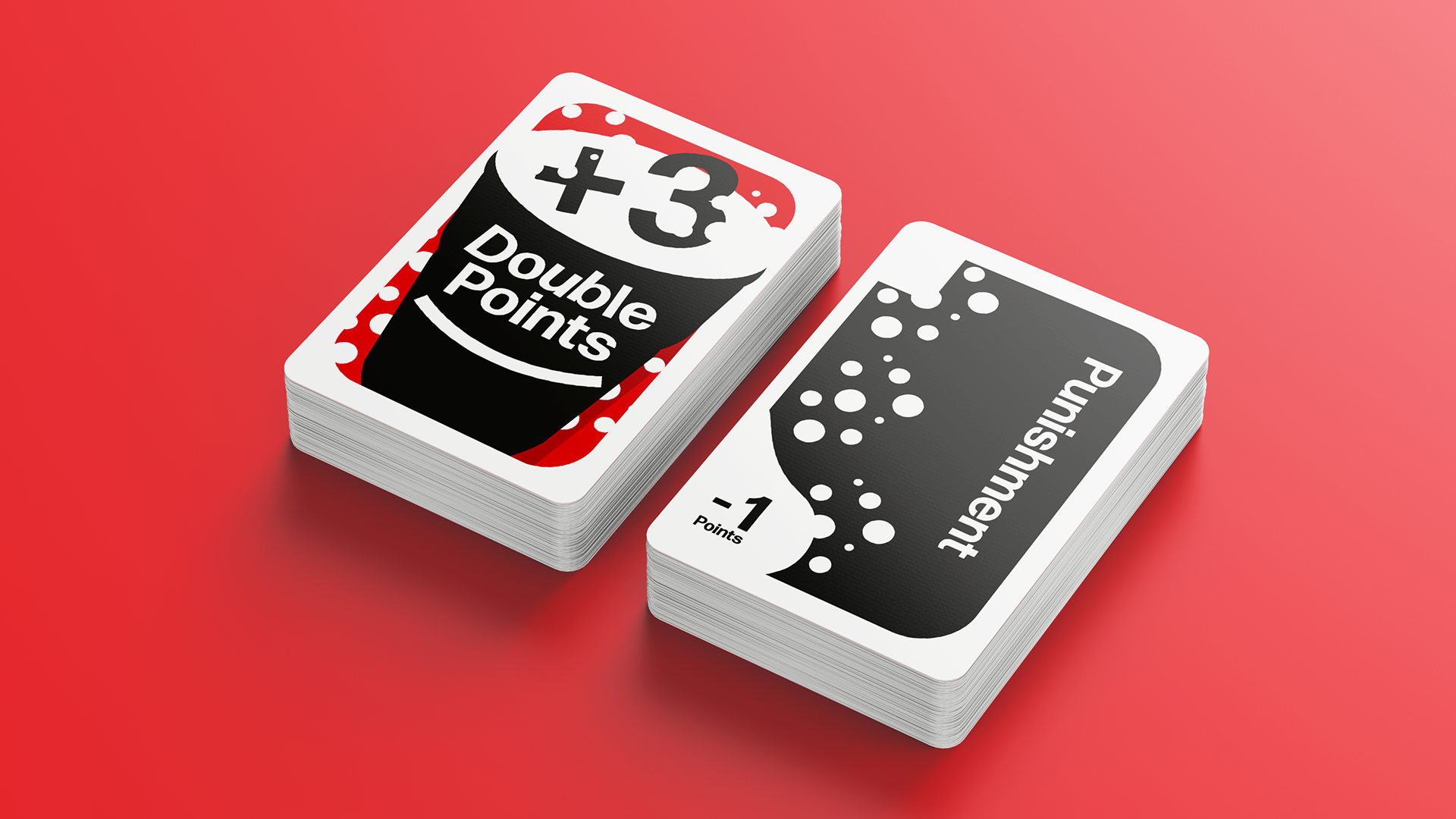
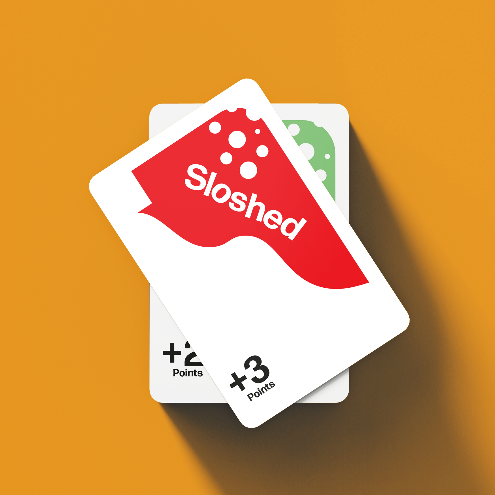
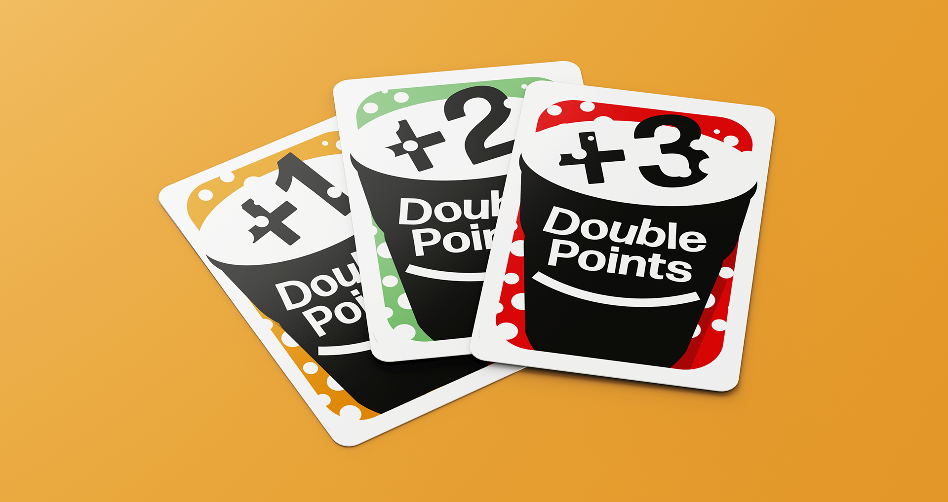
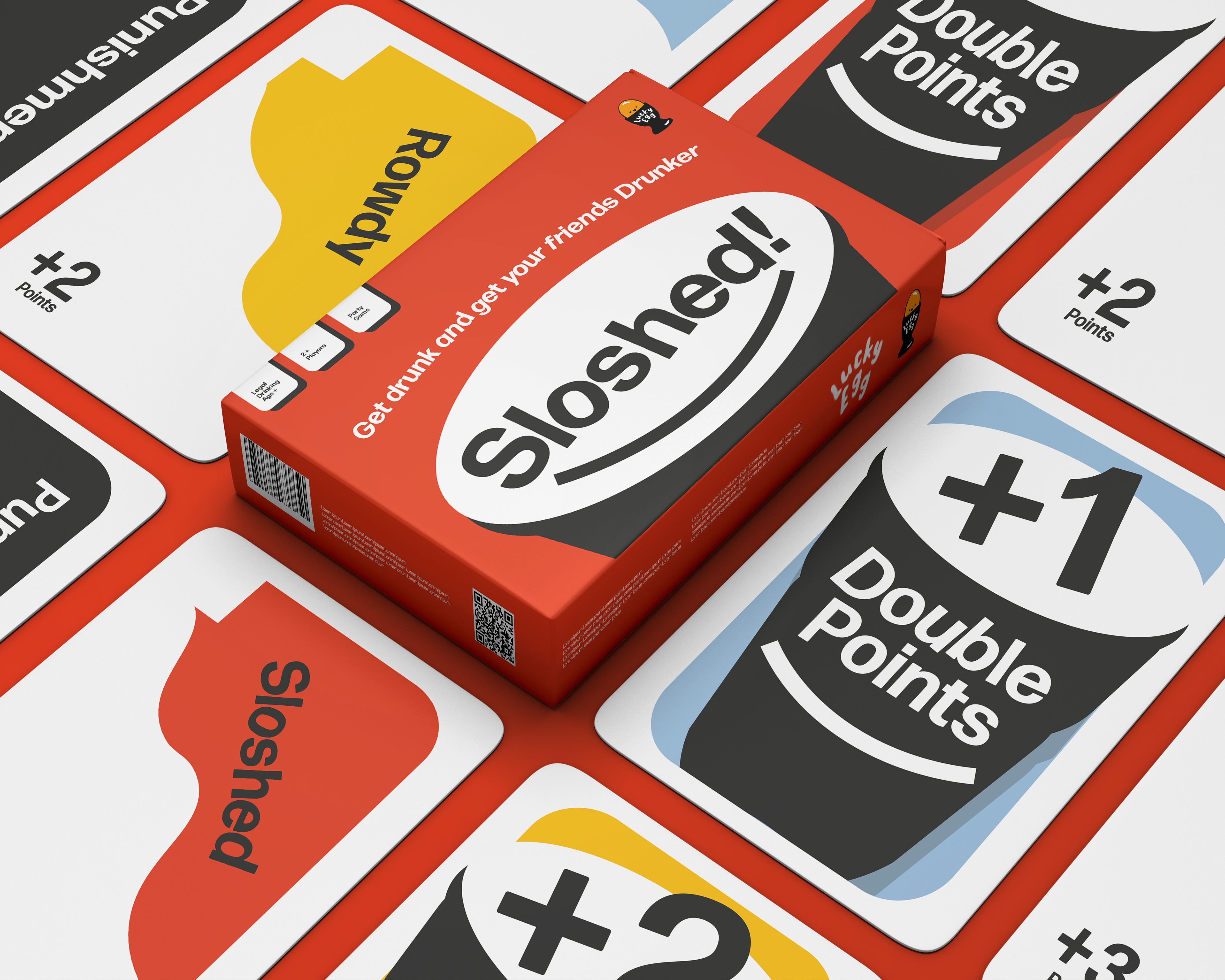
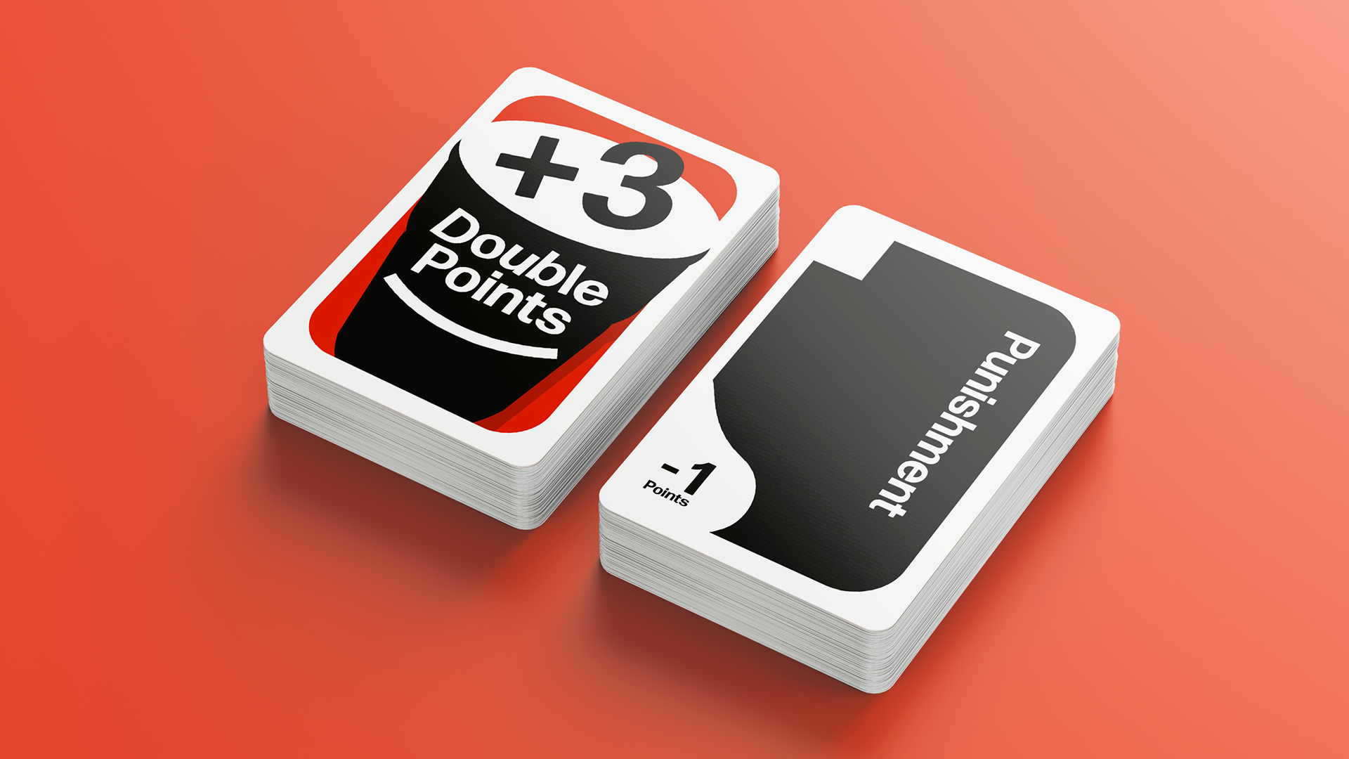
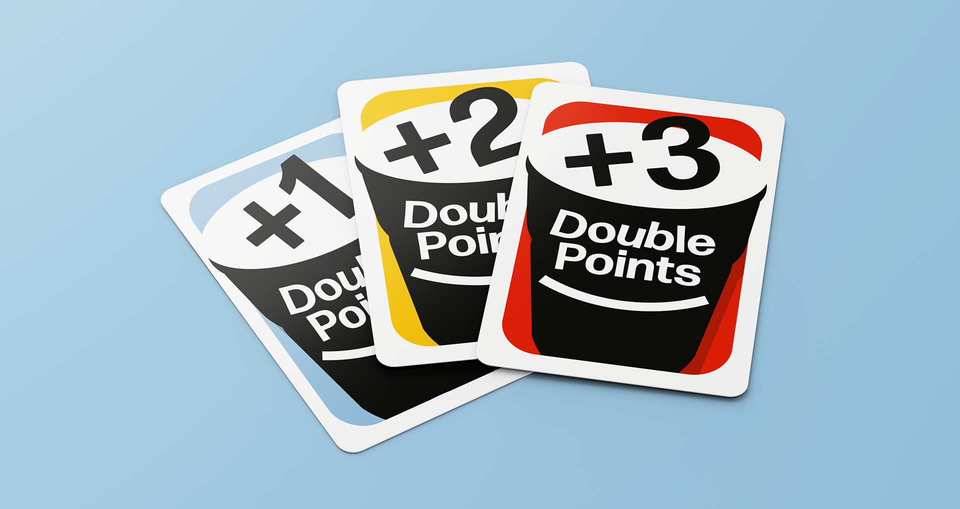
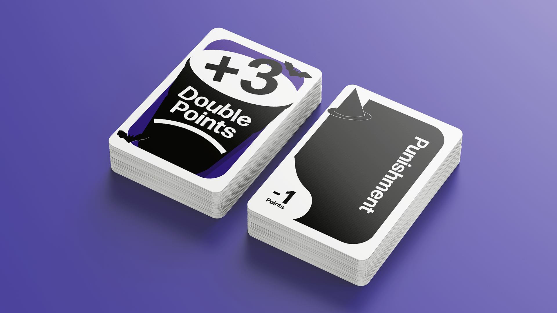
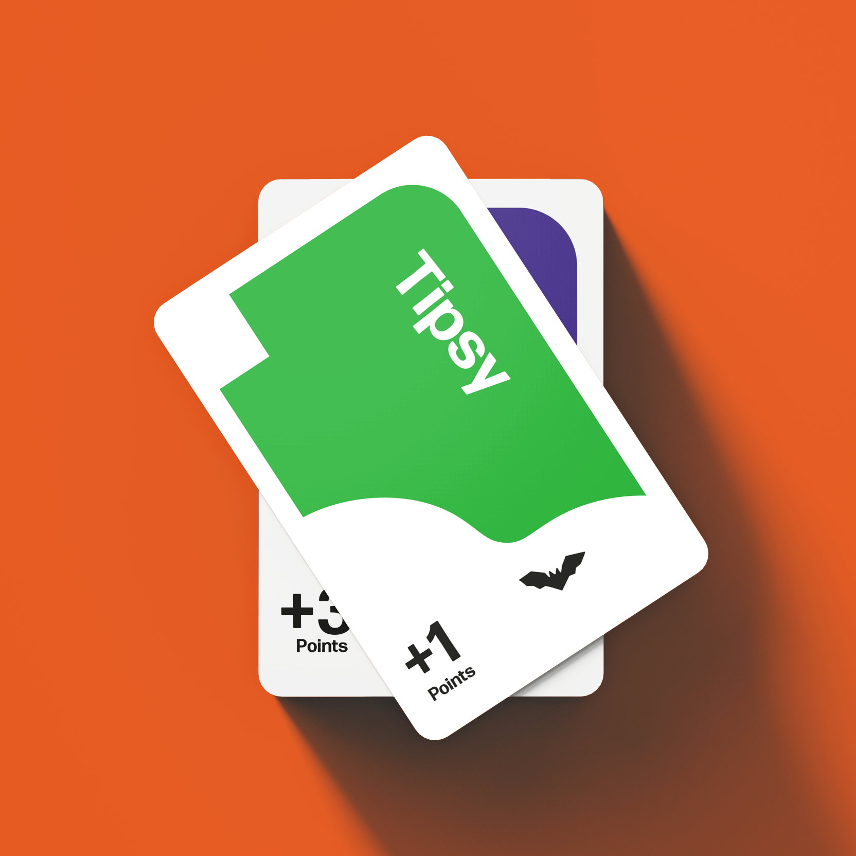
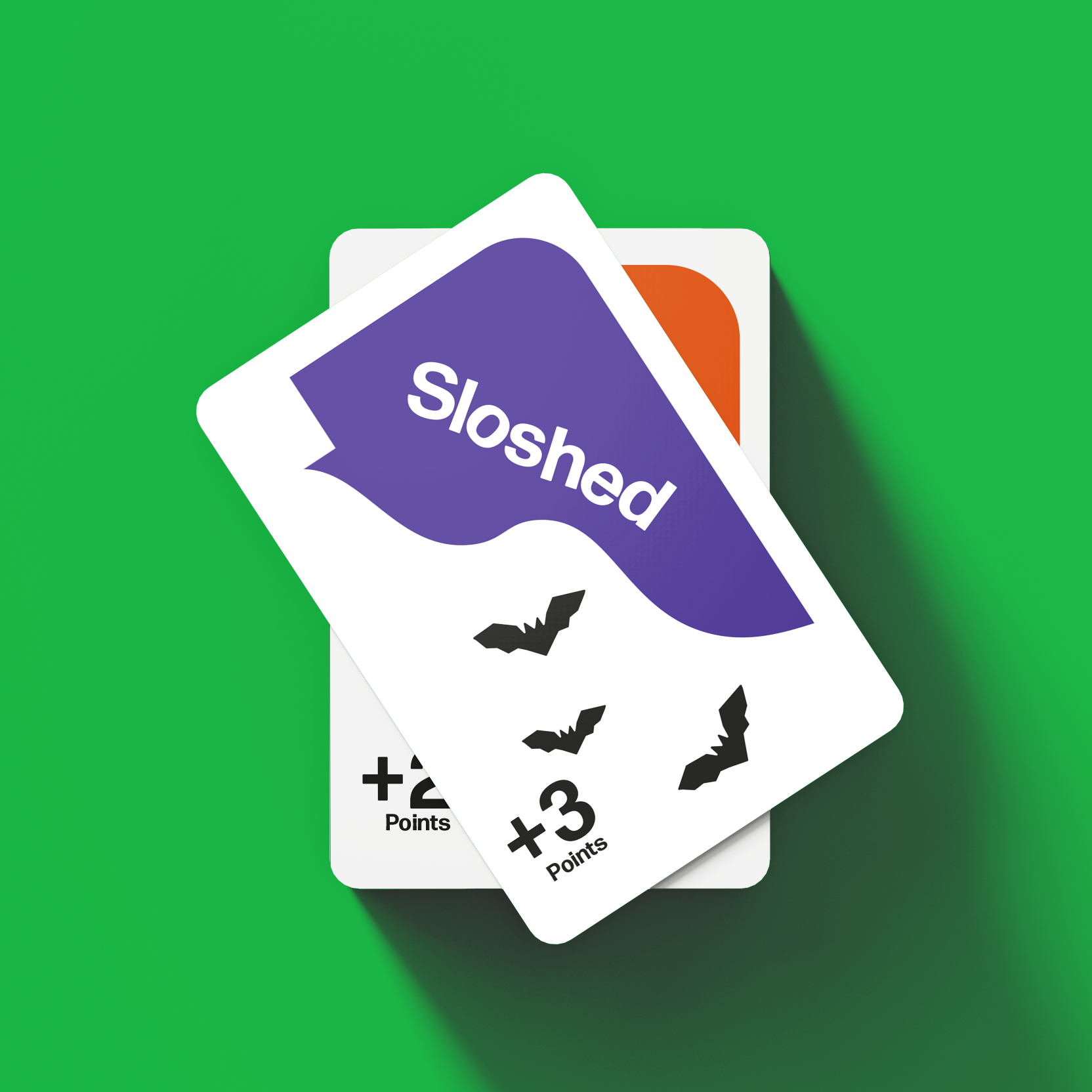
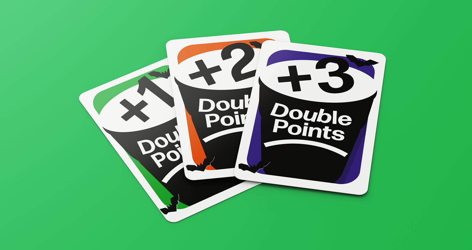
Ultimately, drawing inspiration from the imagery of a jug pouring drinks, I envisioned incorporating this into each card design. Each card would feature a spout-like opening at the top left corner, creating the illusion of alcohol pouring out when viewed at a 45-degree angle. Additionally, double-point cards would showcase party drinking cups to keep the thematic coherence. To align with the aesthetic of Lucky Egg, the re-design would have bold block colours.
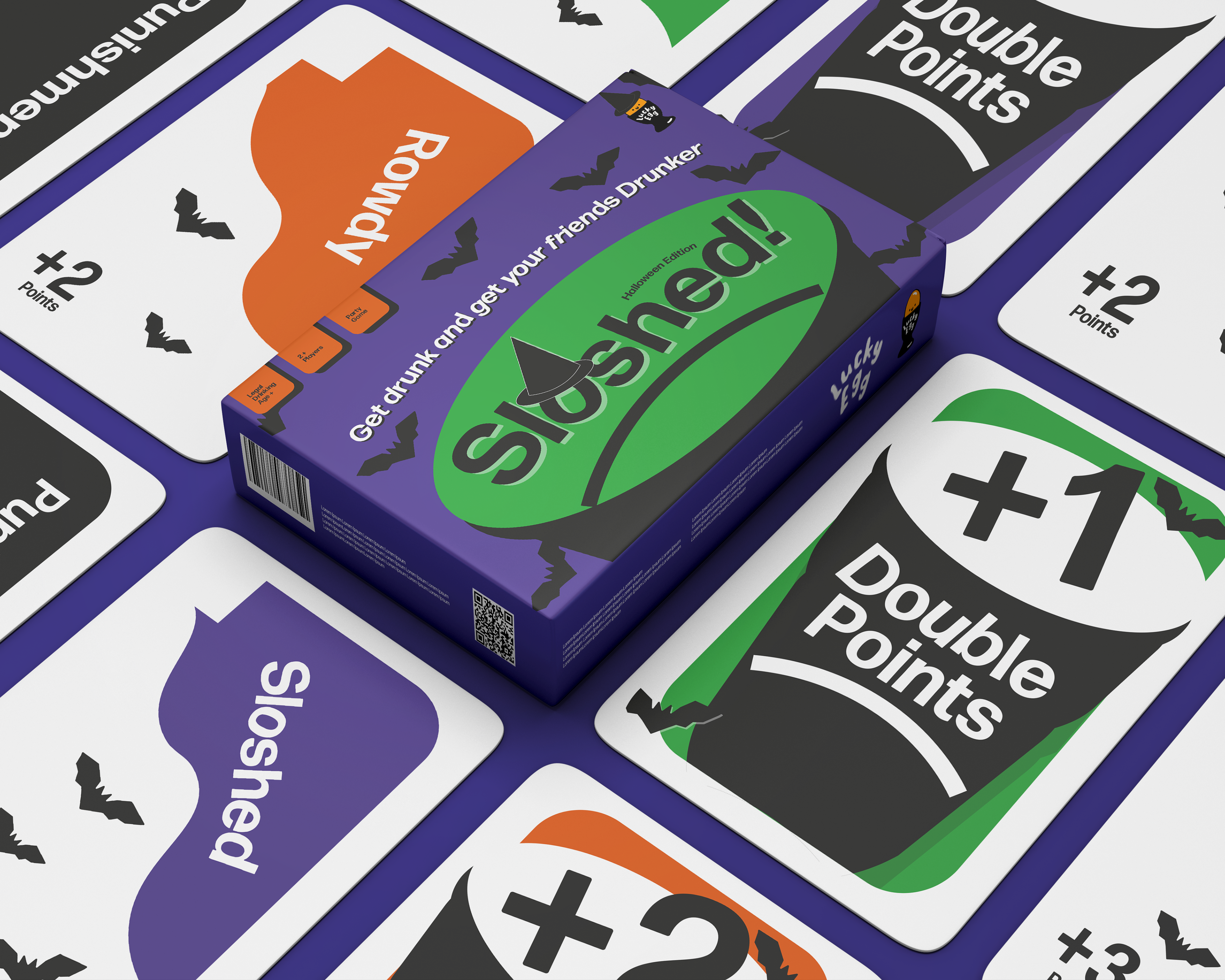
The packaging design would be equally playful, featuring a drinking cup with the Sloshed logo manipulated to resemble ice cubes within the beverage. A
cheerful smile hidden in the beverage would complete the design, reinforcing the lighthearted, playful spirit with Lucky Egg games.
My re-design also considers a Halloween and Christmas theme, for extra development.
Halloween Edition

Christmas Edition