GREGGS
GRAB & GREGGS MORNINGS
Problem: Around 15-20% of commuters skip breakfast in the morning to balance getting to work on time, their busy schedules and financial pressures
Insight: However, there is now an increase in the grab and go trend
Solution: Greggs repositions themselves as the quick, affordable and simple grab and go for morning commuters.
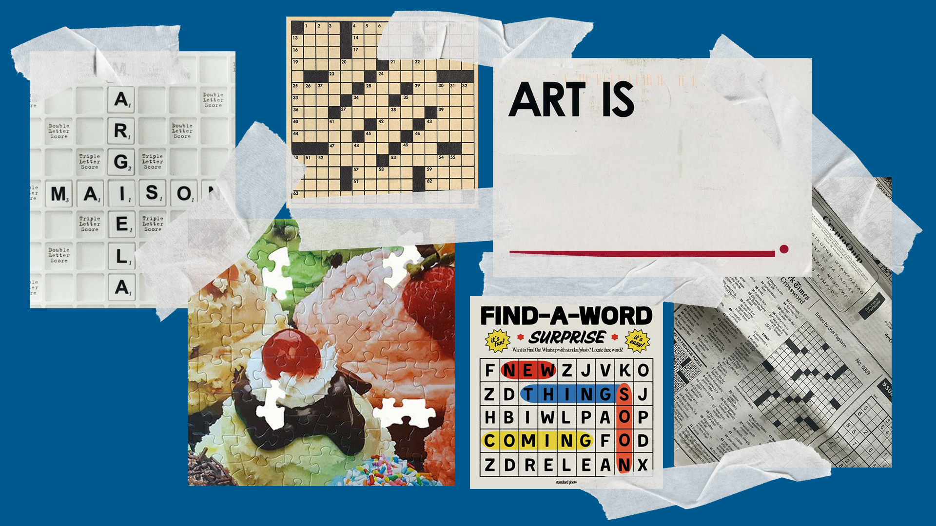
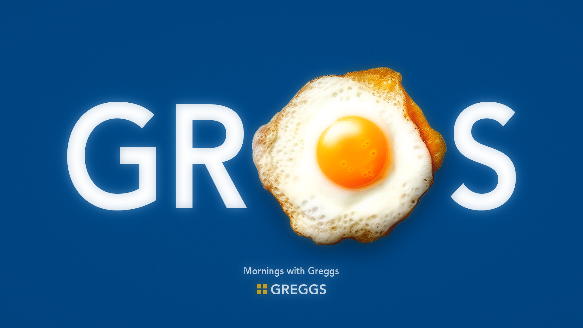
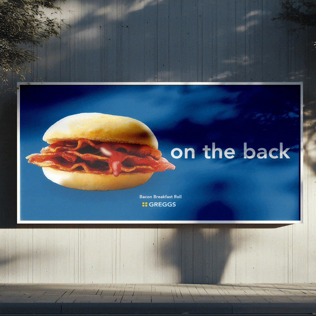
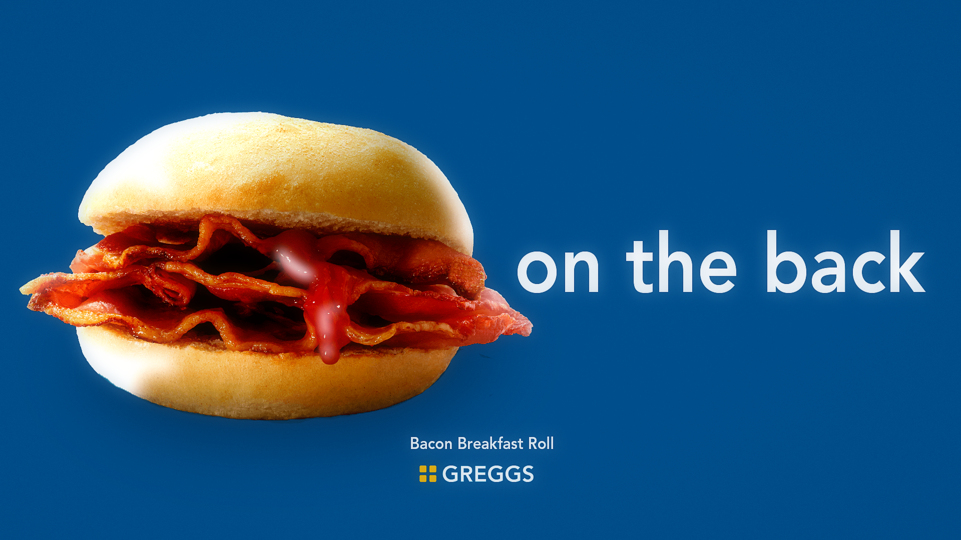
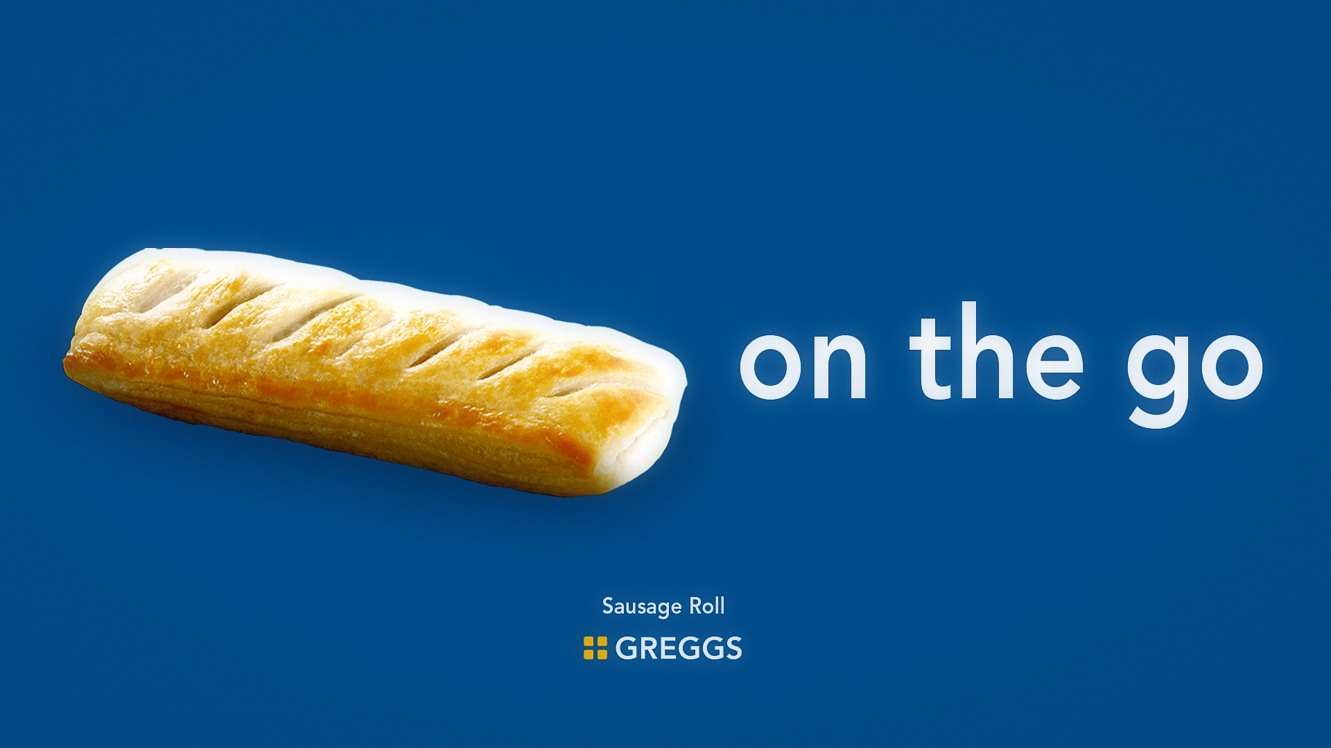
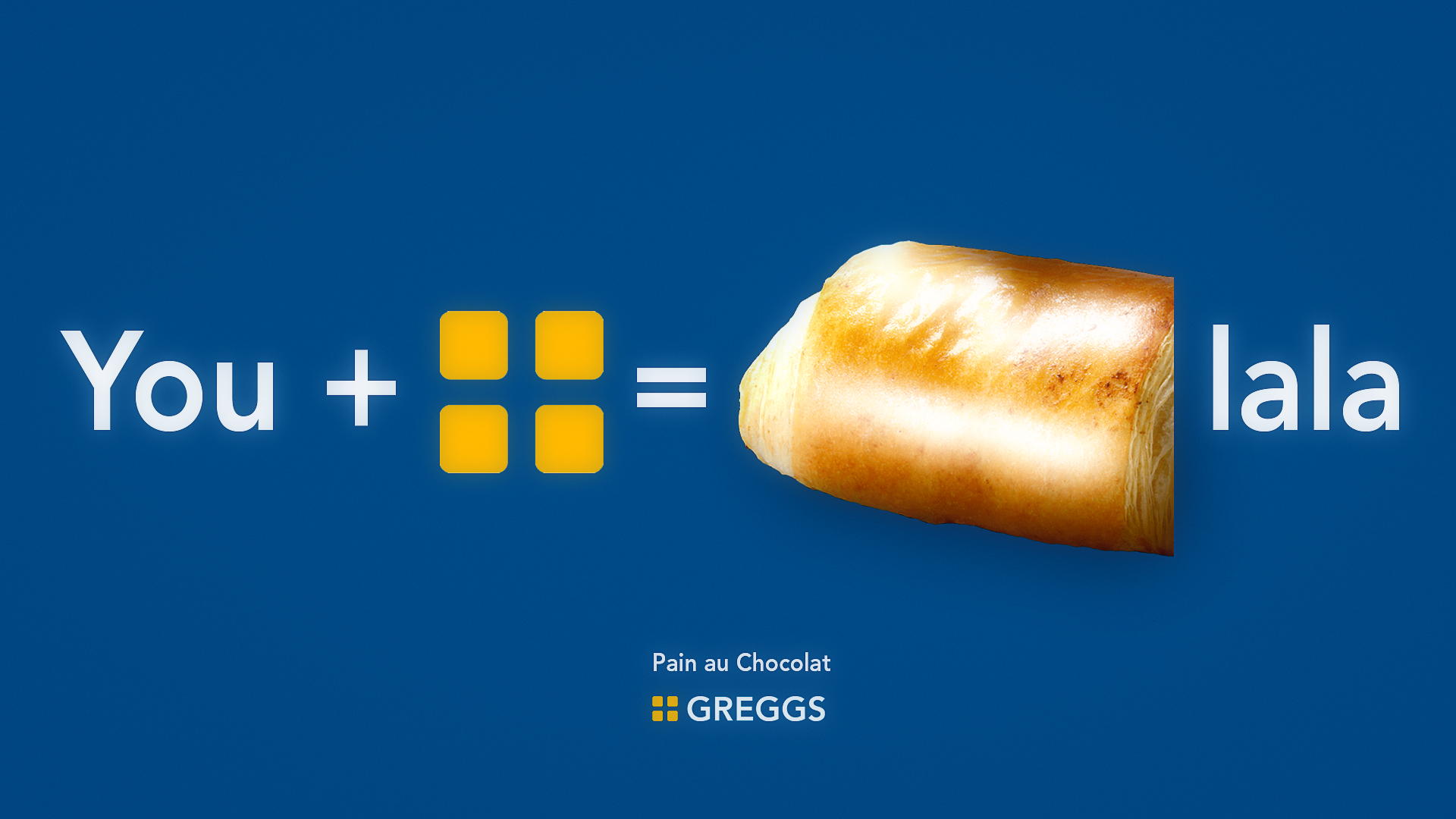
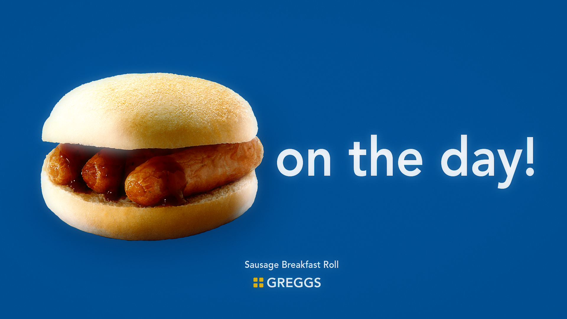
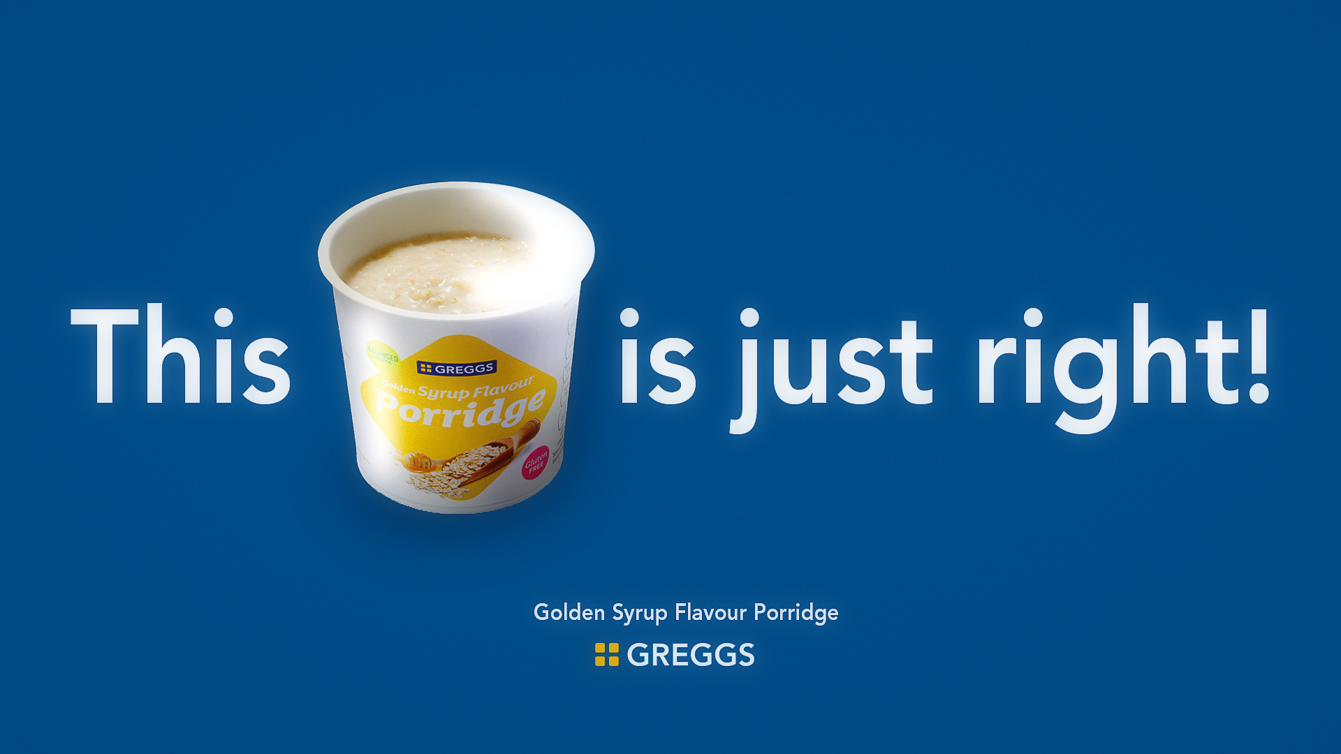
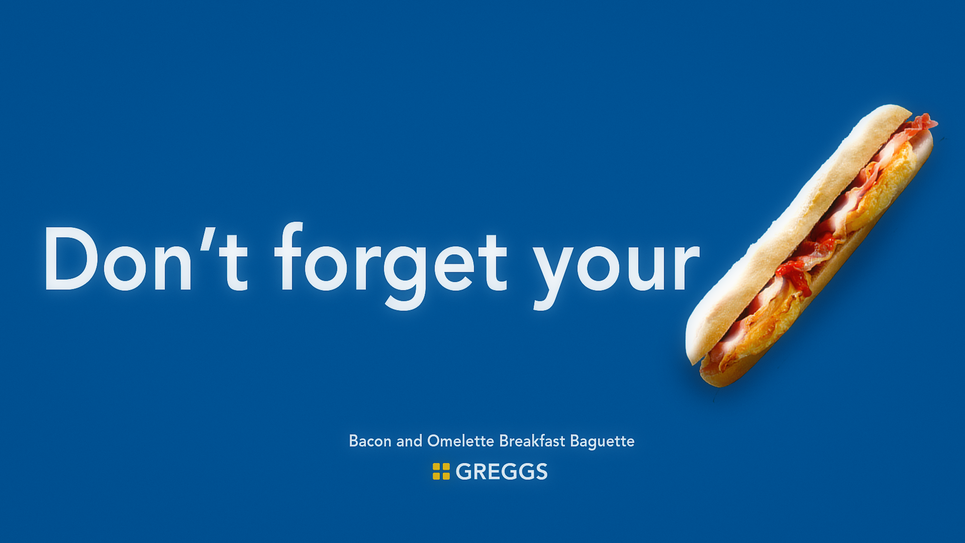
Identity The design of this campaign is a simple aesthetic, with the purpose of allowing busy commuters to see, recognise and acknowledge Greggs in the short 2 seconds they may have to spare. Inspired by picture art, puzzles and morning crosswords to communicate Greggs in a digestible, quick and engaging way.This is complemented with wordplay for the language and features of Greggs morning menu for the imagery. This simple style helps our audience to see how easy it is for Greggs to slot into their busy lives.
DESIGNED FOR
OUR AUDIENCE

Targeting Commuters who skip breakfast
make food look irresistible
HIGH SHINE - COLOUR - SATURATION - CONTRAST
They need convenience
placed in locations they use to commute
STATIONS - HIGH STREETS - BUS STOPS

Commuters are extremely busy
simple, digestible vocab
average of 3 words per poster
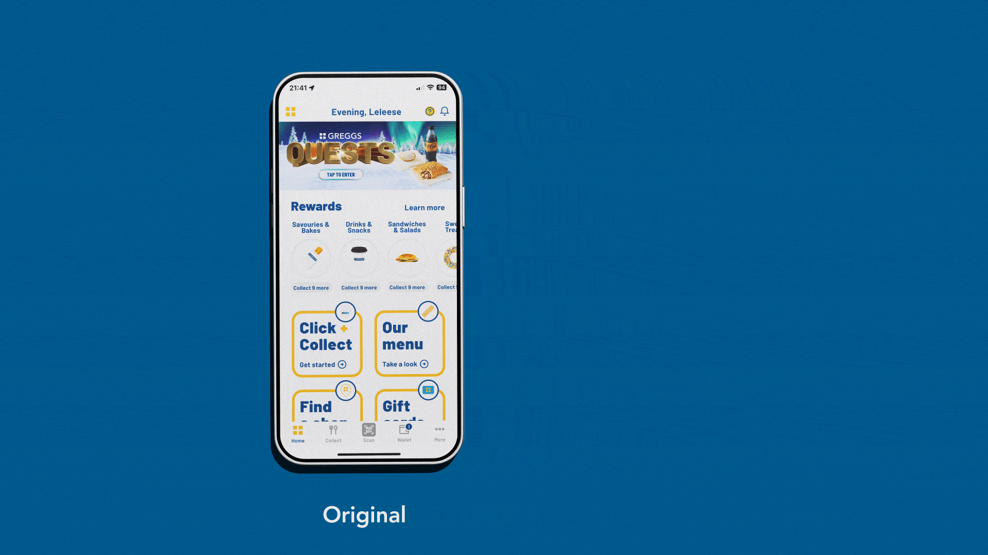
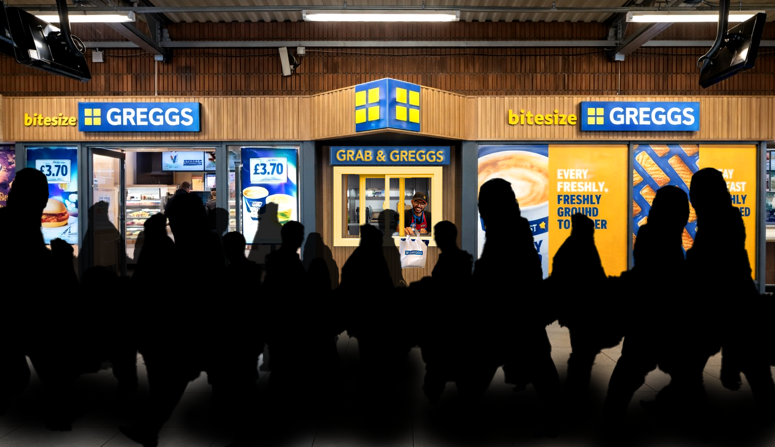
Greggs' new App interface will feature their sunny yellow for mornings and their night time blue for evenings. Greggs will also open pick up points located outside of Greggs shops' to add to their existing Click & collect system. The pick up stations will resemble Drive Throughs to help with speed and convience.
Seeing these posters each day will subconsciously get our audience to think of Greggs and want to go there before work, as it becomes apart of their routine to travel to work and see a Greggs AD on the way.