
This page features a selection of completed design projects.
A mix of university-led projects and self-initiated work.
A mix of university-led projects and self-initiated work.
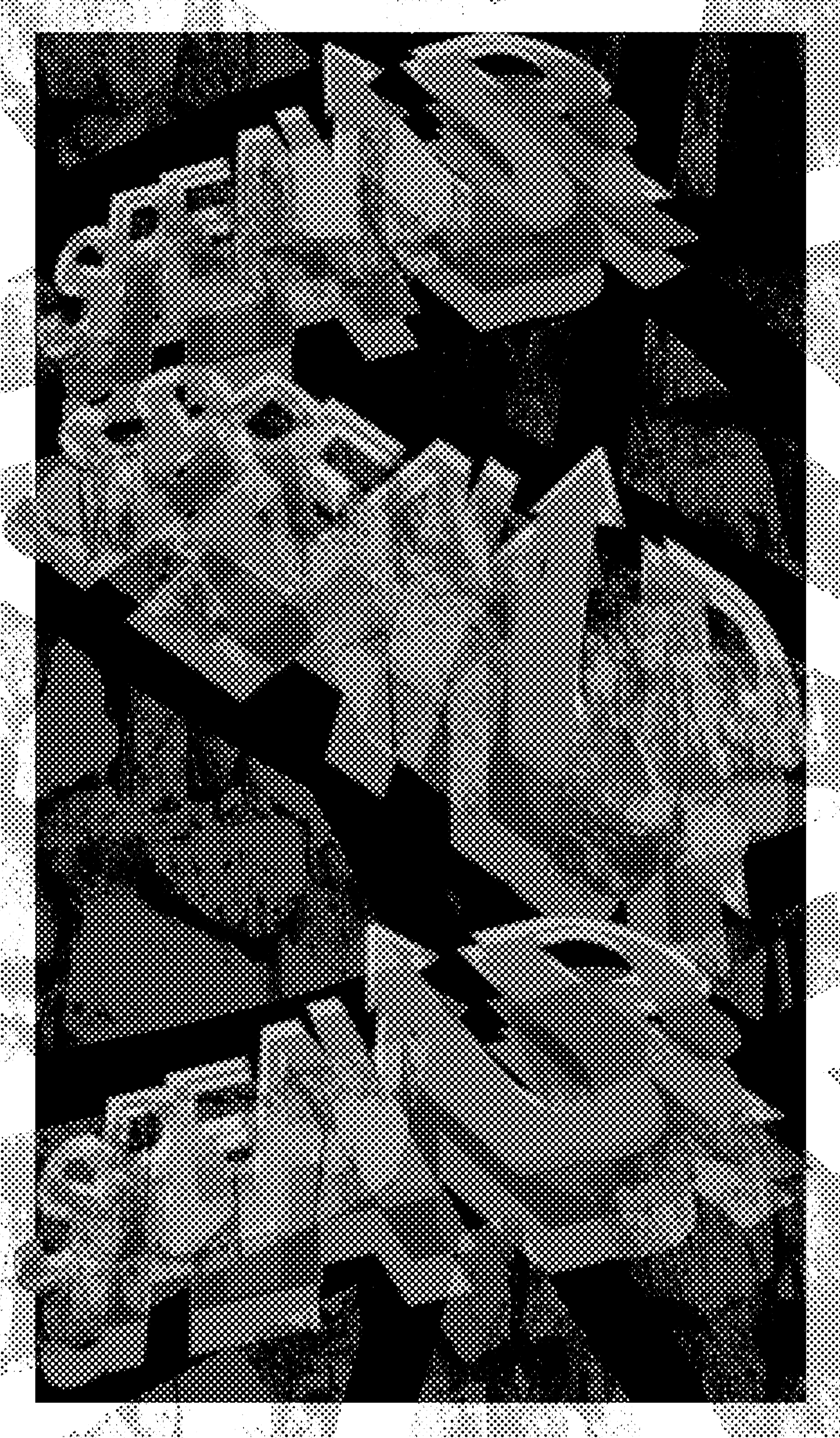
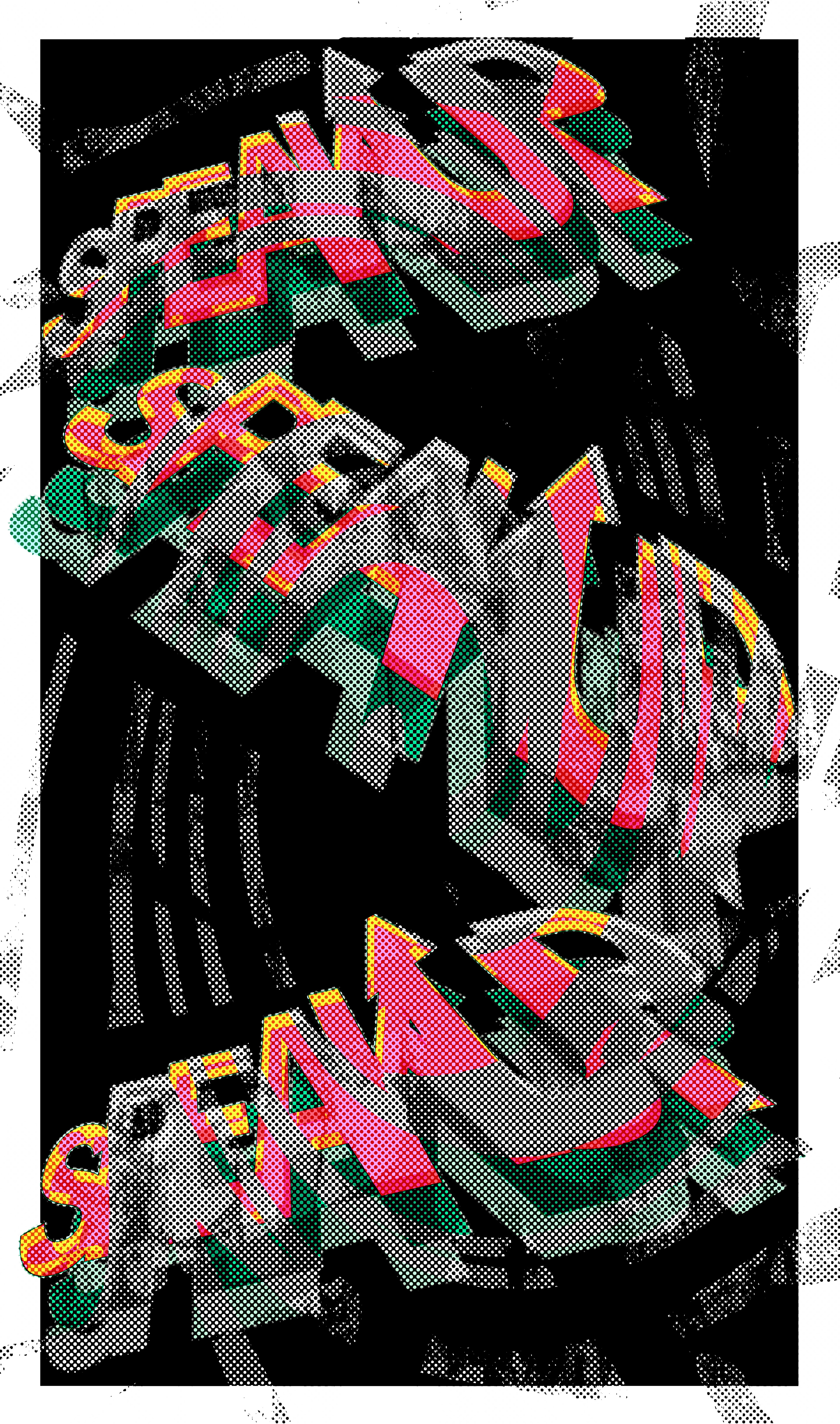
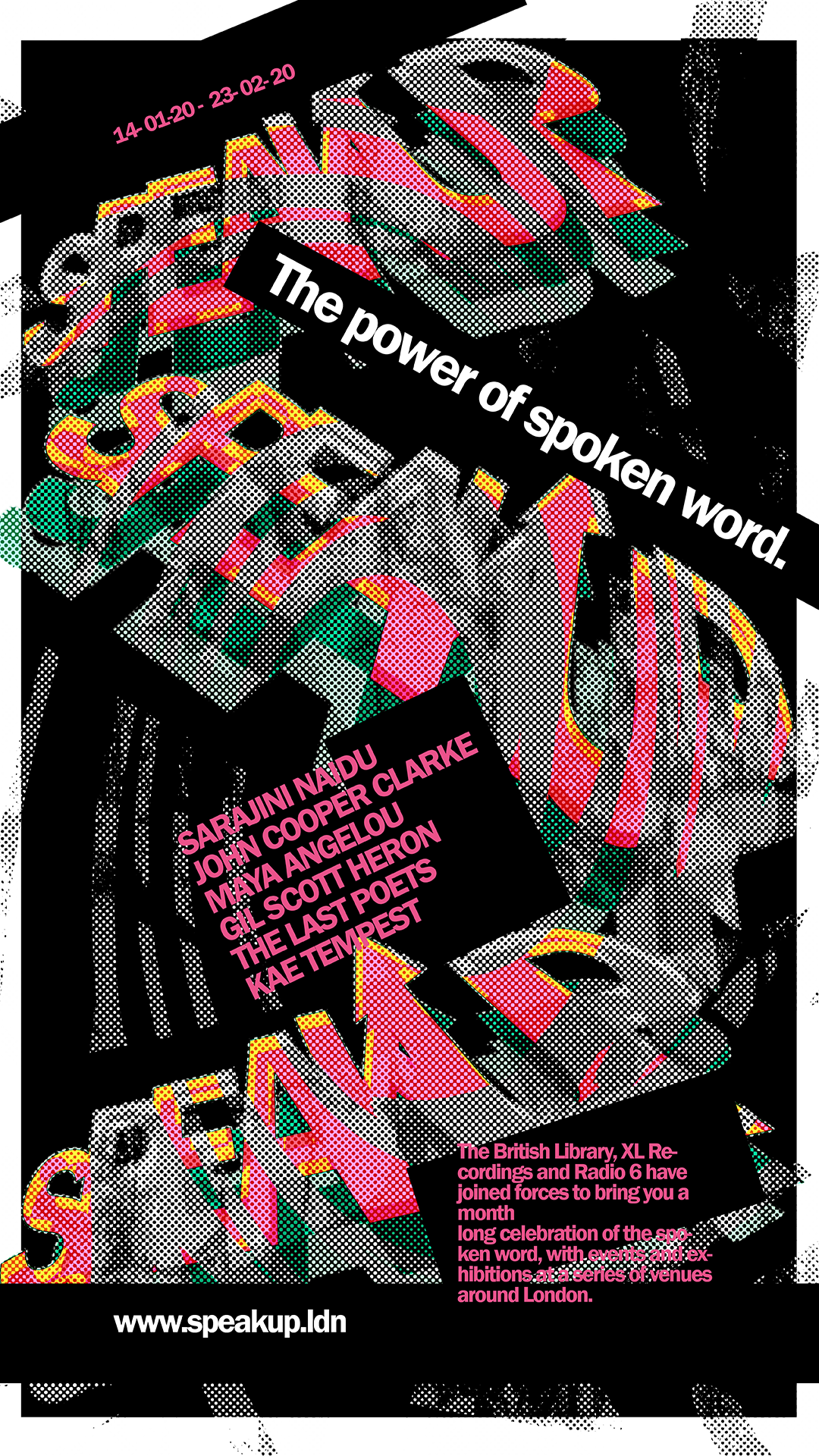
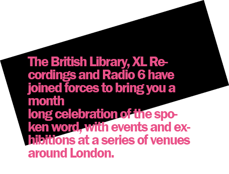
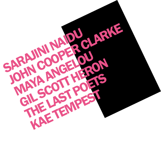
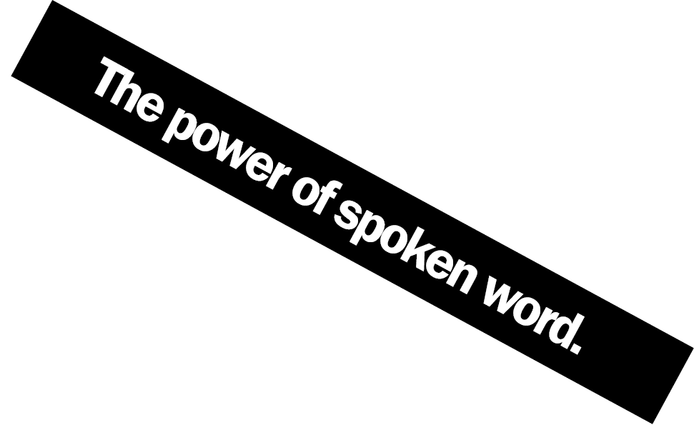
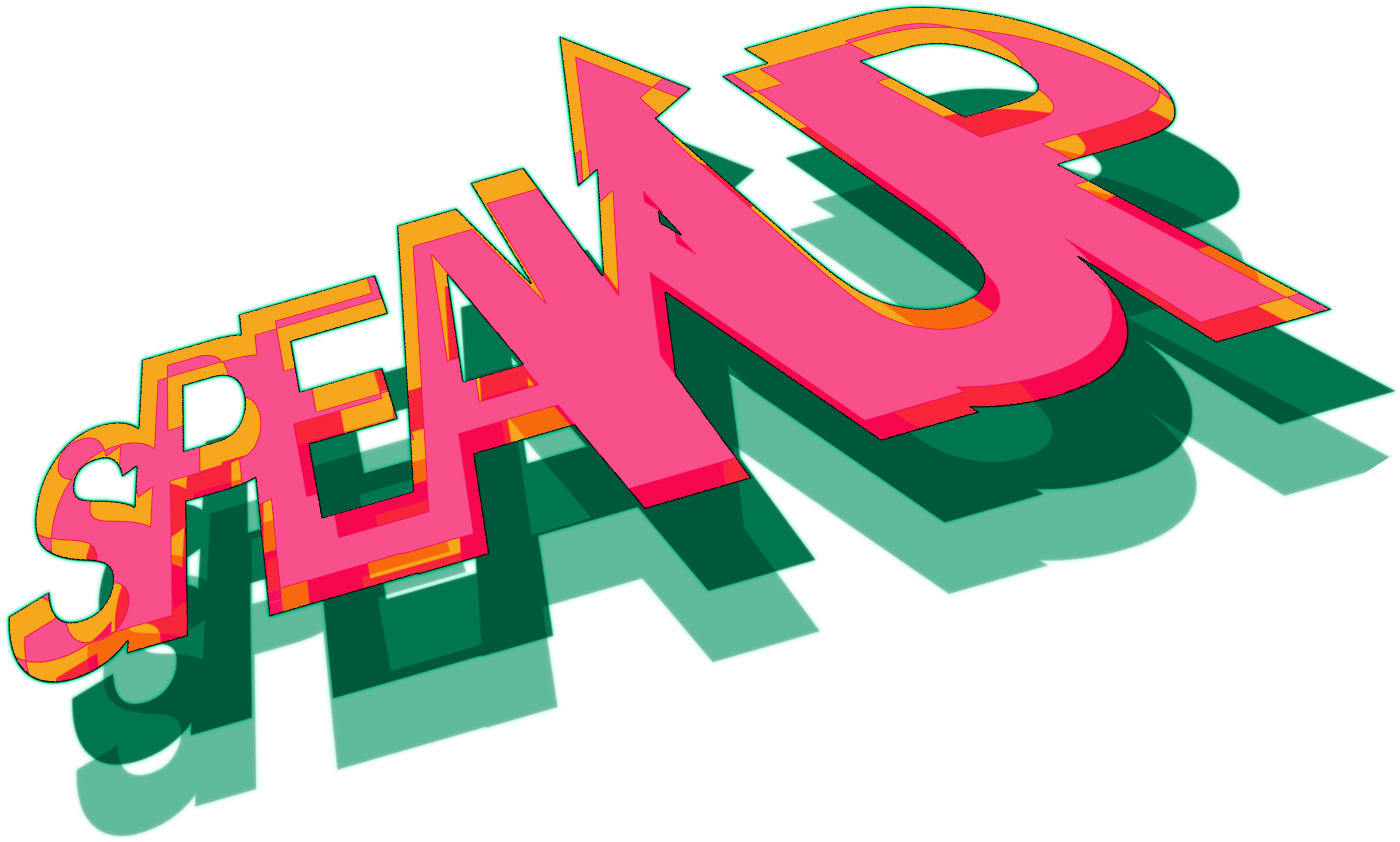
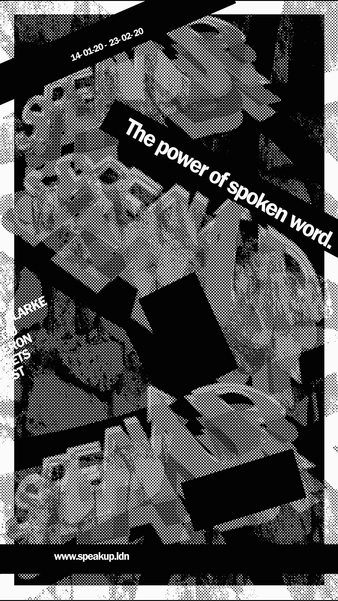
'SPEAK UP' Poetry Campaign
Aim:
to create an animated typography advertising campaign for a London poetry event, sponsored by BBC Radio 6 and The British Library.
Insights:
After researching the design aesthetic of the event sponsors (BBC Radio 6, the British Library) and the group of performing poetry artists, I explored the textures of the urban, grungy parts of London. This was to give the campaign aesthetic more of a relatable impression among creatives and everyday Londoners who would be drawn to the event.
After researching the design aesthetic of the event sponsors (BBC Radio 6, the British Library) and the group of performing poetry artists, I explored the textures of the urban, grungy parts of London. This was to give the campaign aesthetic more of a relatable impression among creatives and everyday Londoners who would be drawn to the event.
Poster Variations
Design Elements
Animated Speak Up Poster
Overview:
This project was my first use of after effects and gradually developing the look of the ad with colour, typography amendments and tutorials, I gradually learnt the basics of after effects and was able to create what I considered a successful outcome.
This project was my first use of after effects and gradually developing the look of the ad with colour, typography amendments and tutorials, I gradually learnt the basics of after effects and was able to create what I considered a successful outcome.
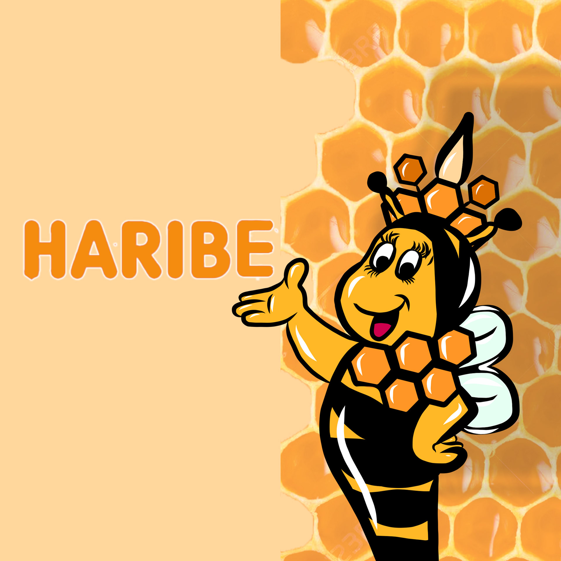
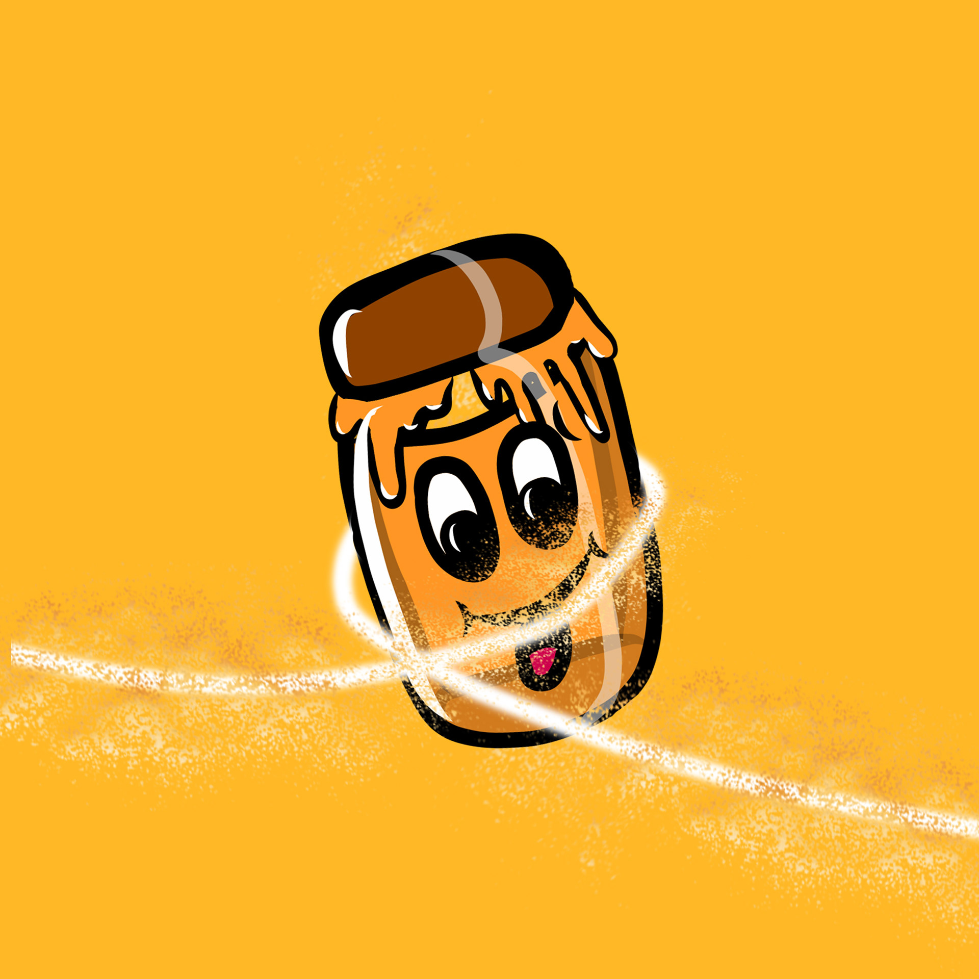
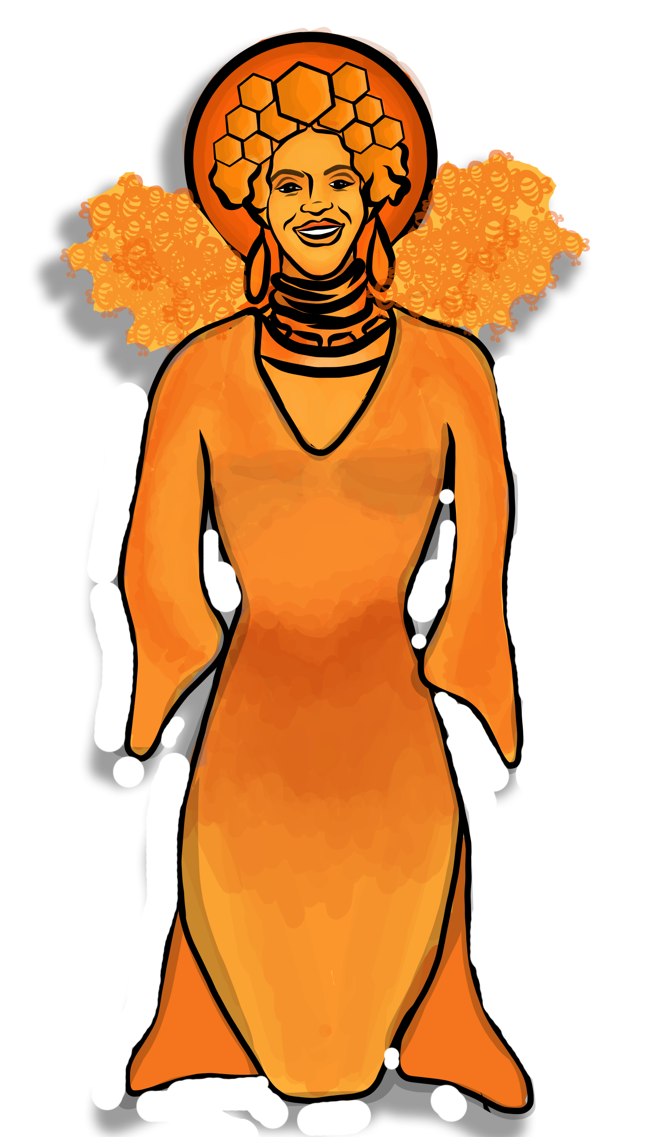
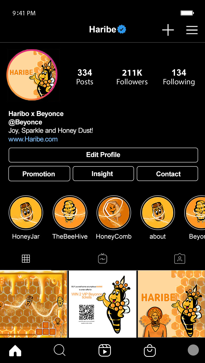
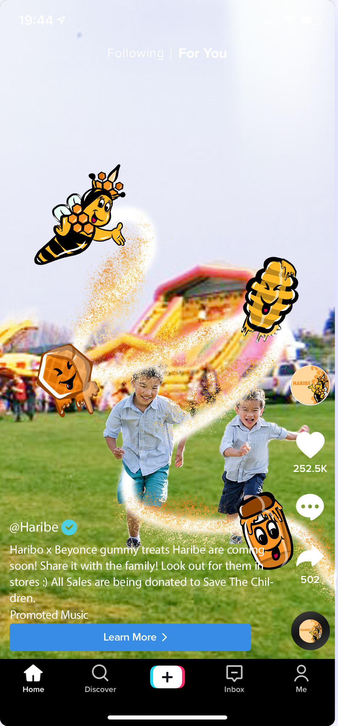
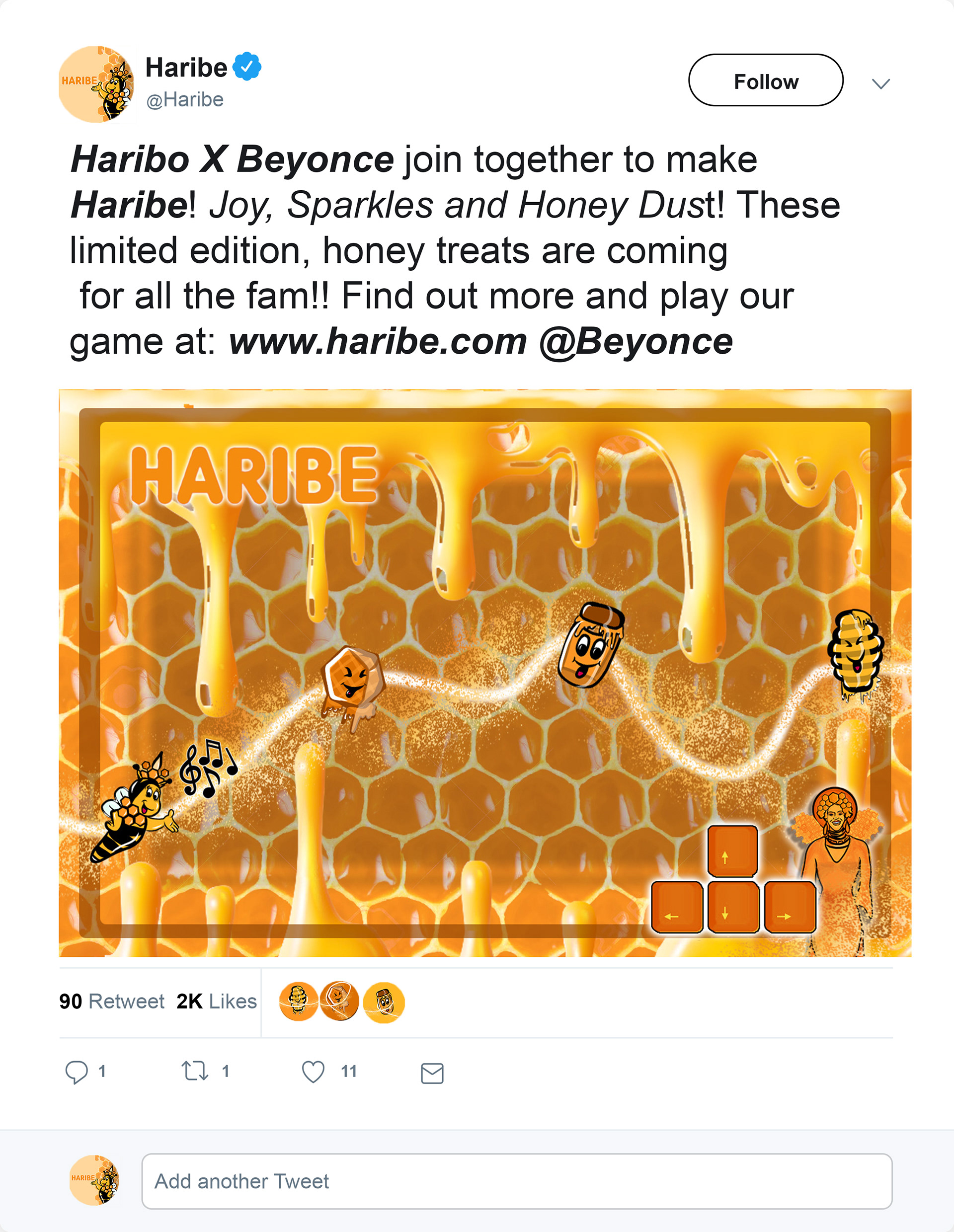
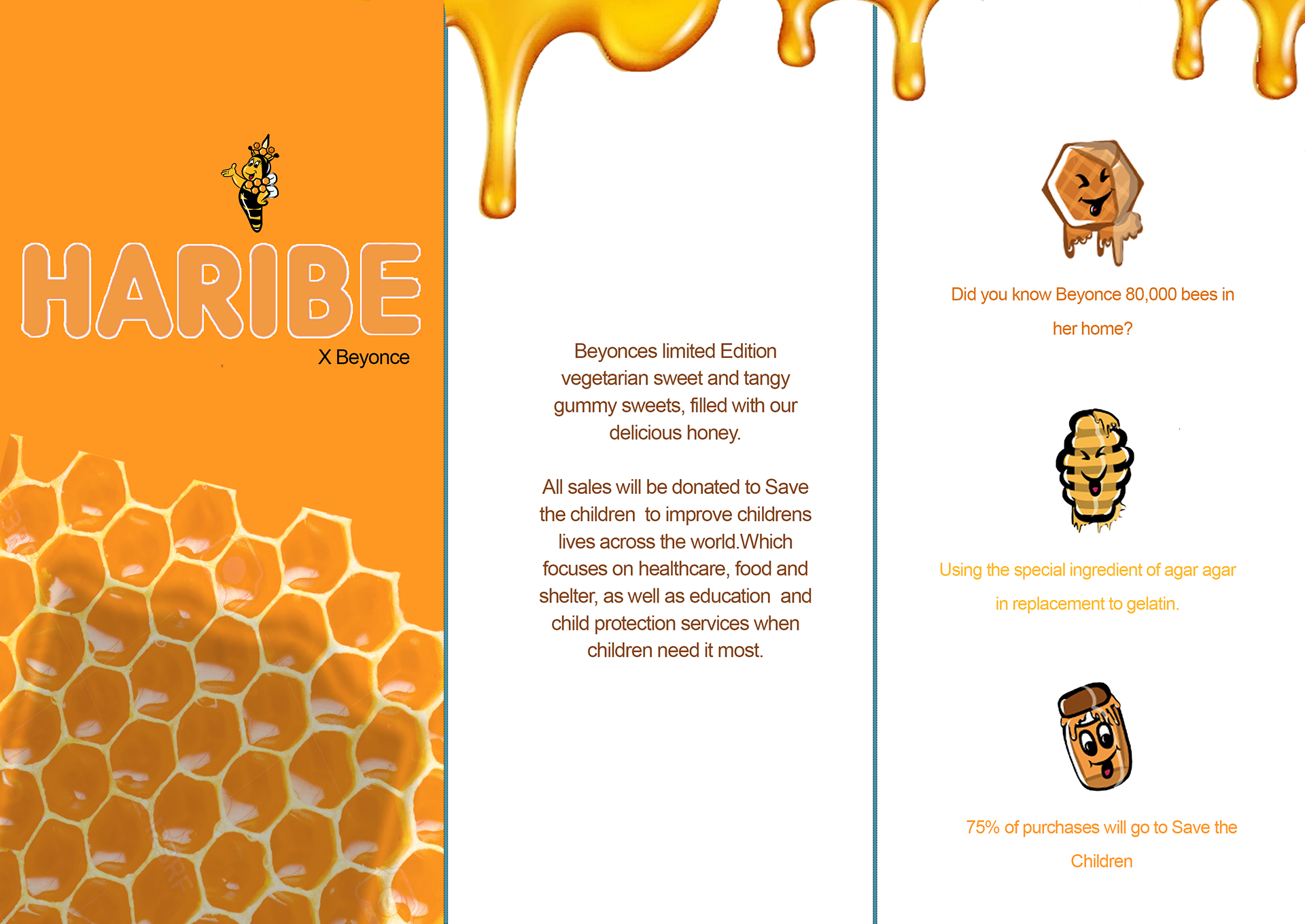
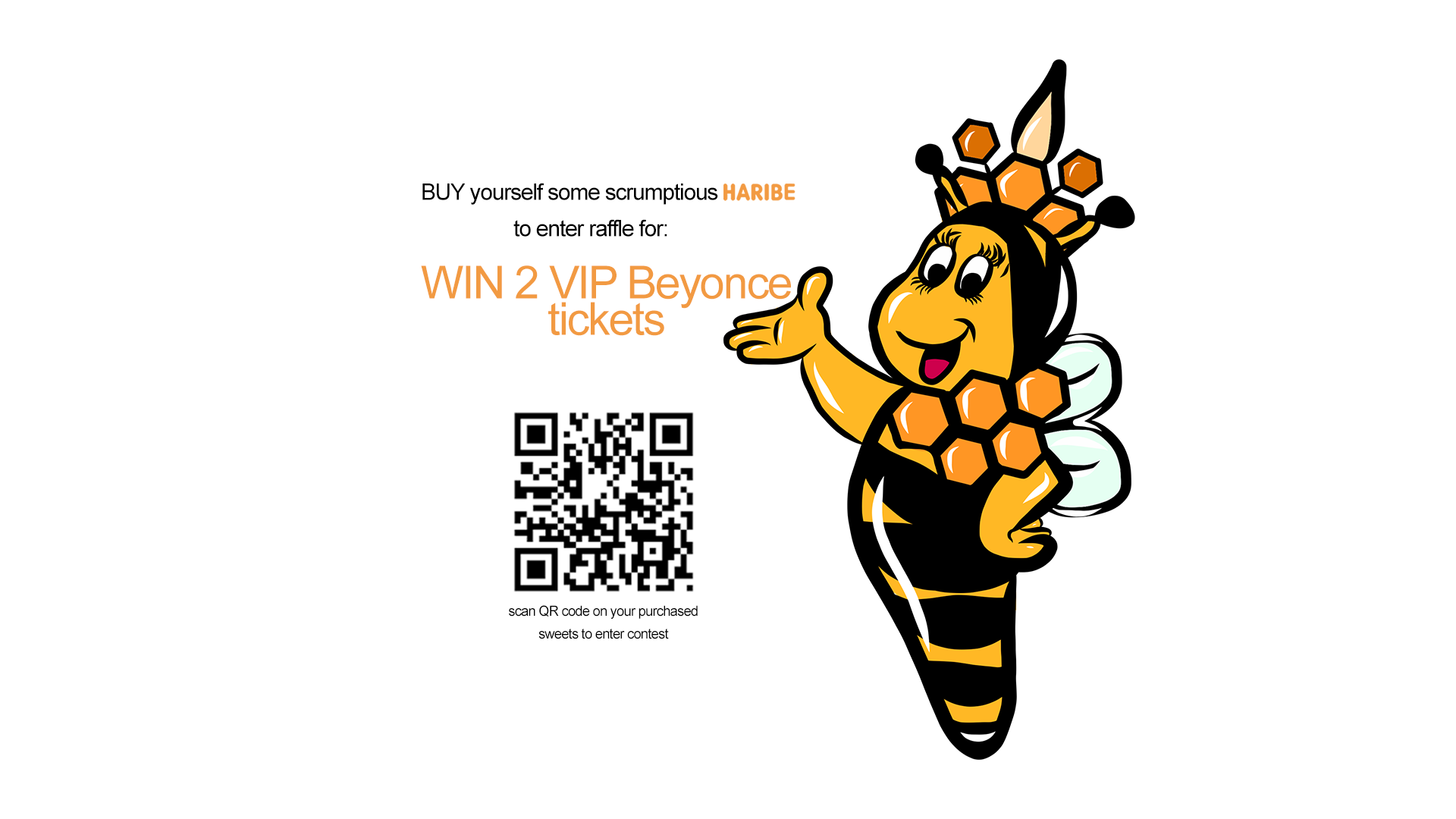
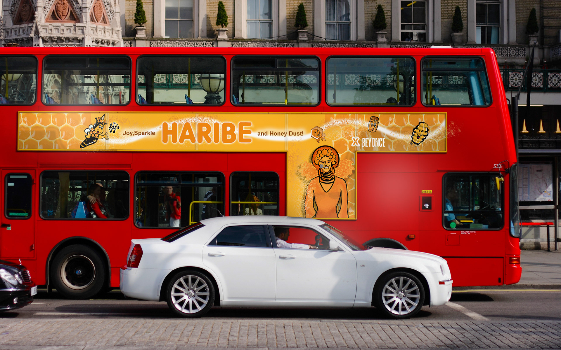
'HARIBE' Beyonce X Haribo Campaign Lf.Designs X Creative.Ravinia
Aim:
To create a Celebrity Collaborative Product Campaign
Insights:
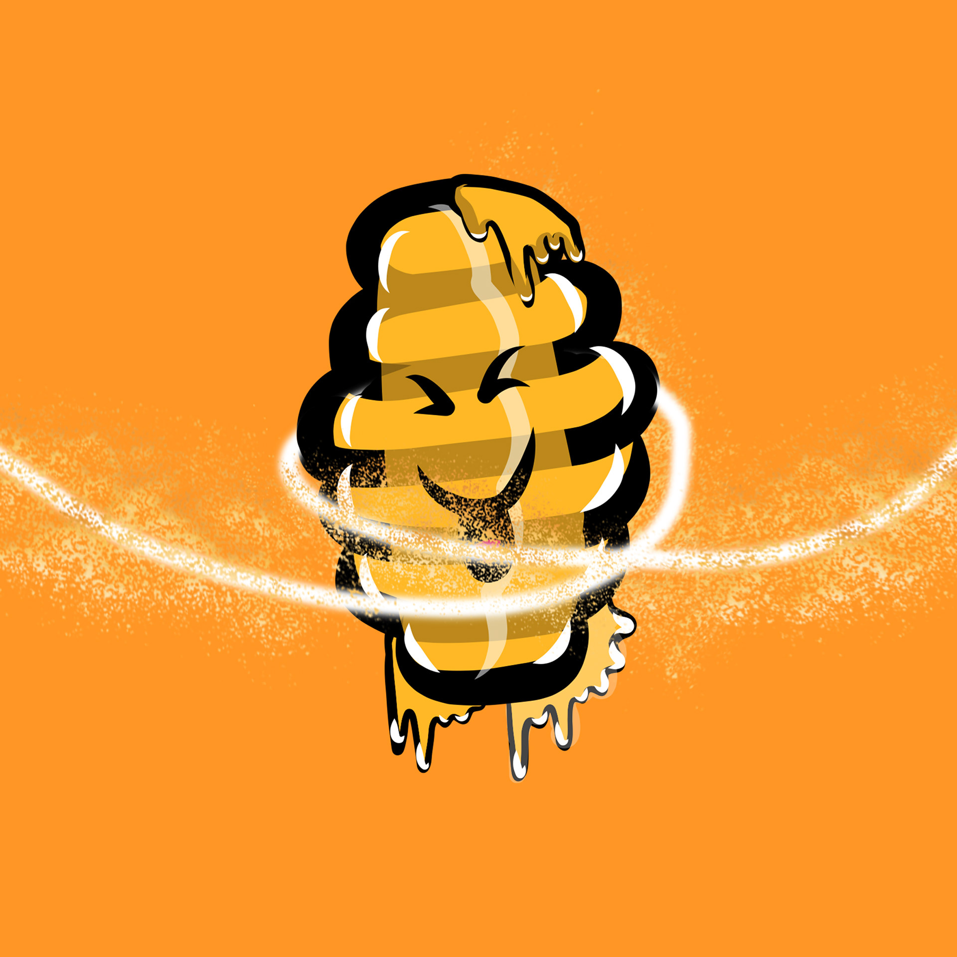
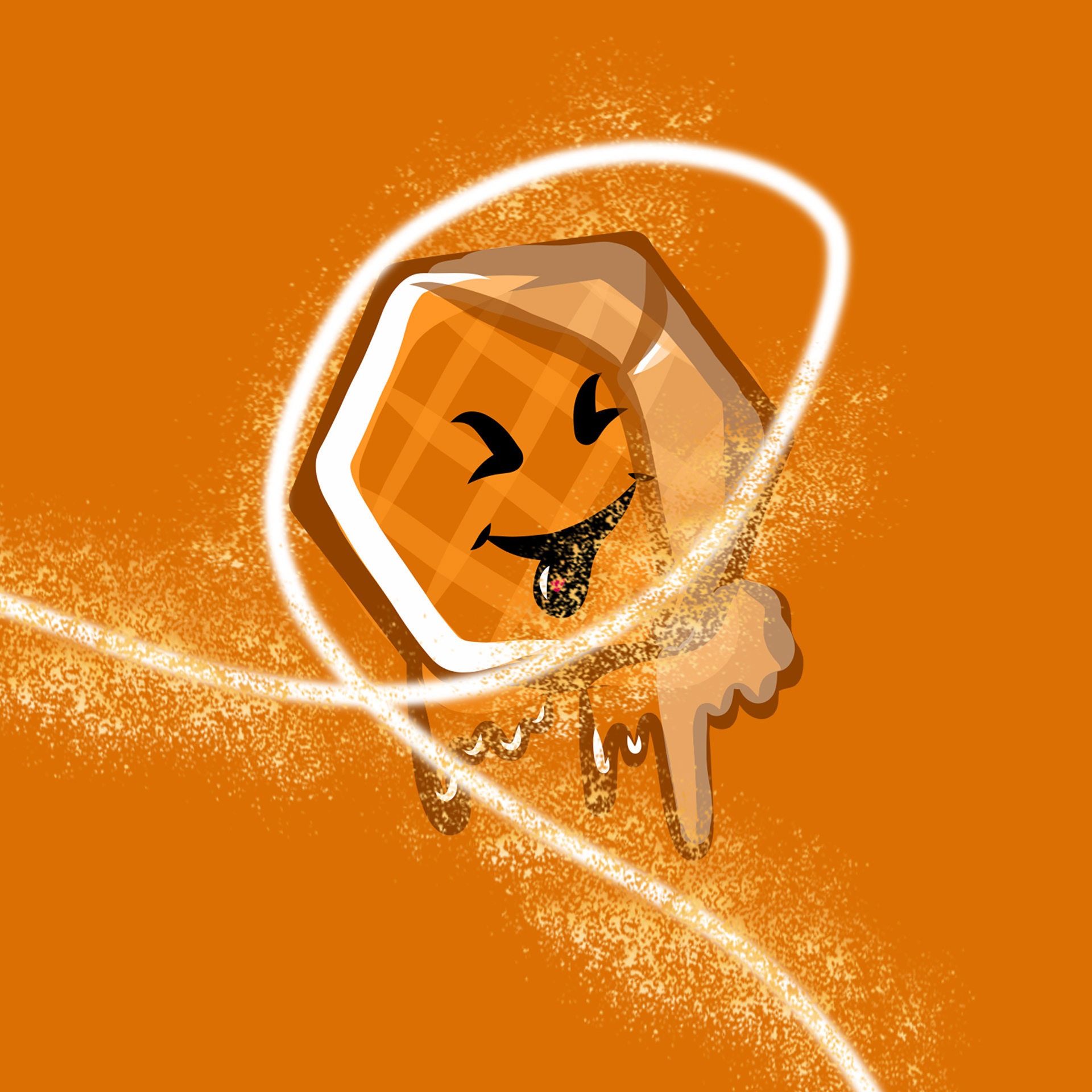
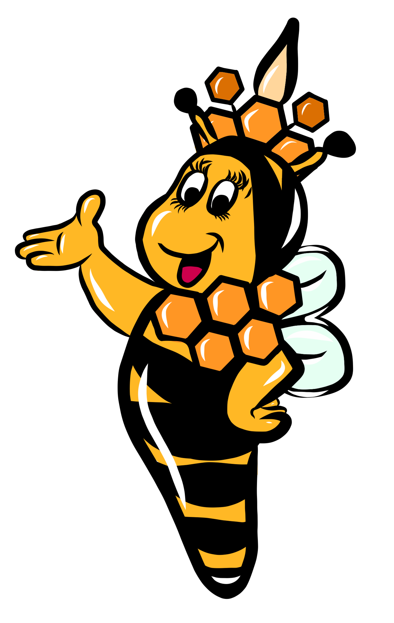
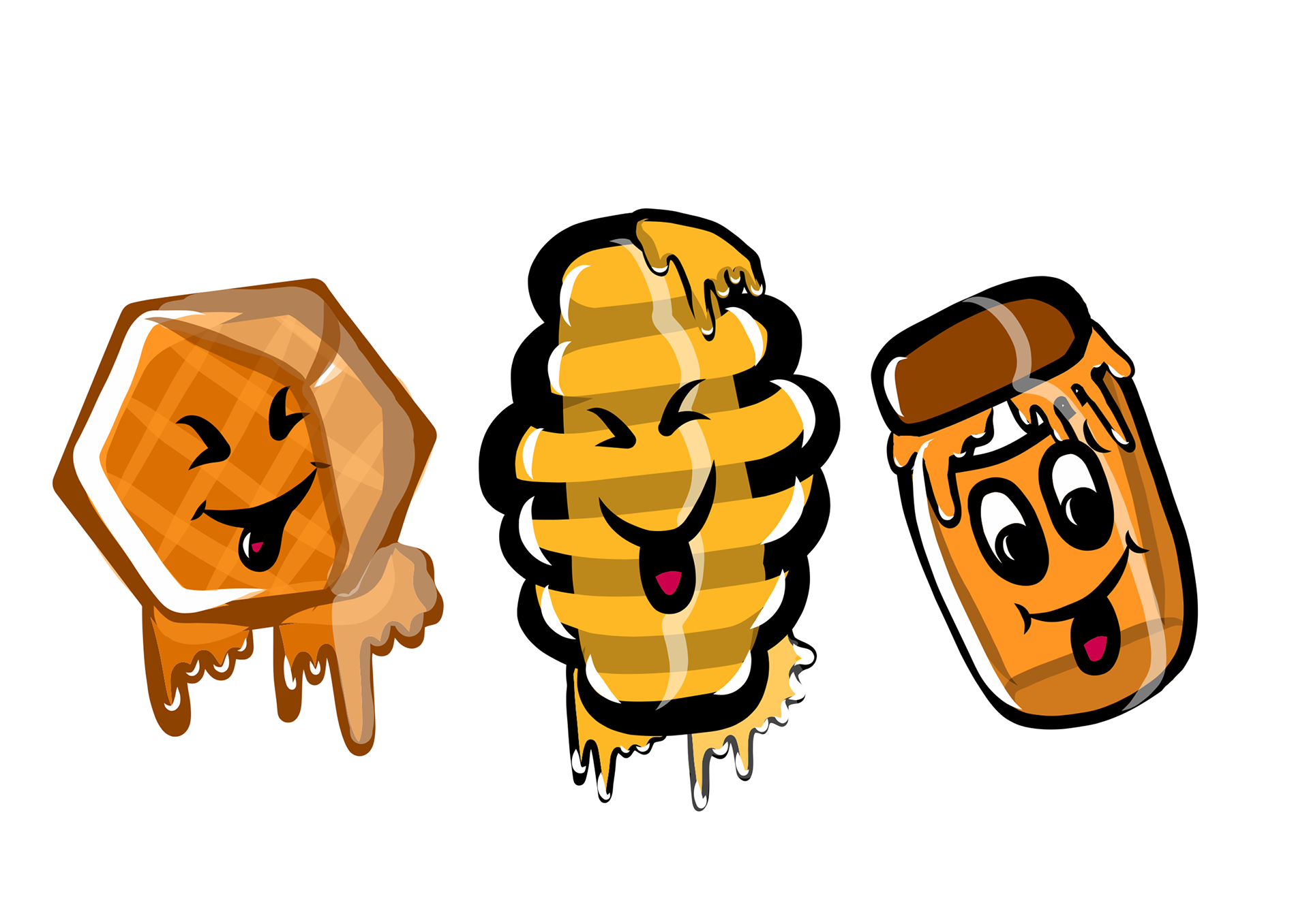
For this team project we came together to create a Product Campaign with a randomly selected Celebrity and Brand. After some research on Beyonce and Haribo, we listed some outstanding elements between the two. This included; the 'Bee Hive' fan Base of Beyonce that we could use as a promotional element for the campaign and the family-friendly identity of Haribo. We took these sweet elements and created a new Haribo product rendition: Haribe, A Honey flavoured gelatin-free sweet treat. We also thought of using one of Beyonce's existing charity sponsors 'Save the Children' which fit in with the family-friendly audience and would be much more effective for the campaign.
Brand Design Identity Logo + Aesthetic
Haribe Illustrated Design Elements: Sweet, Bee and Beyonce Mascots
Haribo Campaign website Transformation Mockup

Haribe Social Media Content Creation: Instagram, Tiktok and Twitter
Product Campaign Leaflet and Customer Incentive
Haribe Bus Advertisement Mockup
Overview:
This was a fun campaign to do and was great to work in a team, mould our ideas together and split work between us to create an all-rounded campaign. Being able to criticise our own work and making amendments was so much easier as a pair as we could see what was working and what wasn't, as we progressed and developed our ideas. We used our illustrative and Photoshop skills to make our outcomes.
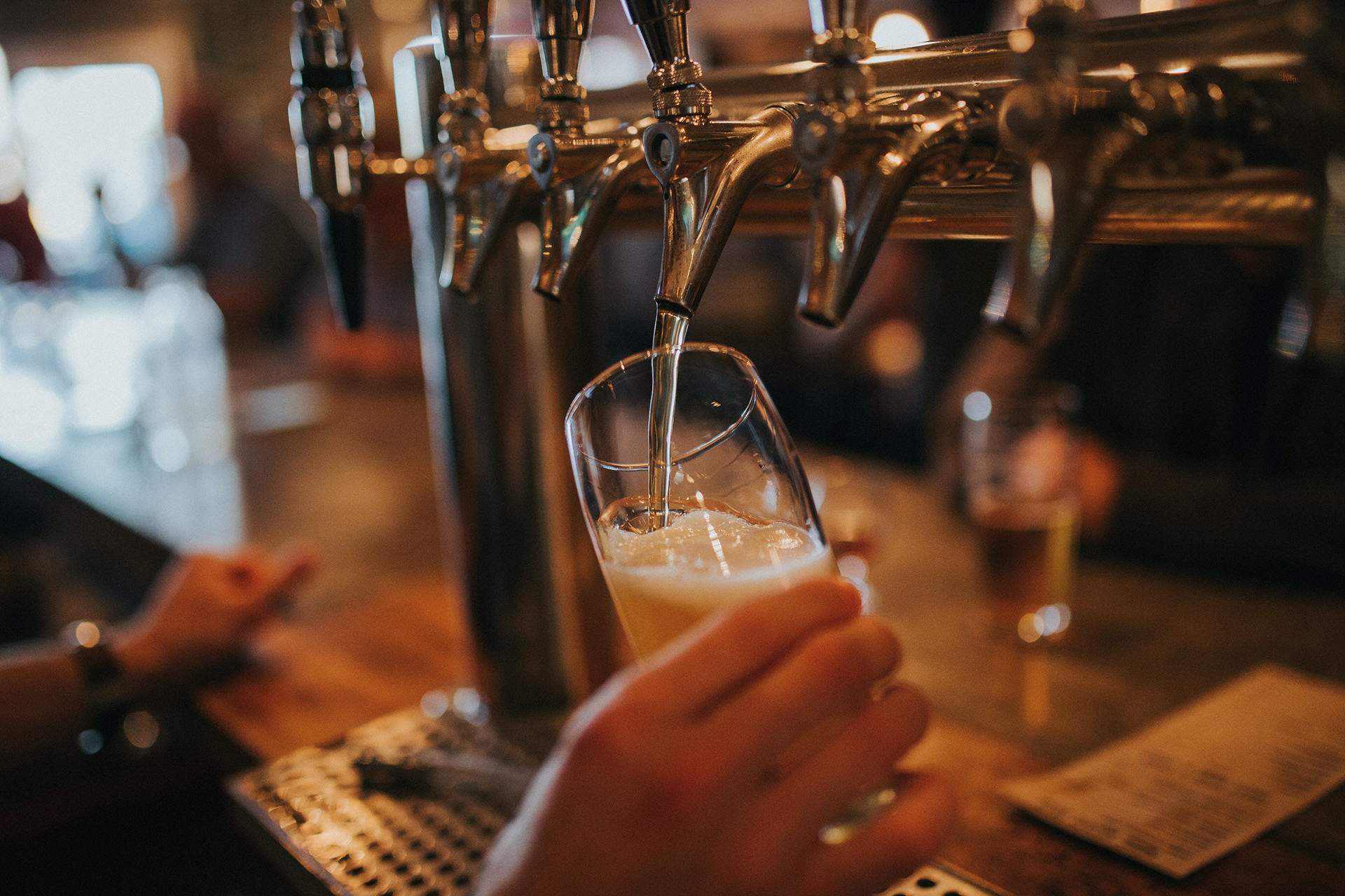
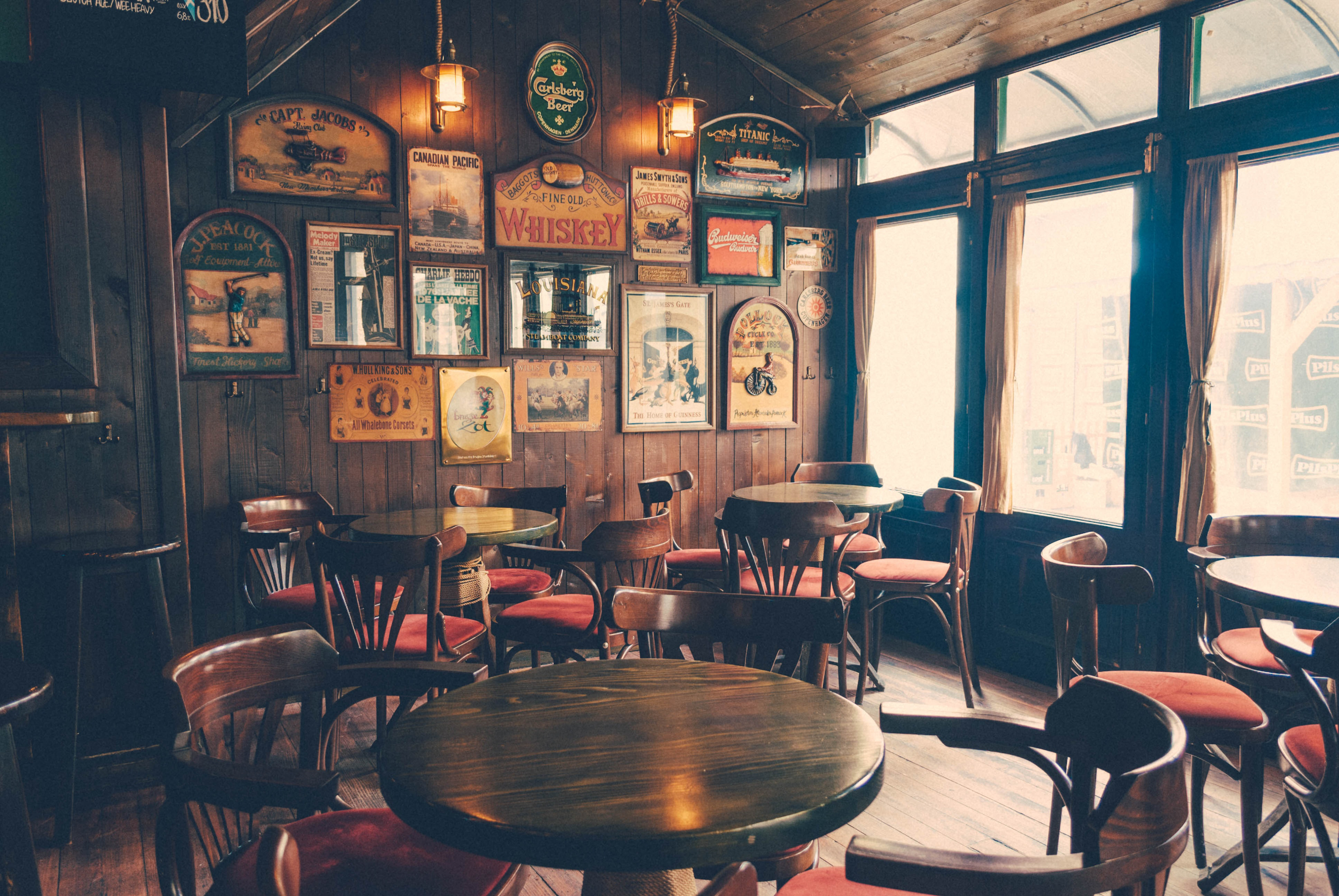
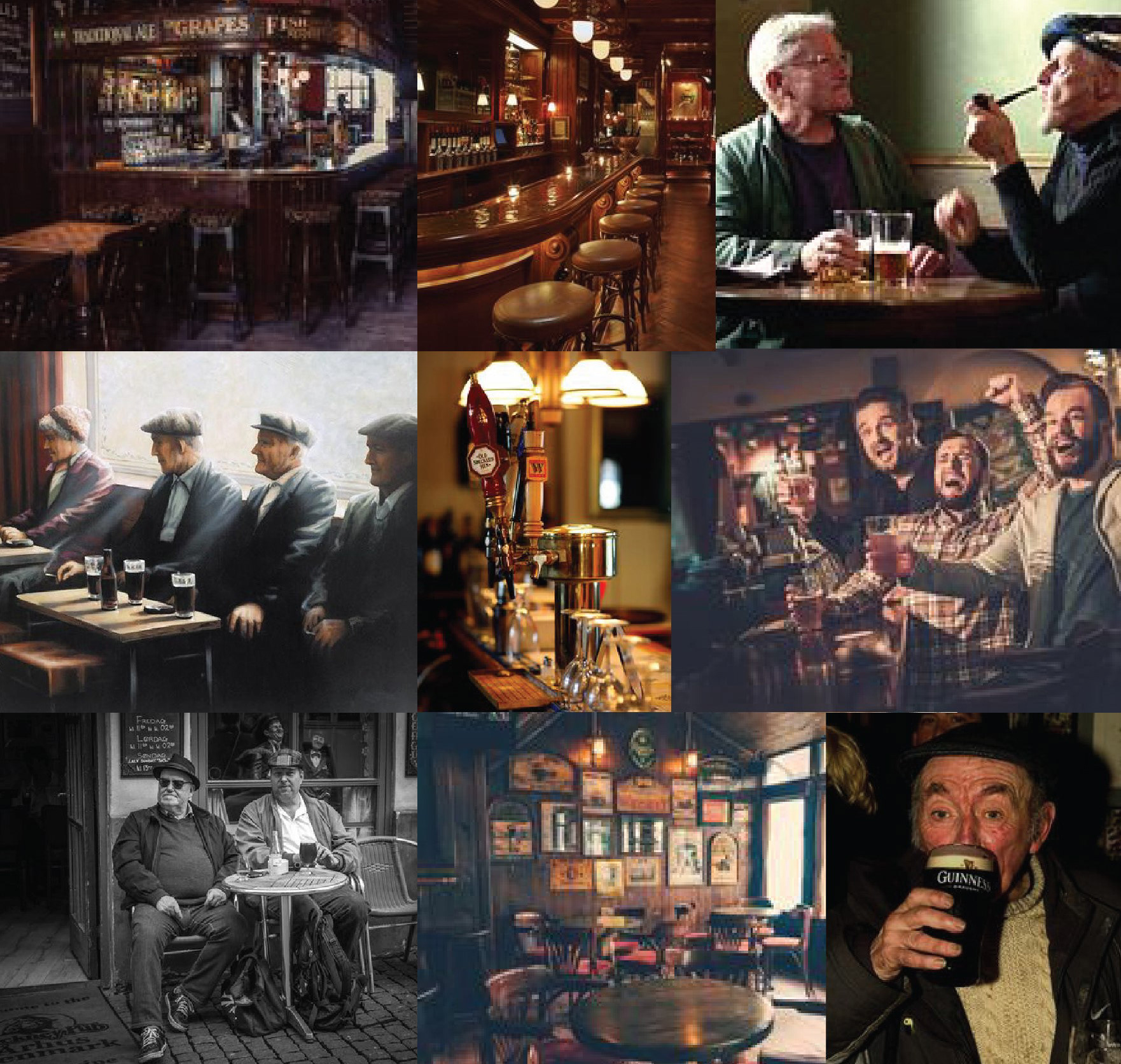
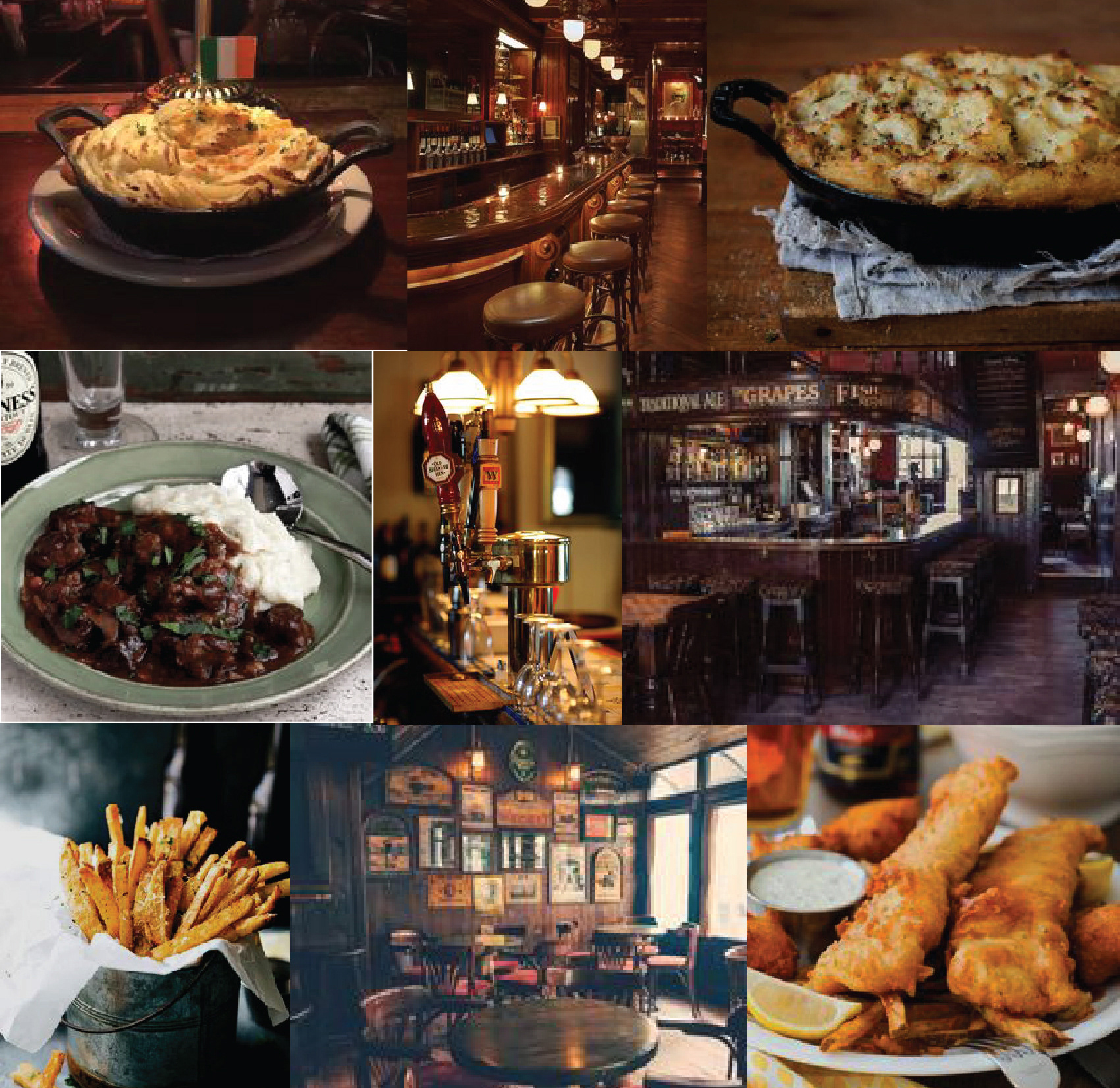
'THE COMMON CRUNCH' Product Design Campaign
Aim: to create an advertising product campaign for a pub-exclusive snack.
Insights:
For this personal project, I took this as an opportunity to practice some design that was out of my comfort zone. In an audience that was purposely masculine, pub-related and in the older age bracket I wanted to take a challenge and see what I could create with all of these elements included. In this project, I created a brand identity and a product design.
For this personal project, I took this as an opportunity to practice some design that was out of my comfort zone. In an audience that was purposely masculine, pub-related and in the older age bracket I wanted to take a challenge and see what I could create with all of these elements included. In this project, I created a brand identity and a product design.
Typography and icon Logo

Product Flavour Posters
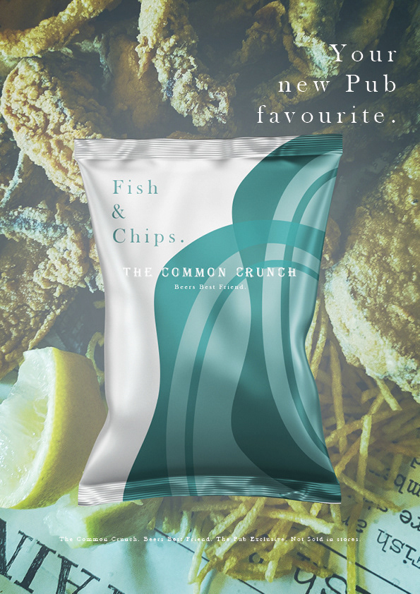
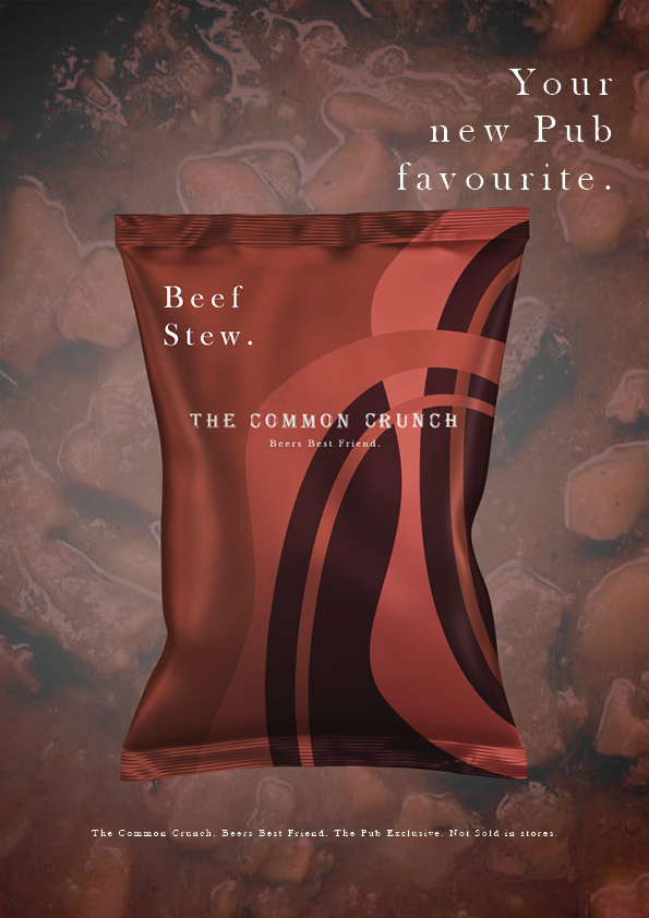
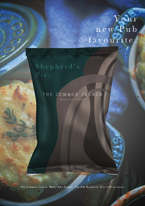
Product Mockups
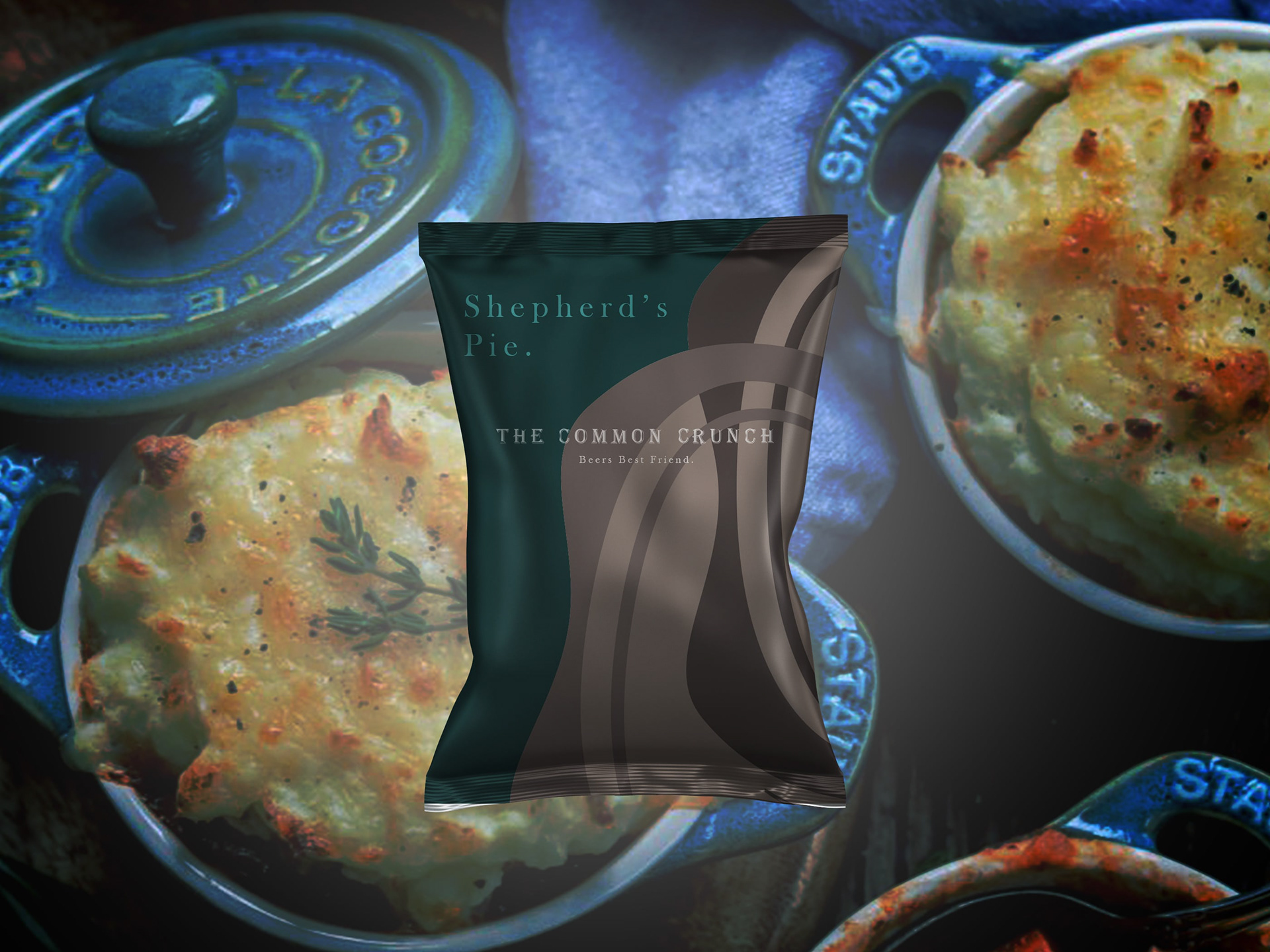
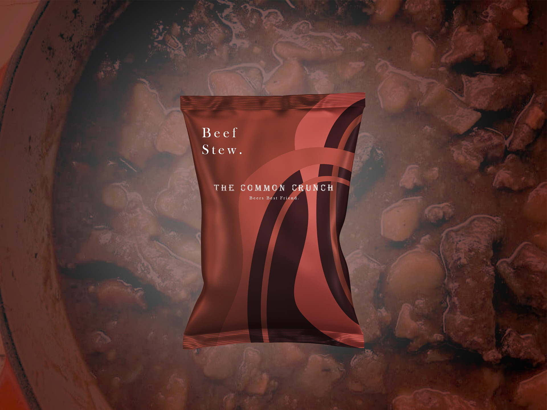
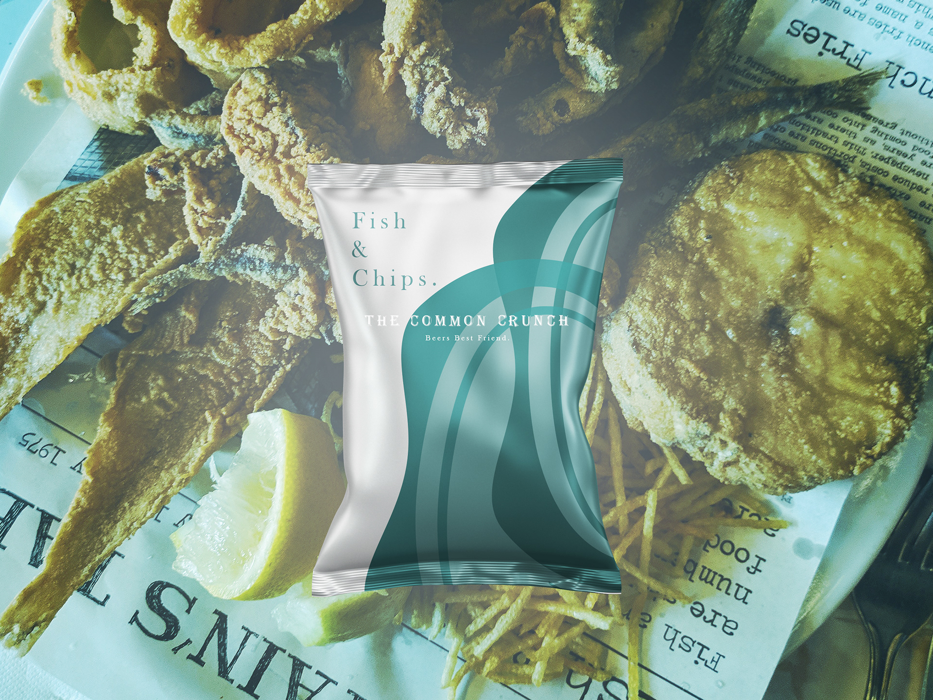
Product Colour Variations and Exterior Design Image

Brand Aesthetic
The Common Crunch Advertisement
Overview:
I enjoyed the project process of first creating the brand copy, name and logo and using my research and the pub aesthetic mood boards to help drive the product colours and look. I felt all the final elements were successful and can always be added to. After this, I look forward to creating more product design work.
I enjoyed the project process of first creating the brand copy, name and logo and using my research and the pub aesthetic mood boards to help drive the product colours and look. I felt all the final elements were successful and can always be added to. After this, I look forward to creating more product design work.
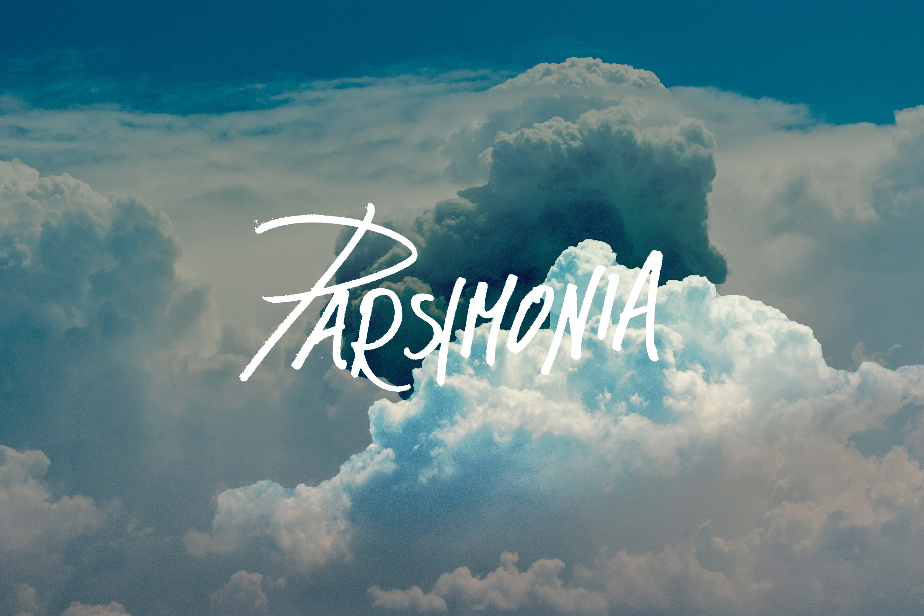
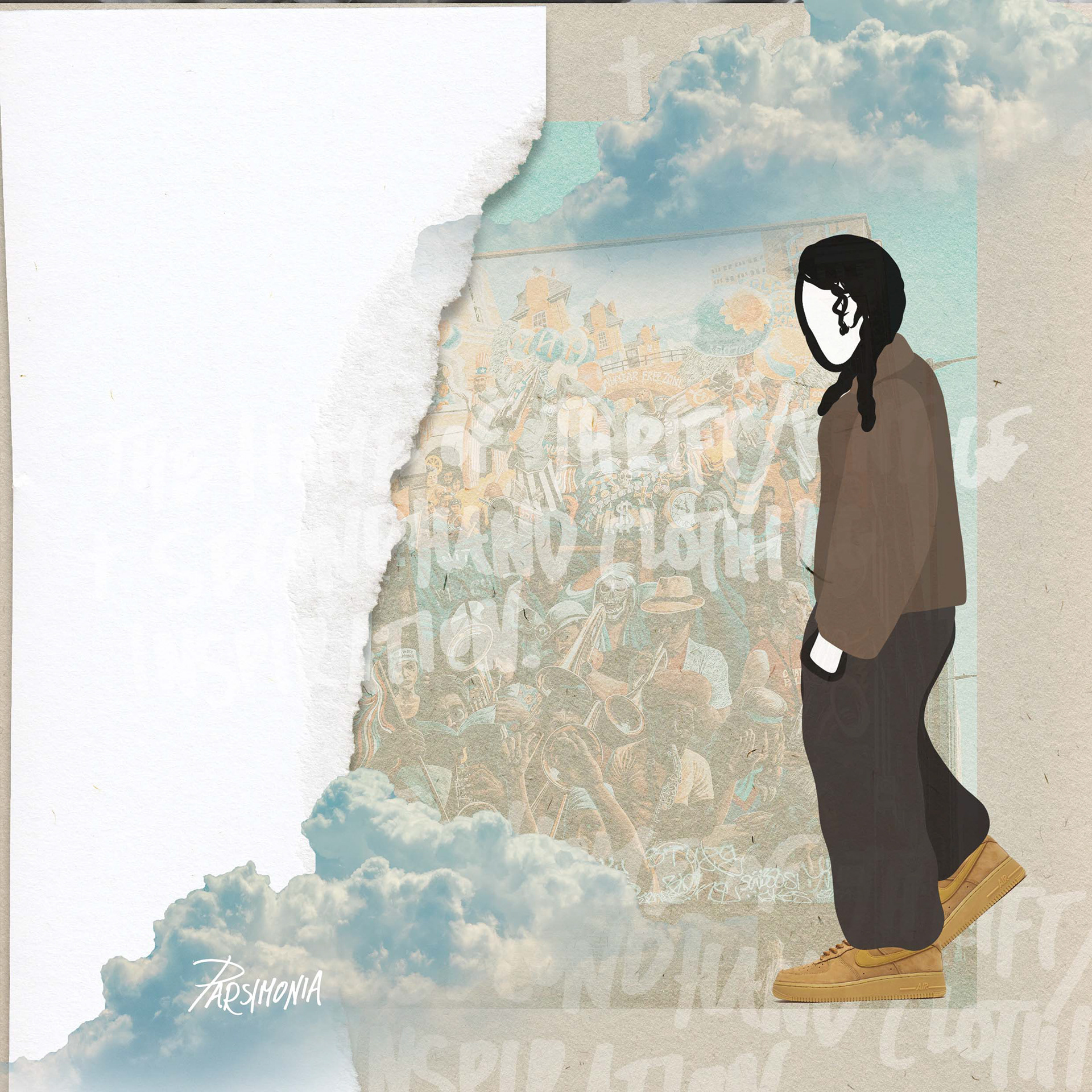
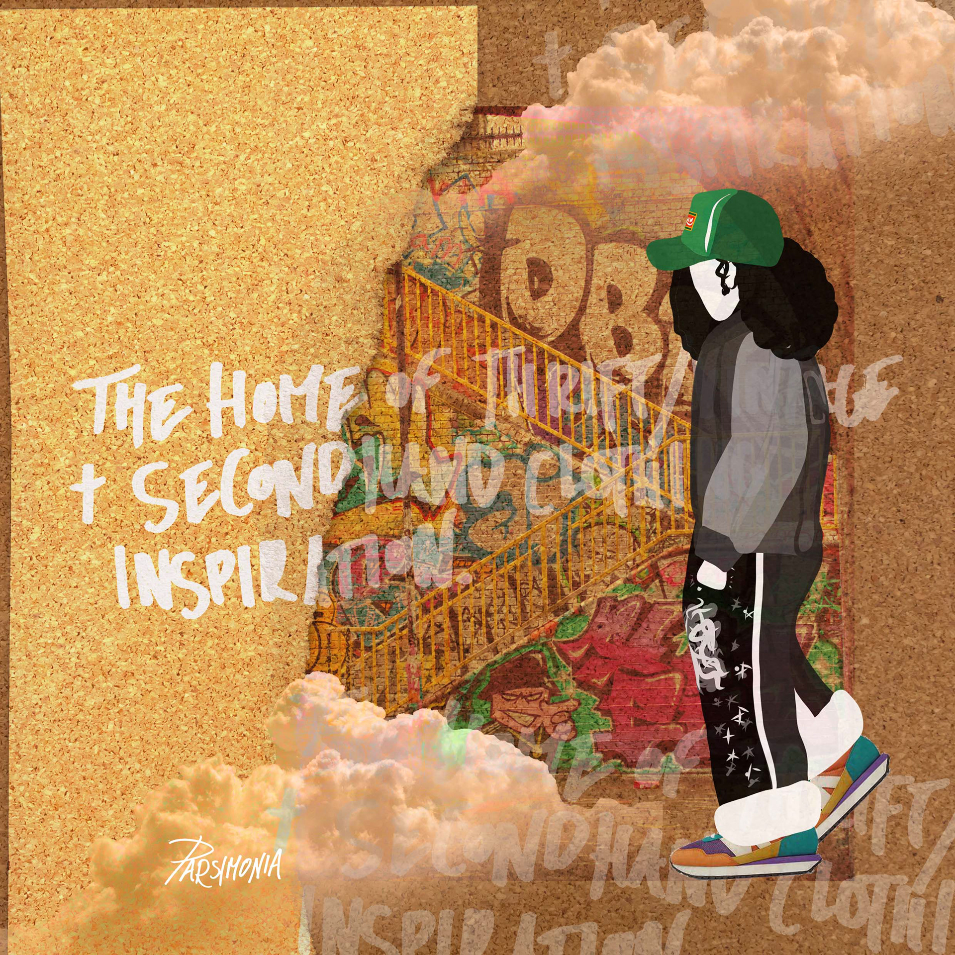
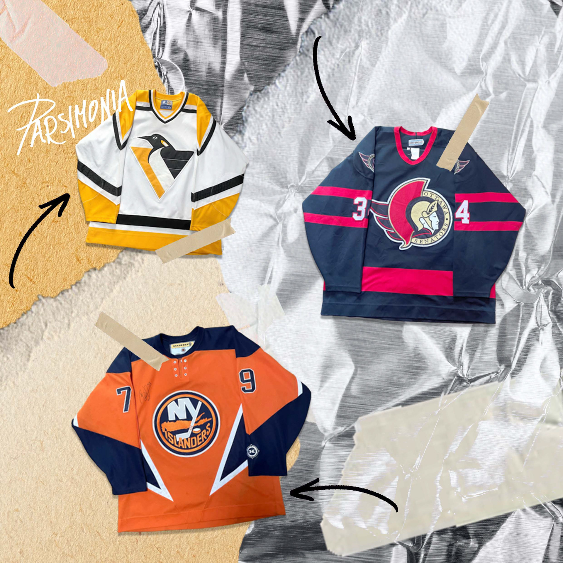
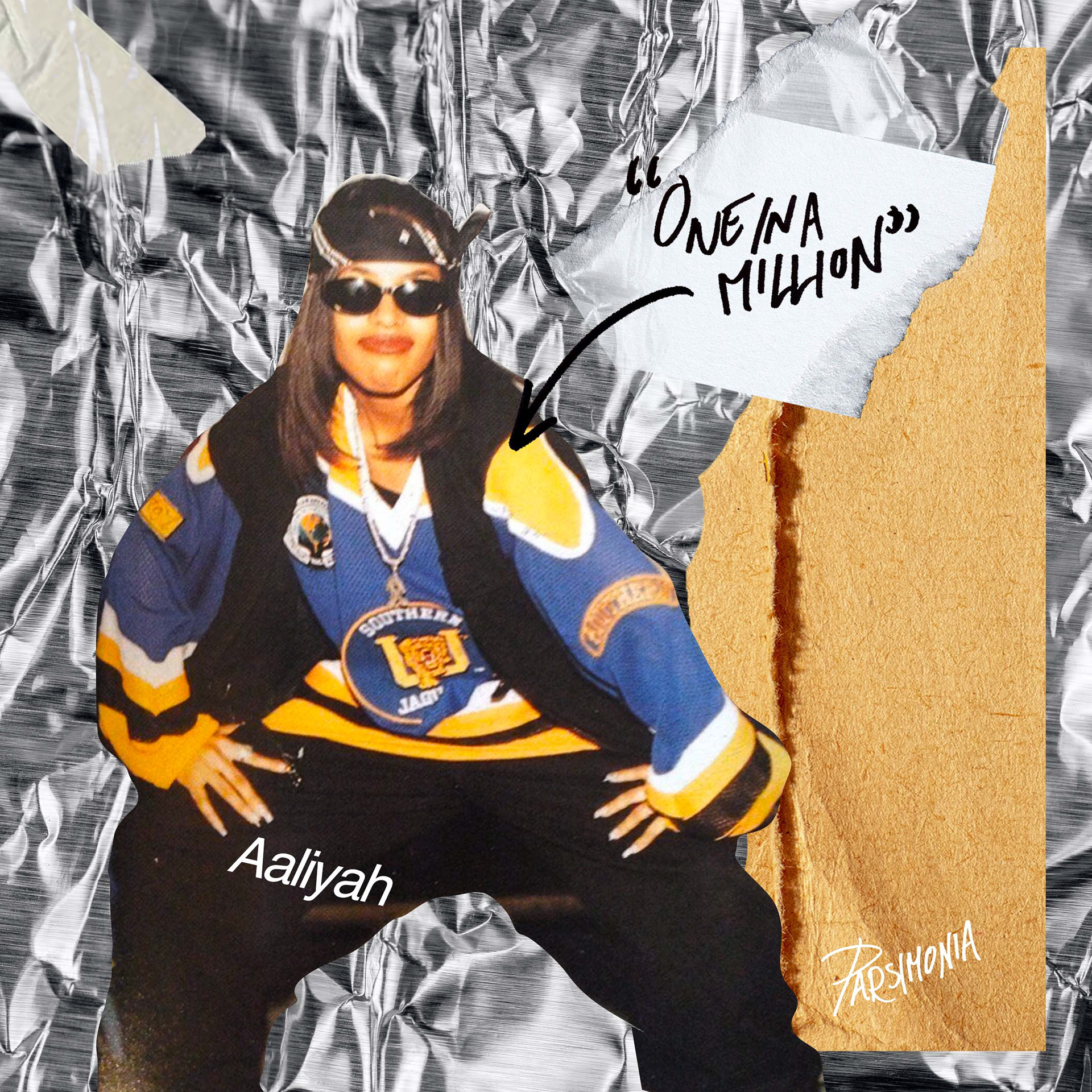
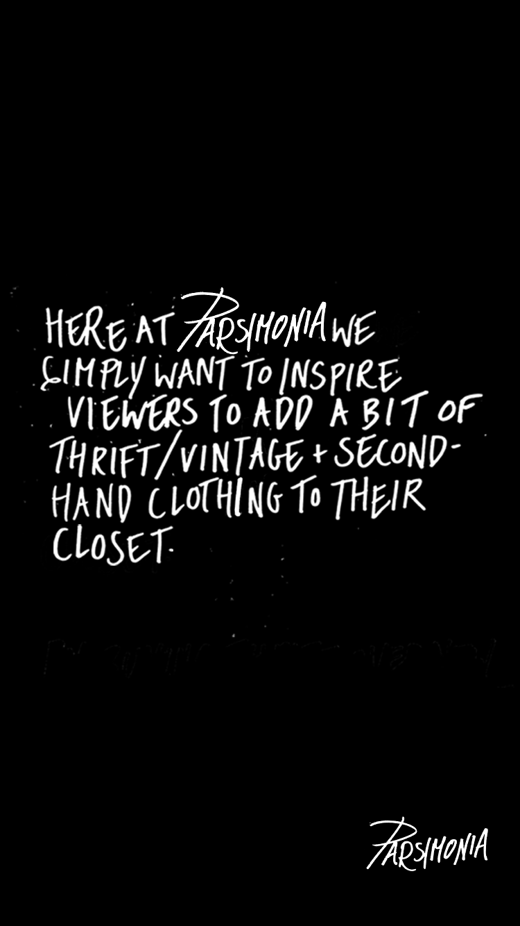
'PARSIMONIA' Content Creation Campaign
Aim:
To create a social-media content creation campaign, inspired by an item of clothing.
To create a social-media content creation campaign, inspired by an item of clothing.
Insight:
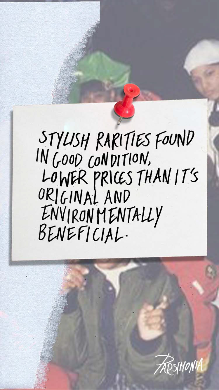
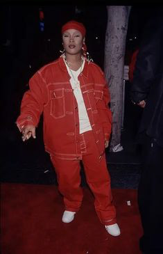
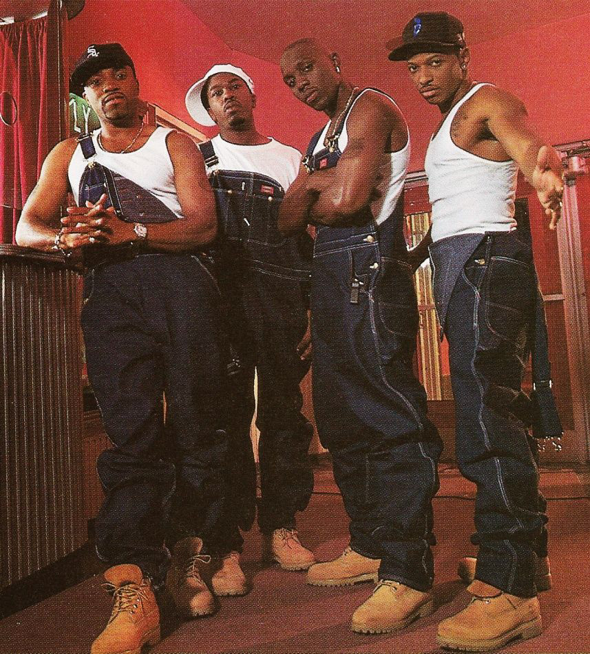
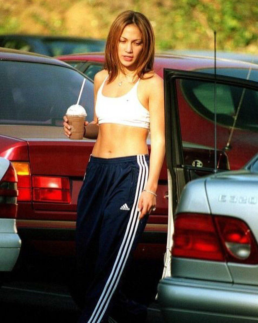
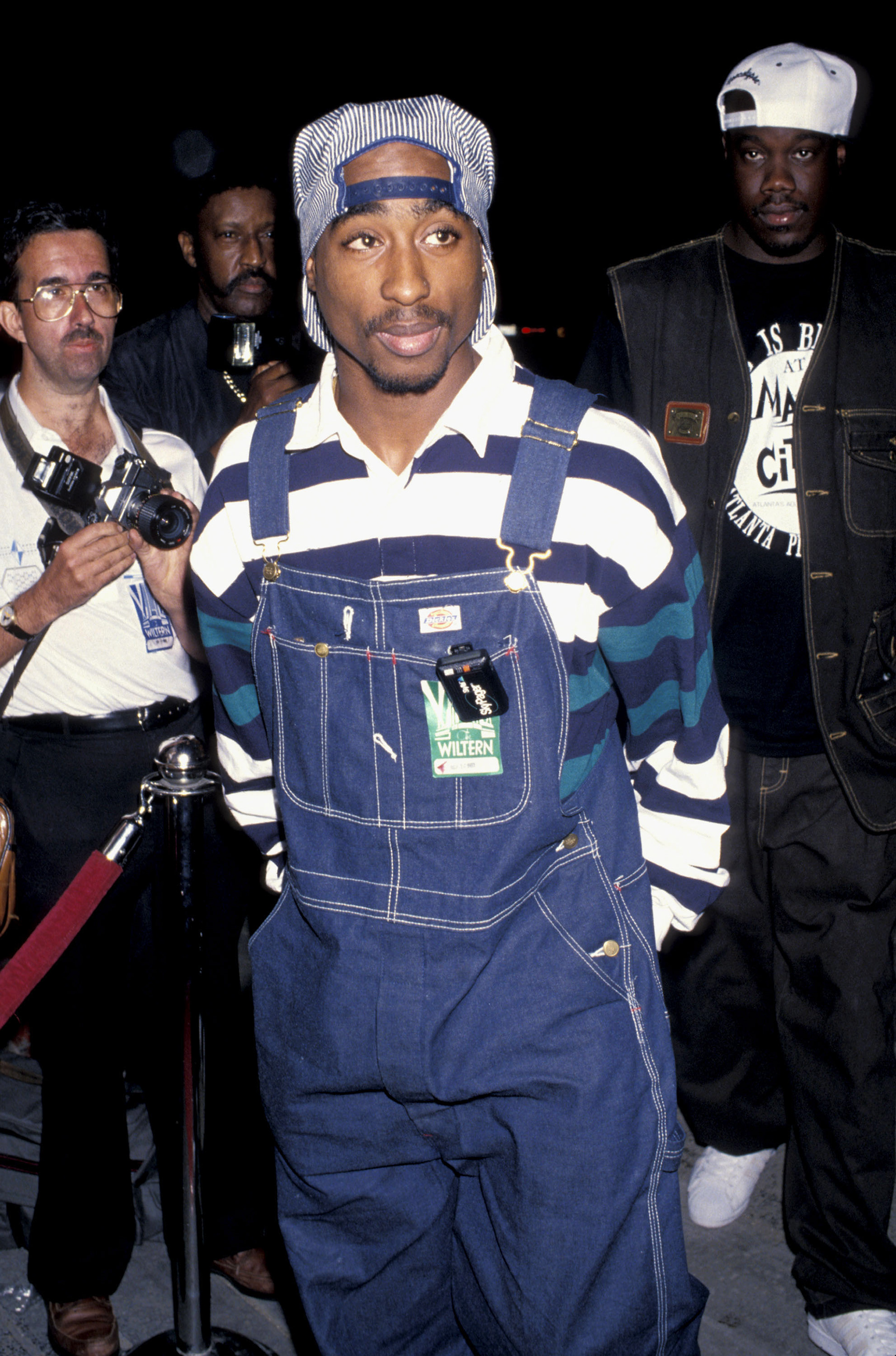
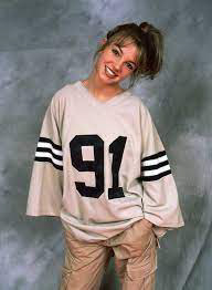
On a previous family trip to downtown Atlanta, Georgia I purchased my first thrift-clothing item a yellow FUBU jersey. This is a staple piece of mine so I decided to use it for this project. I decided to promote purchasing thrift and second-hand clothing over fast fashion. One that helps the environment but also draws viewers in, with clothing inspirations and look-books. As streetwear thrift is a favourite of mine I used a lot of 90s hip-hop artists for reference.
On a previous family trip to downtown Atlanta, Georgia I purchased my first thrift-clothing item a yellow FUBU jersey. This is a staple piece of mine so I decided to use it for this project. I decided to promote purchasing thrift and second-hand clothing over fast fashion. One that helps the environment but also draws viewers in, with clothing inspirations and look-books. As streetwear thrift is a favourite of mine I used a lot of 90s hip-hop artists for reference.
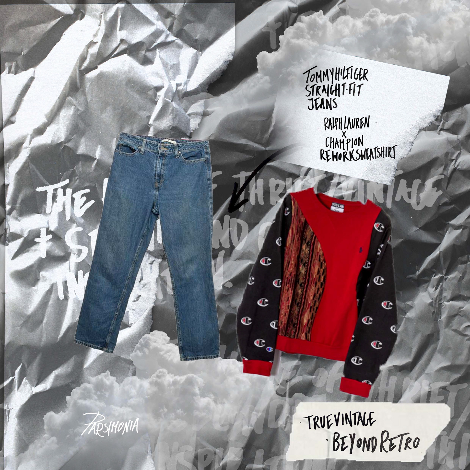
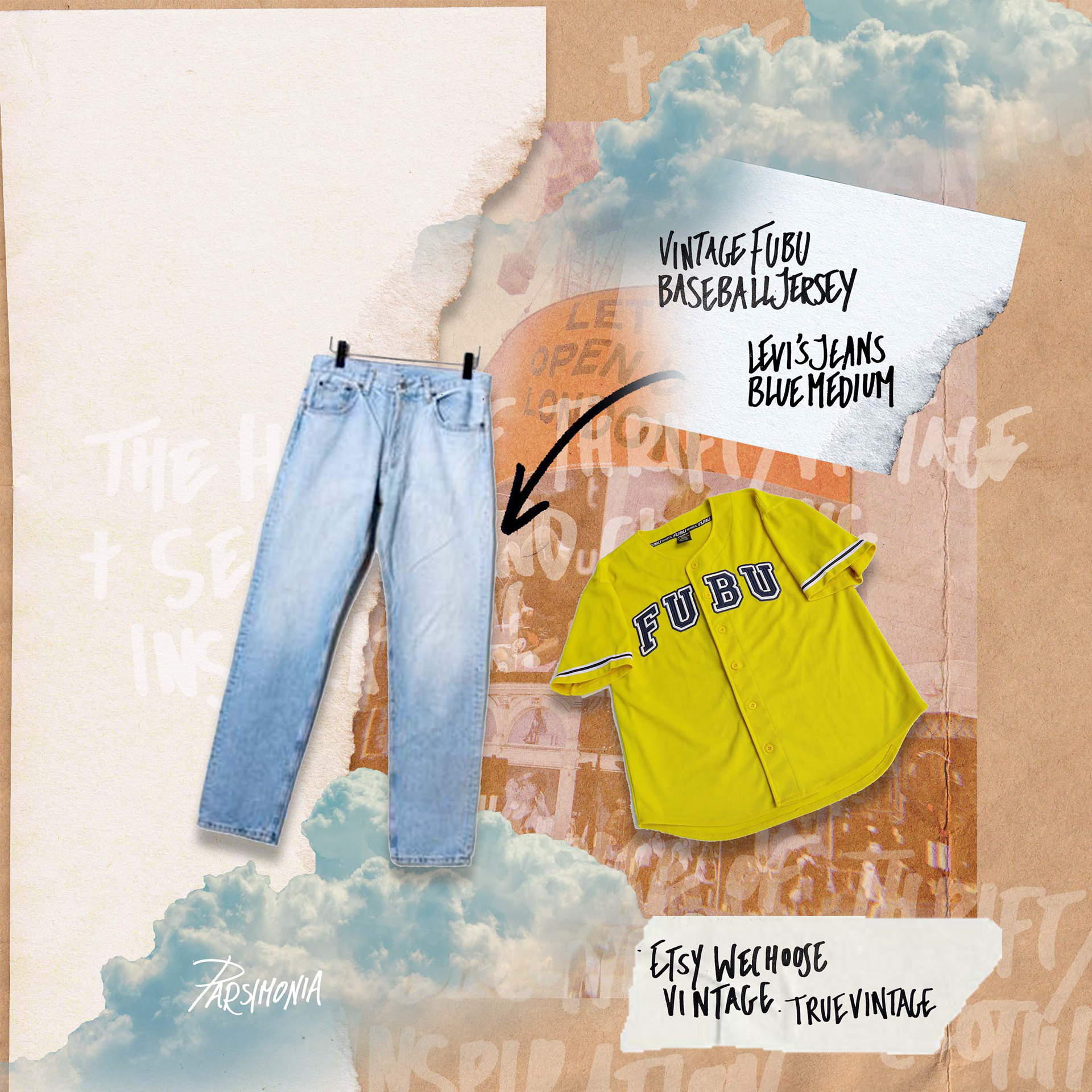
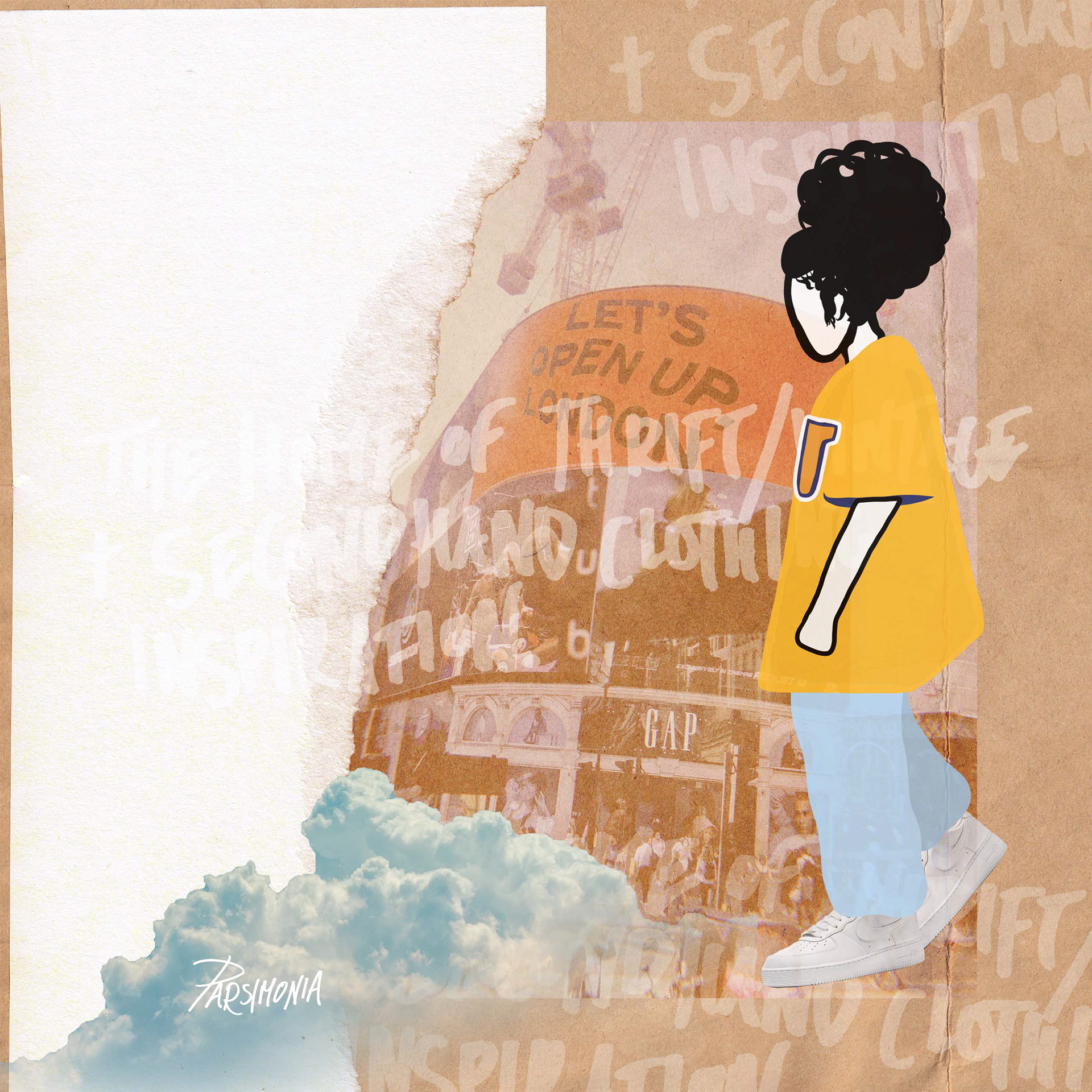
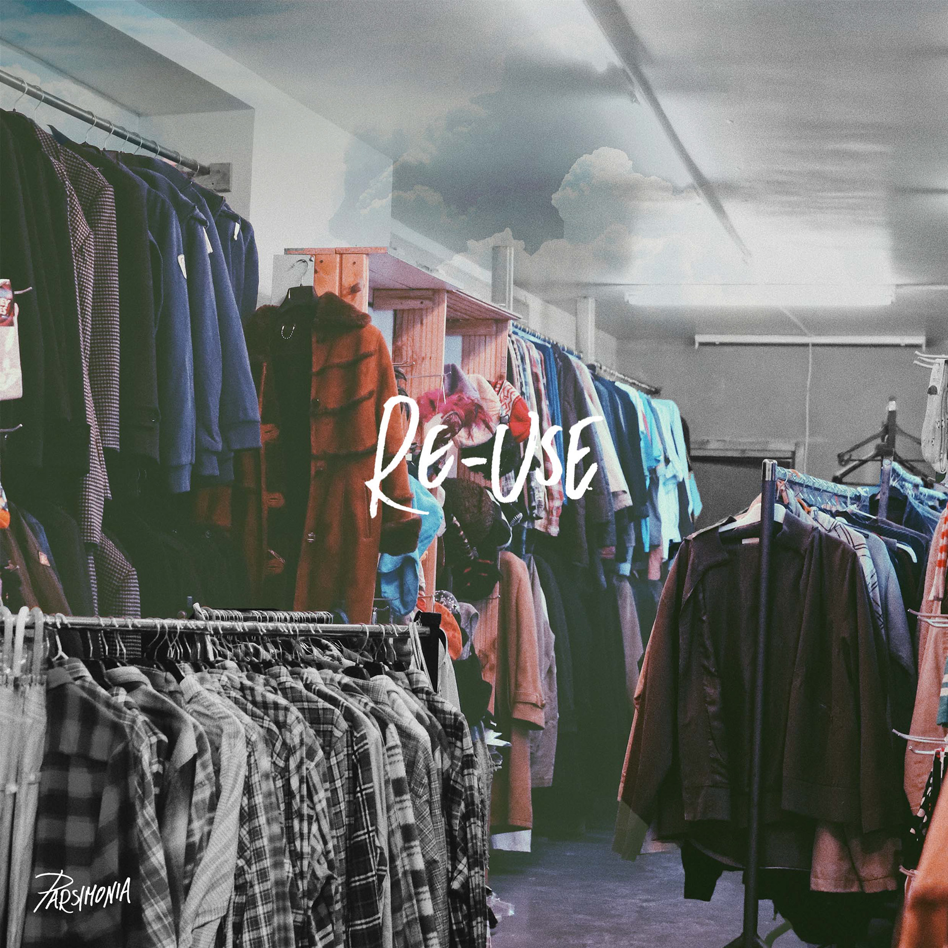
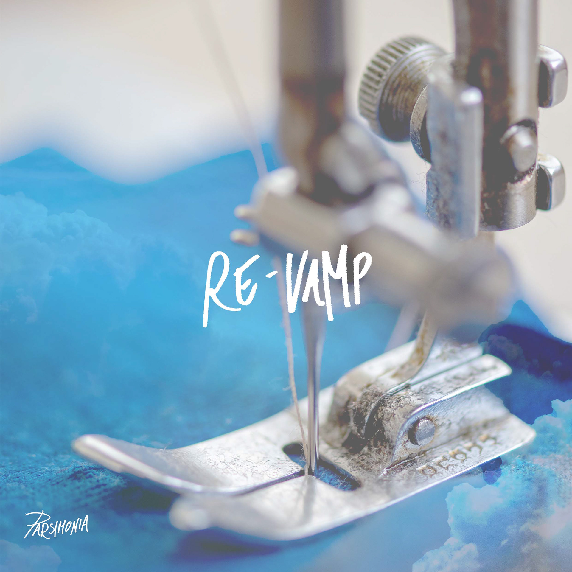
Logo and Brand Image
Instagram Style-inspiration Posts
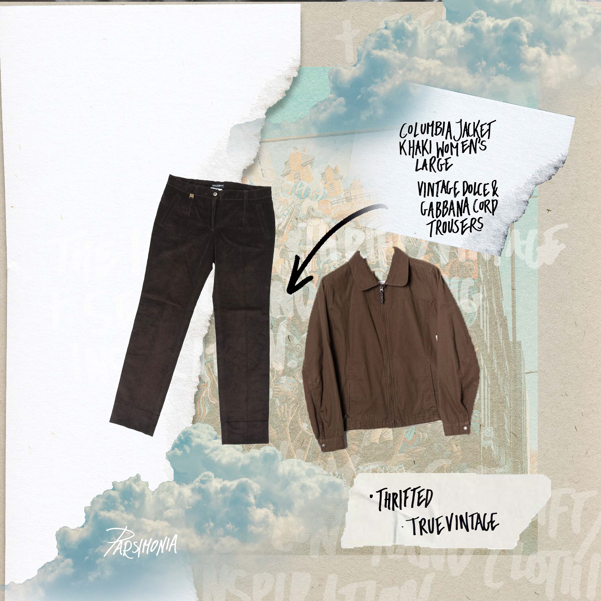
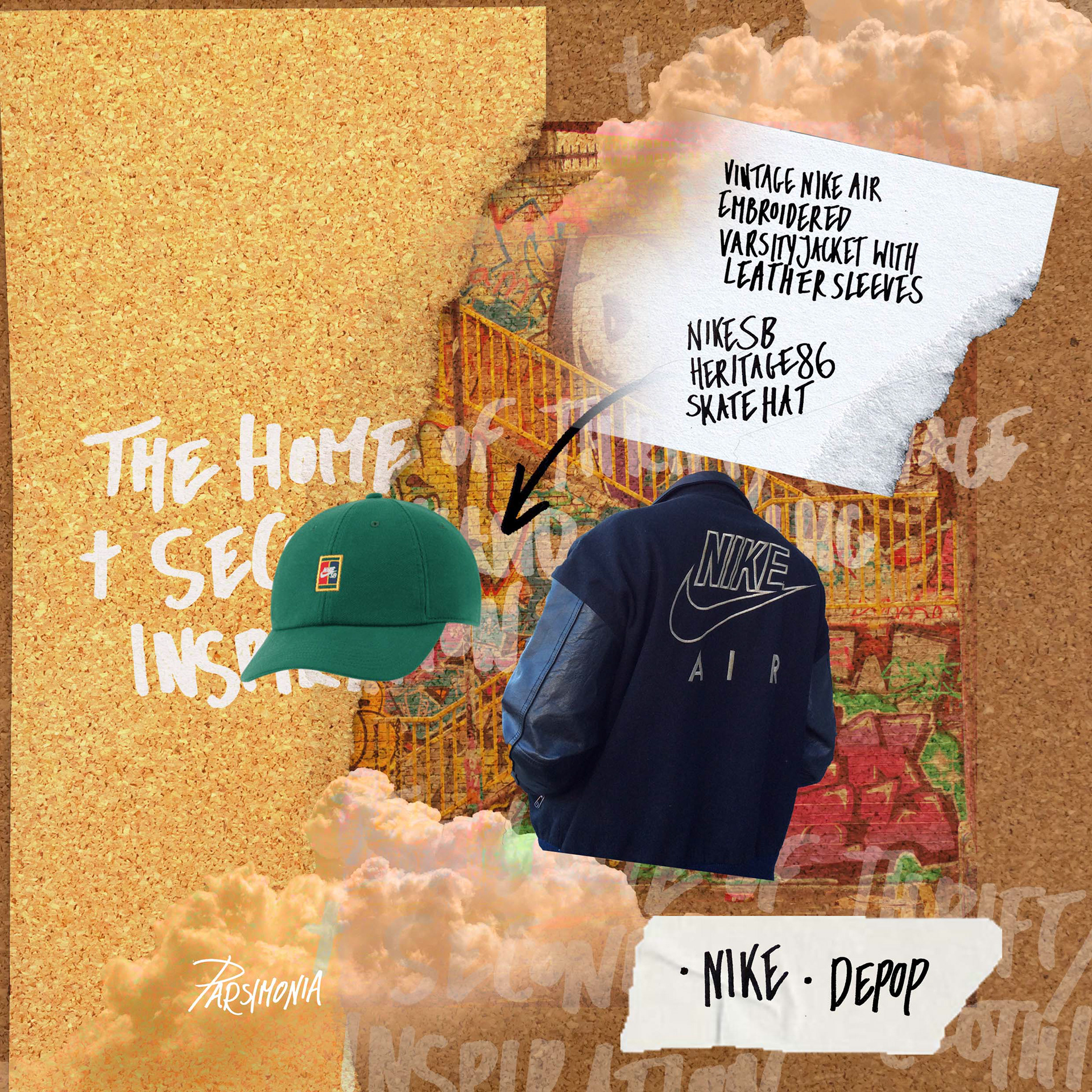
Instagram Illustrated Style-Inspiration Post Variations
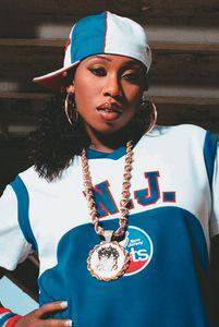
Instagram Celebrity Style-Inspiration Posts: Aaliyah
Instagram Parsimonia Visualiser
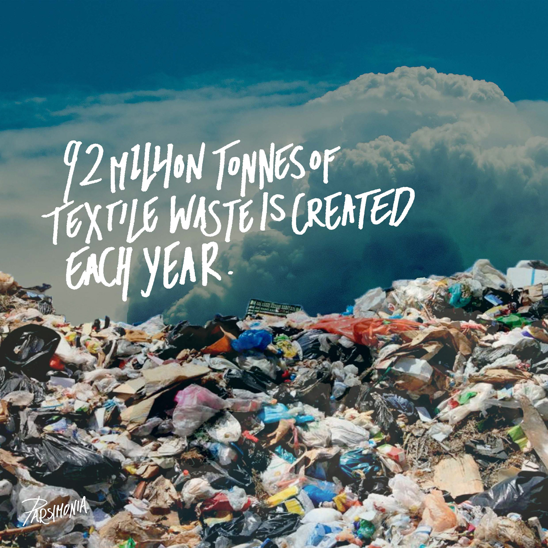
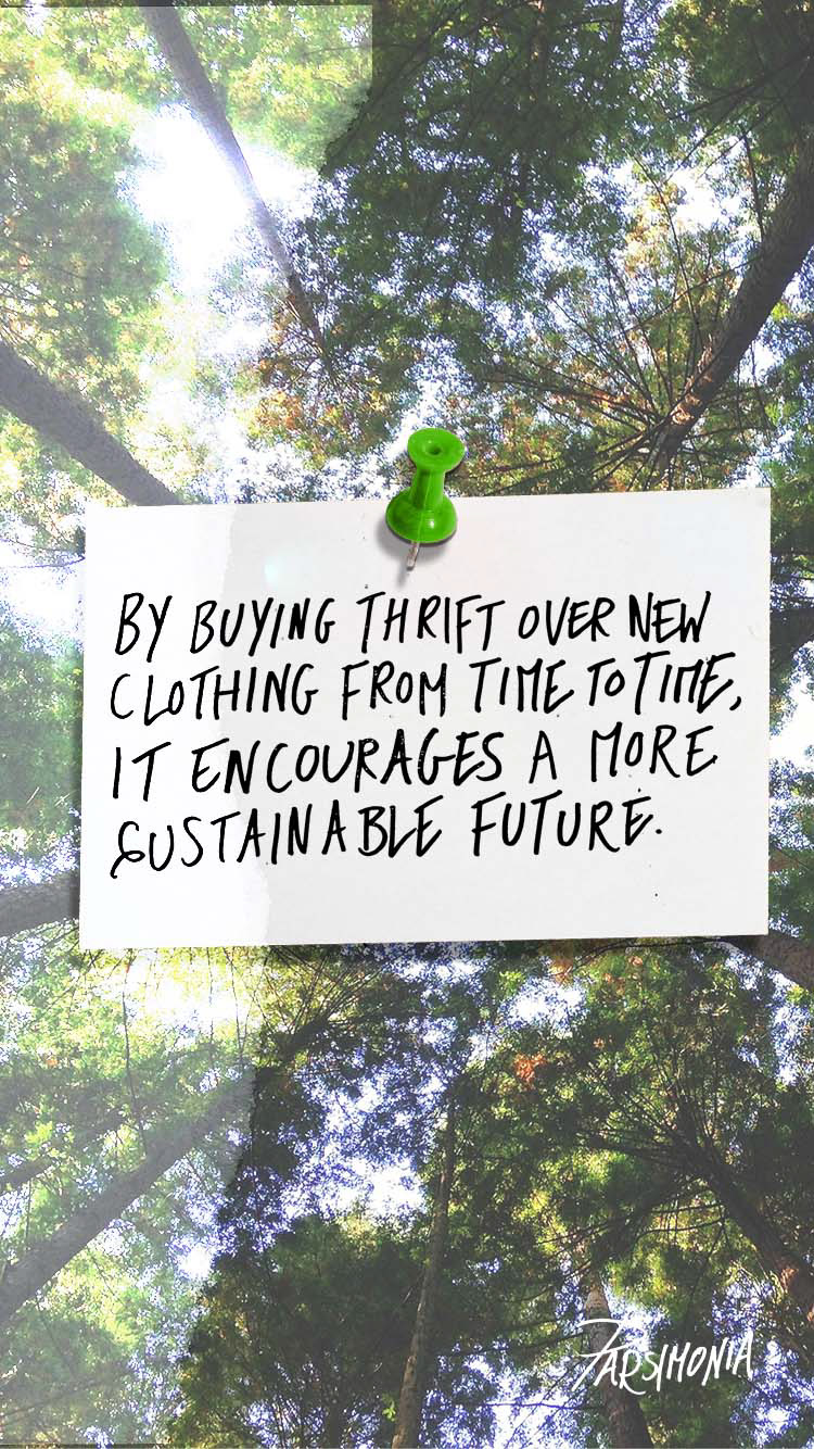
Instagram Parsimonia Factual Copy
Instagram Stories: 'Find out more'
Instagram Stories: Story Covers
Tiktok Parsimonia Videos: Style Guides and Thrift Shops
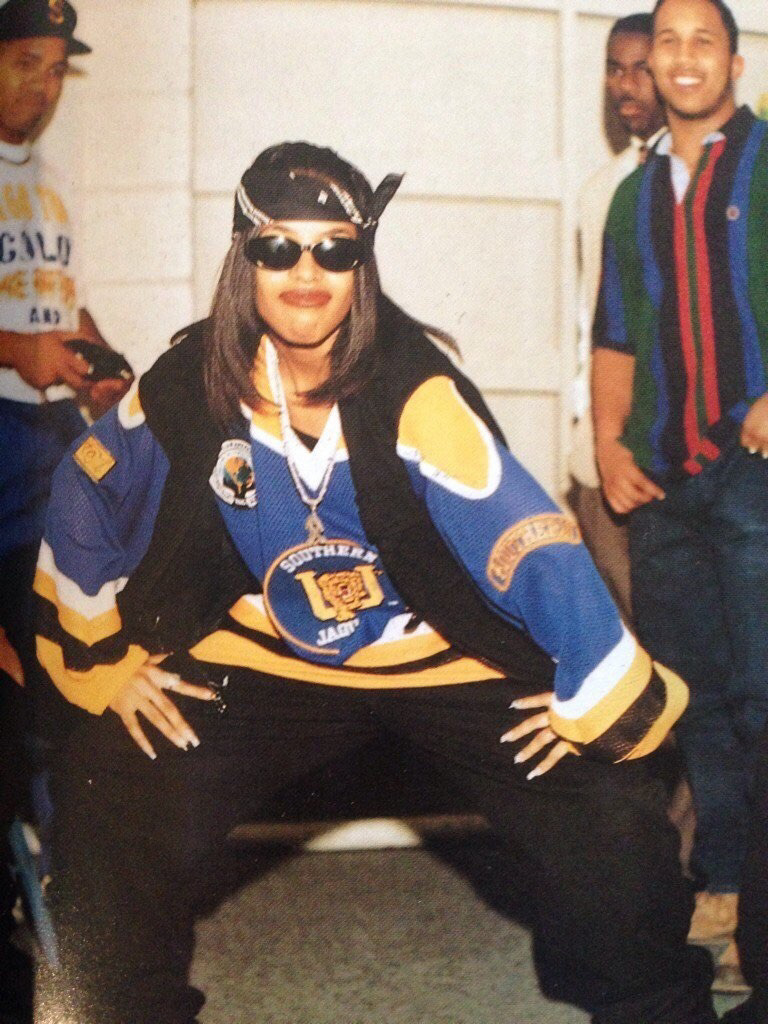
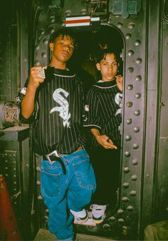
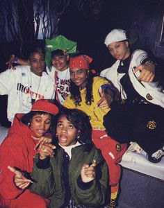
90s Hiphop Streetwear Aesthetic
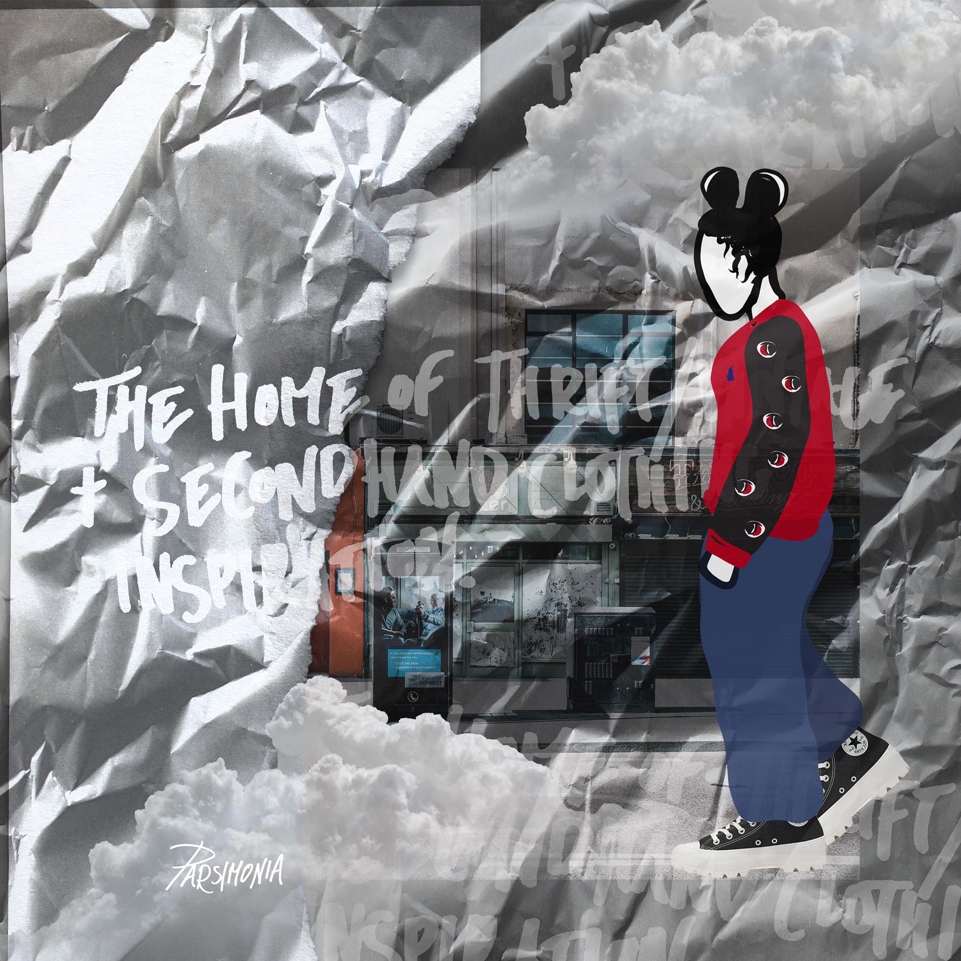
Parsimonia Brand Visualiser
Overview:
This project helped me to learn more about how social media analytics work along with the use of hashtags and music, on both Instagram and TikTok. As I have an Instagram art account of my own, this was a good insight into what more I could do to boost my reach on the media. It would be good to also think of more social platforms that this campaign could fit on and what parts I could highlight.
This project helped me to learn more about how social media analytics work along with the use of hashtags and music, on both Instagram and TikTok. As I have an Instagram art account of my own, this was a good insight into what more I could do to boost my reach on the media. It would be good to also think of more social platforms that this campaign could fit on and what parts I could highlight.
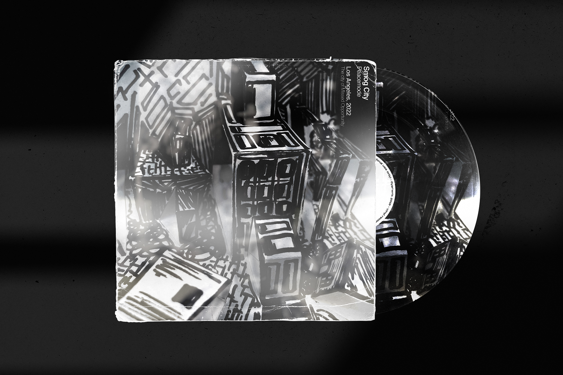
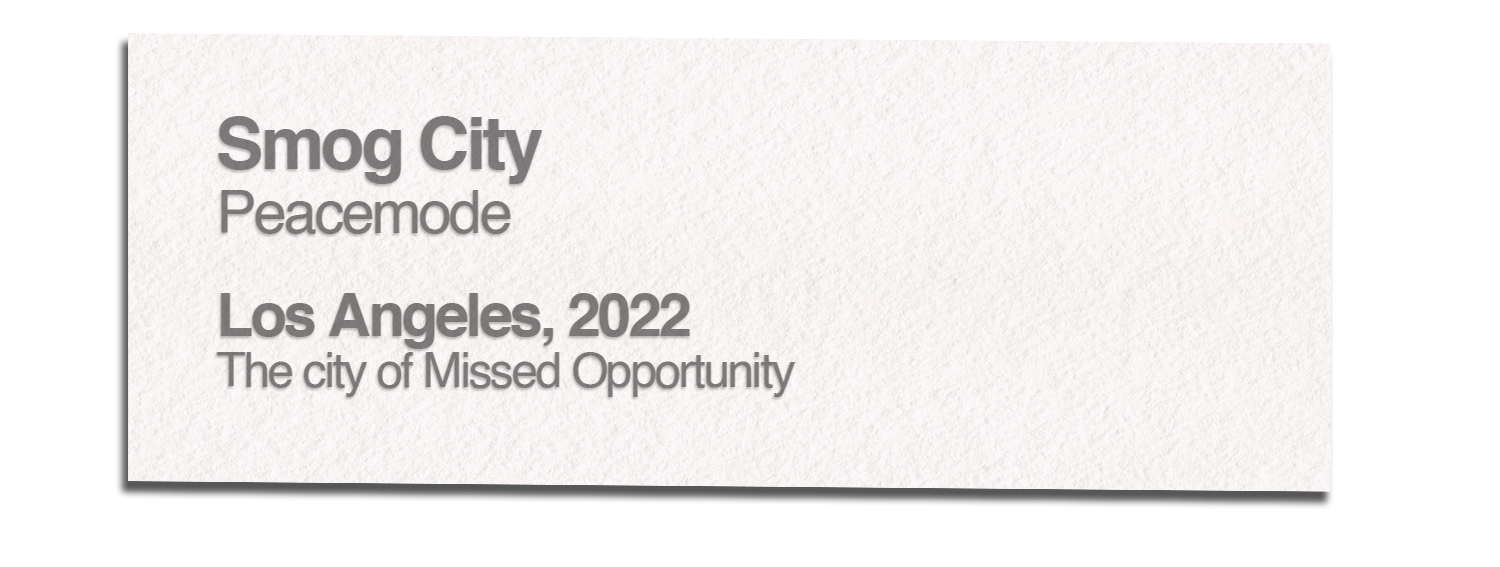
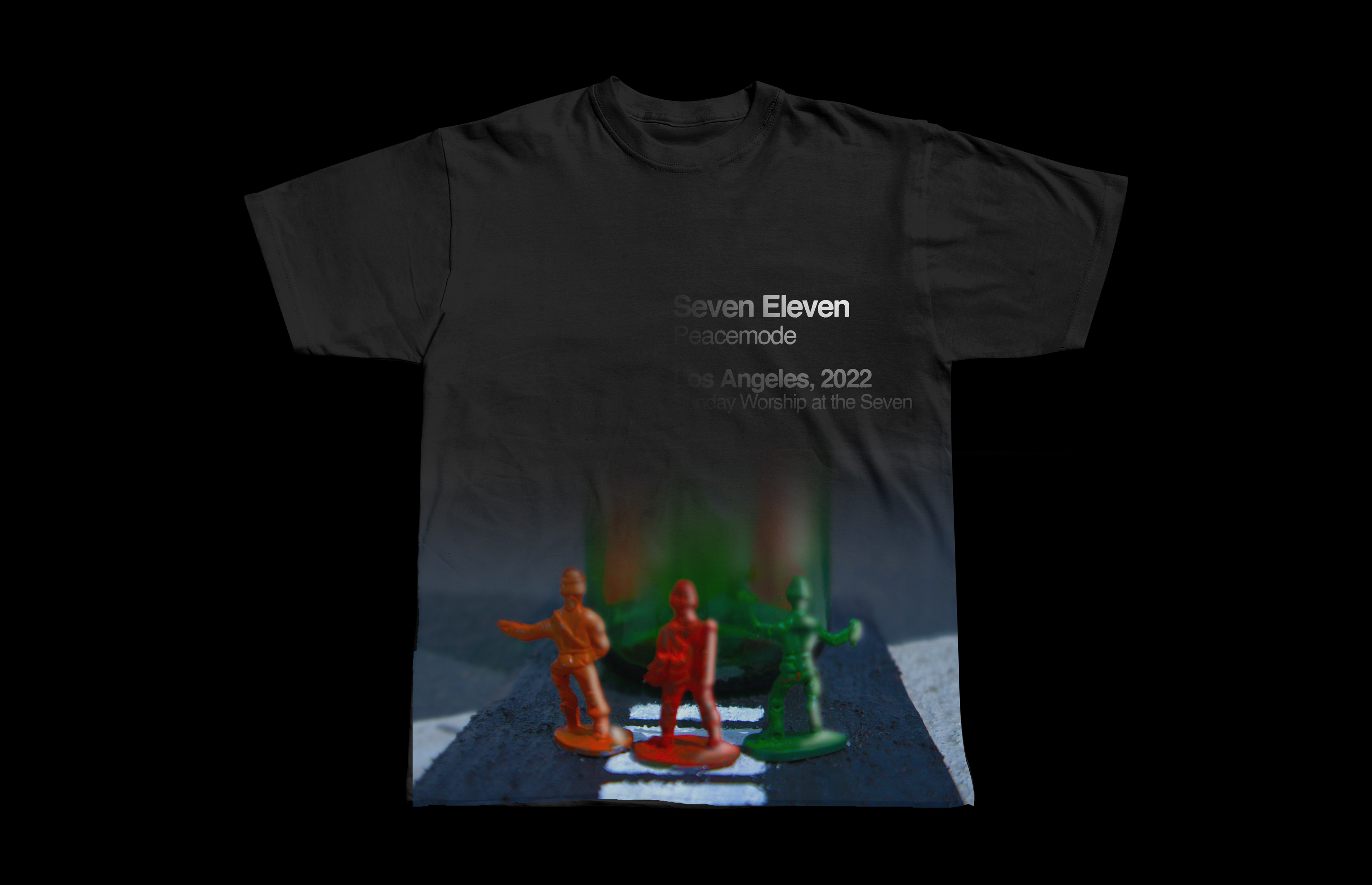
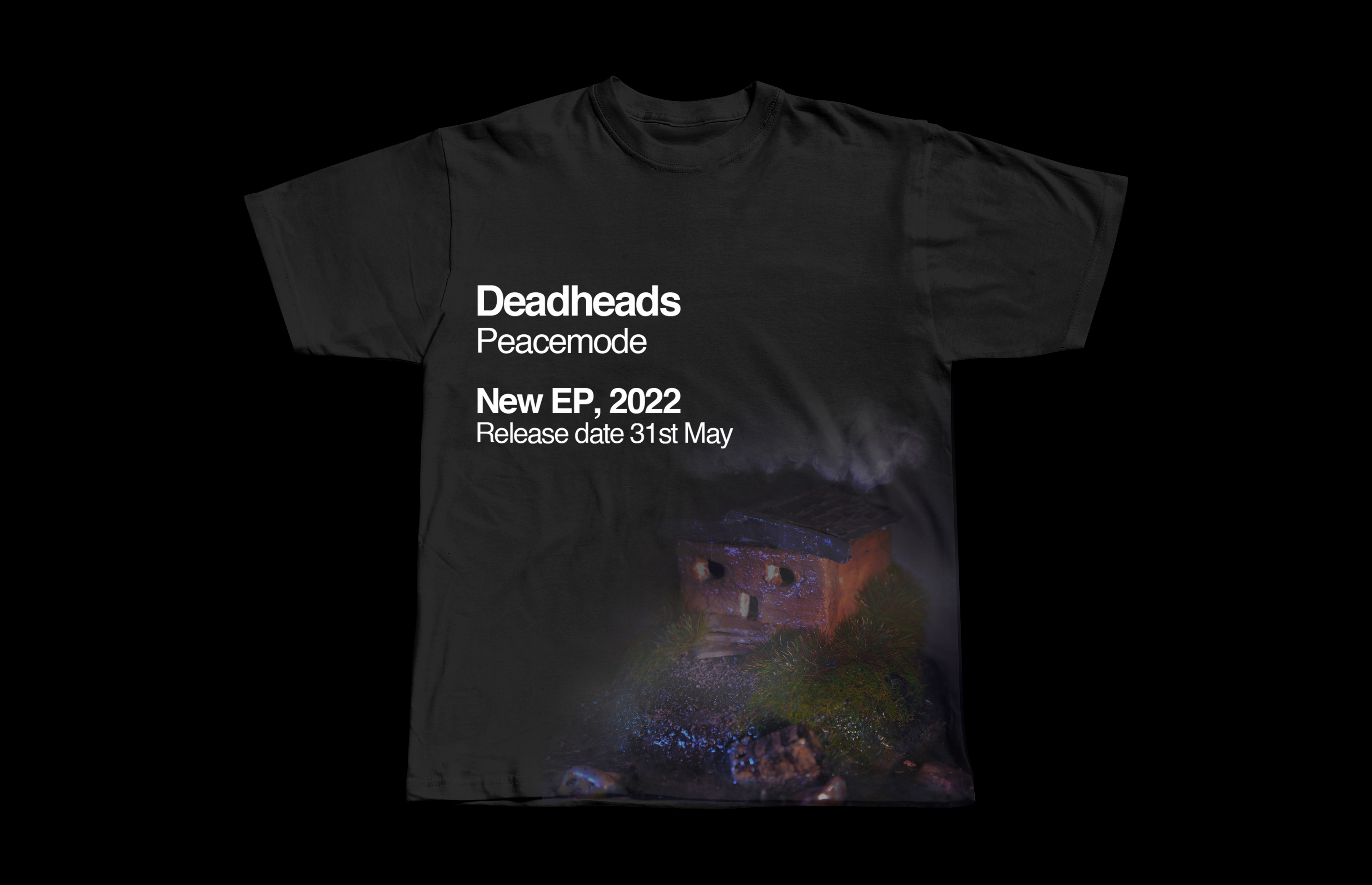
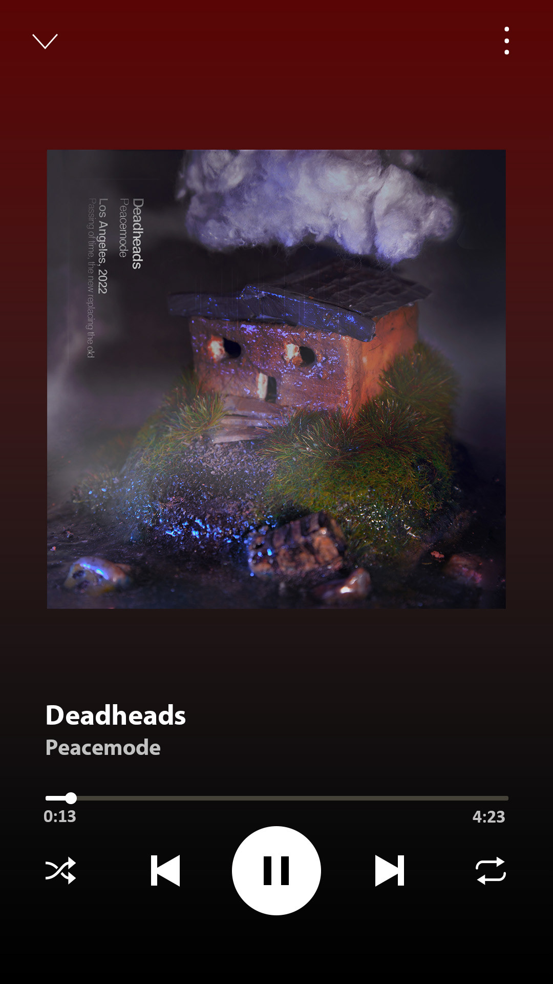
EP Cover + Singles Concept for PEACEMODE BAND
Aim:
To create an EP cover and three single sleeves for the up-and-coming band Peacemode.
To create an EP cover and three single sleeves for the up-and-coming band Peacemode.
Insight:
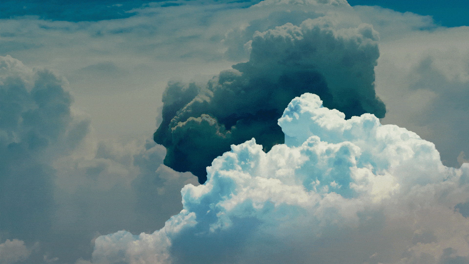
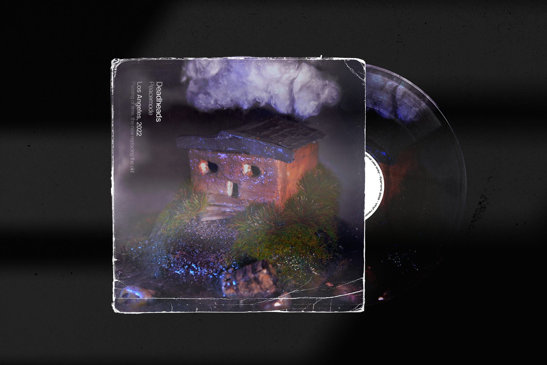
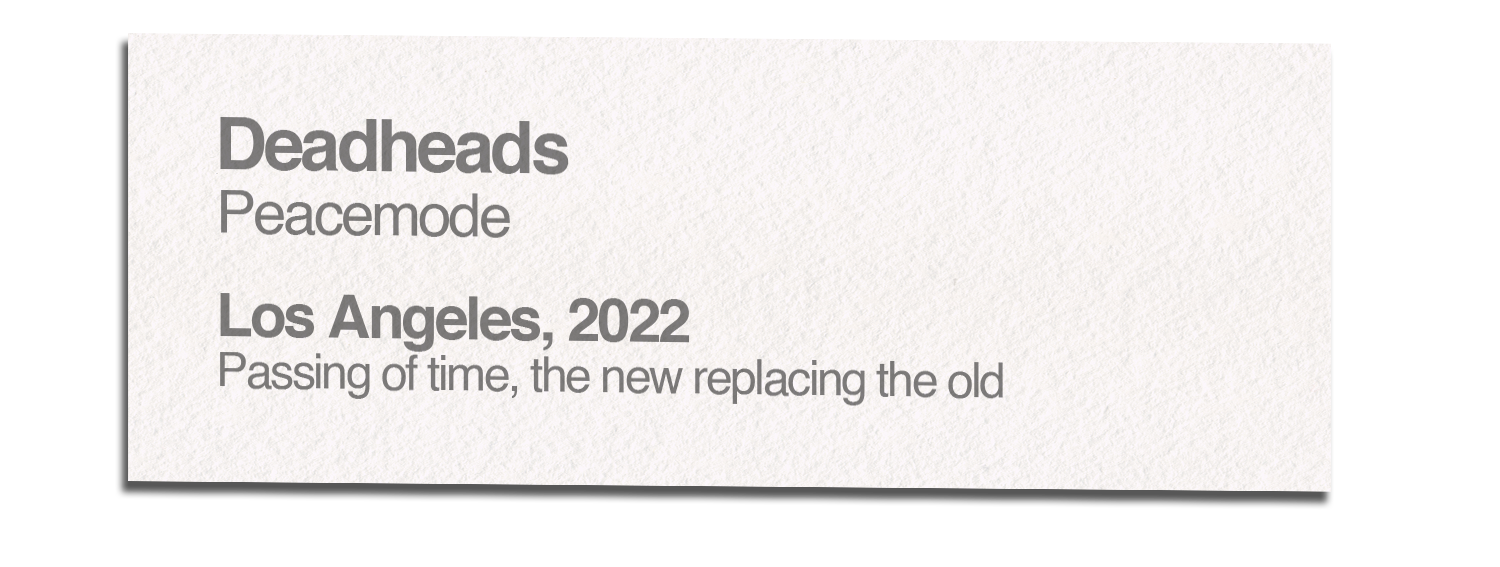
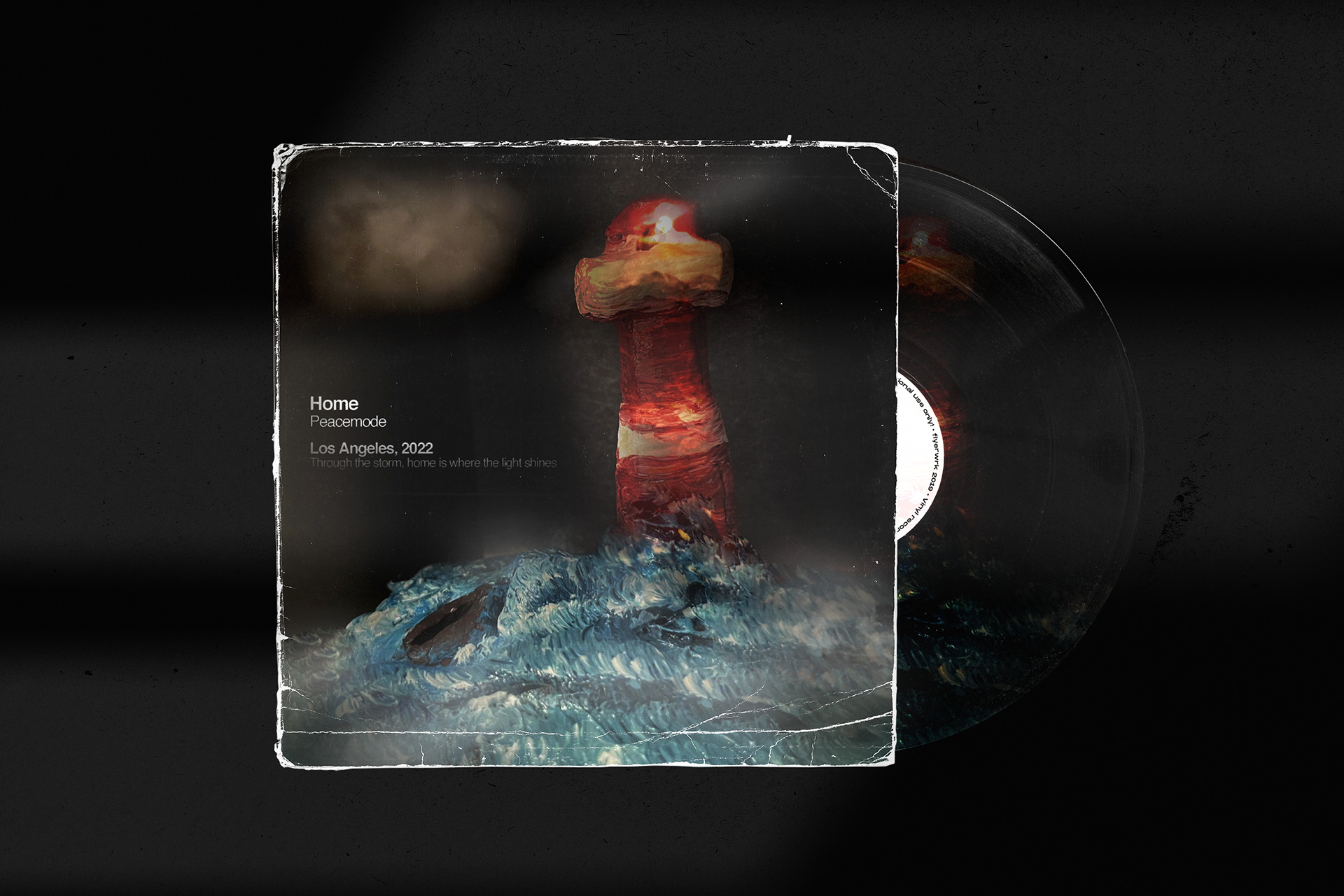
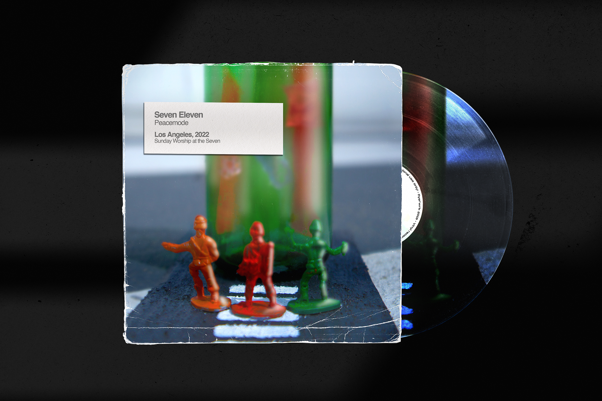
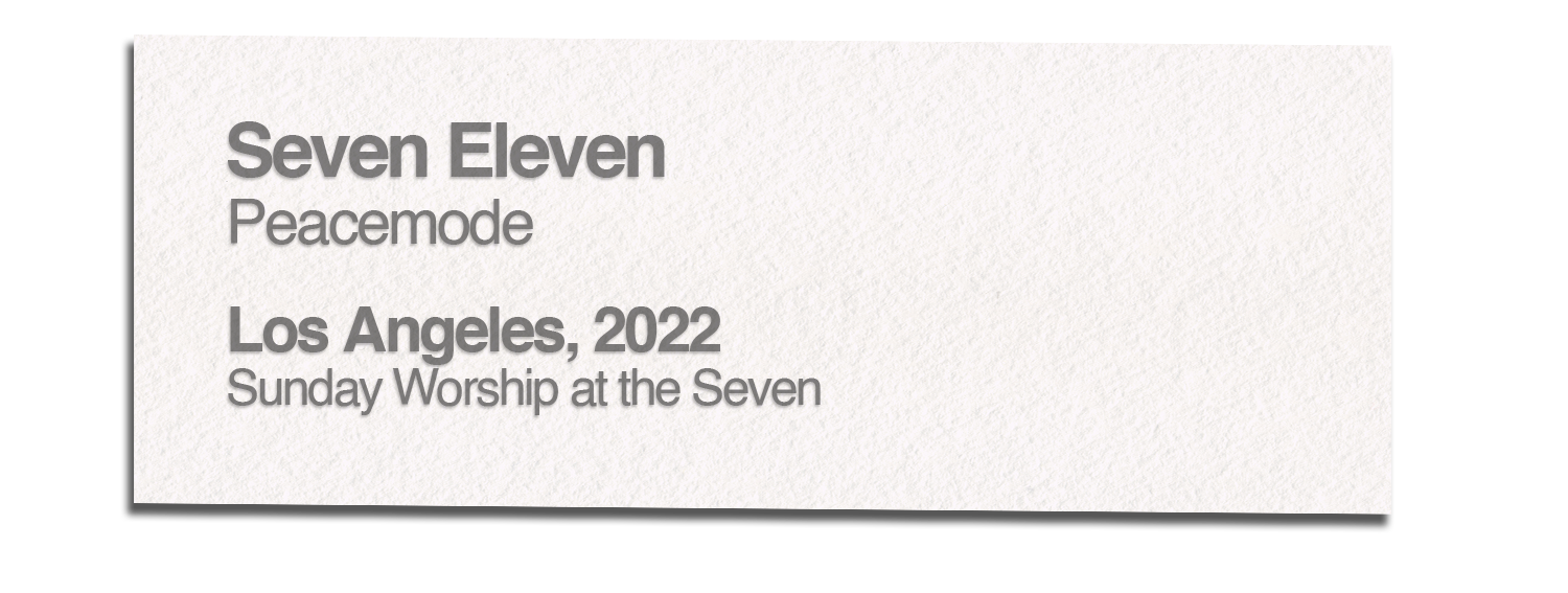
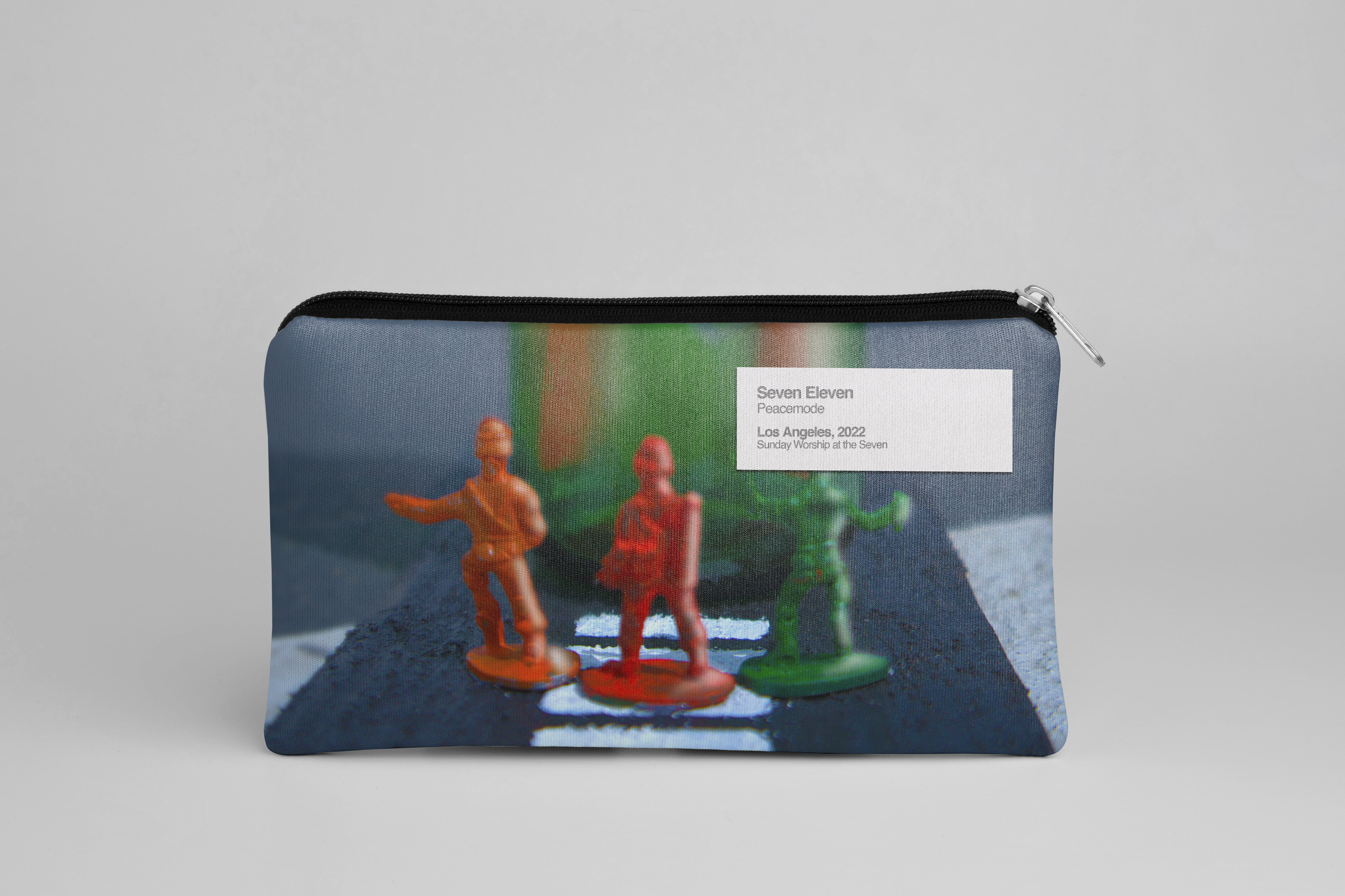
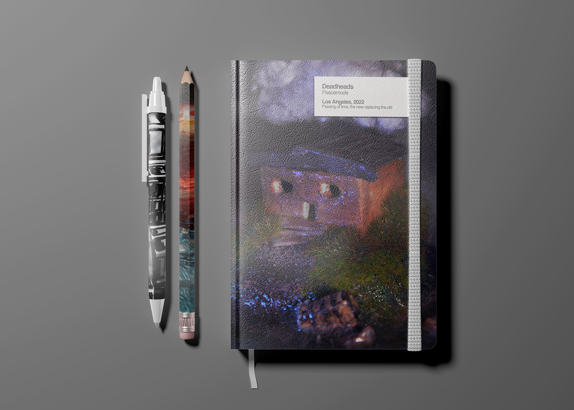
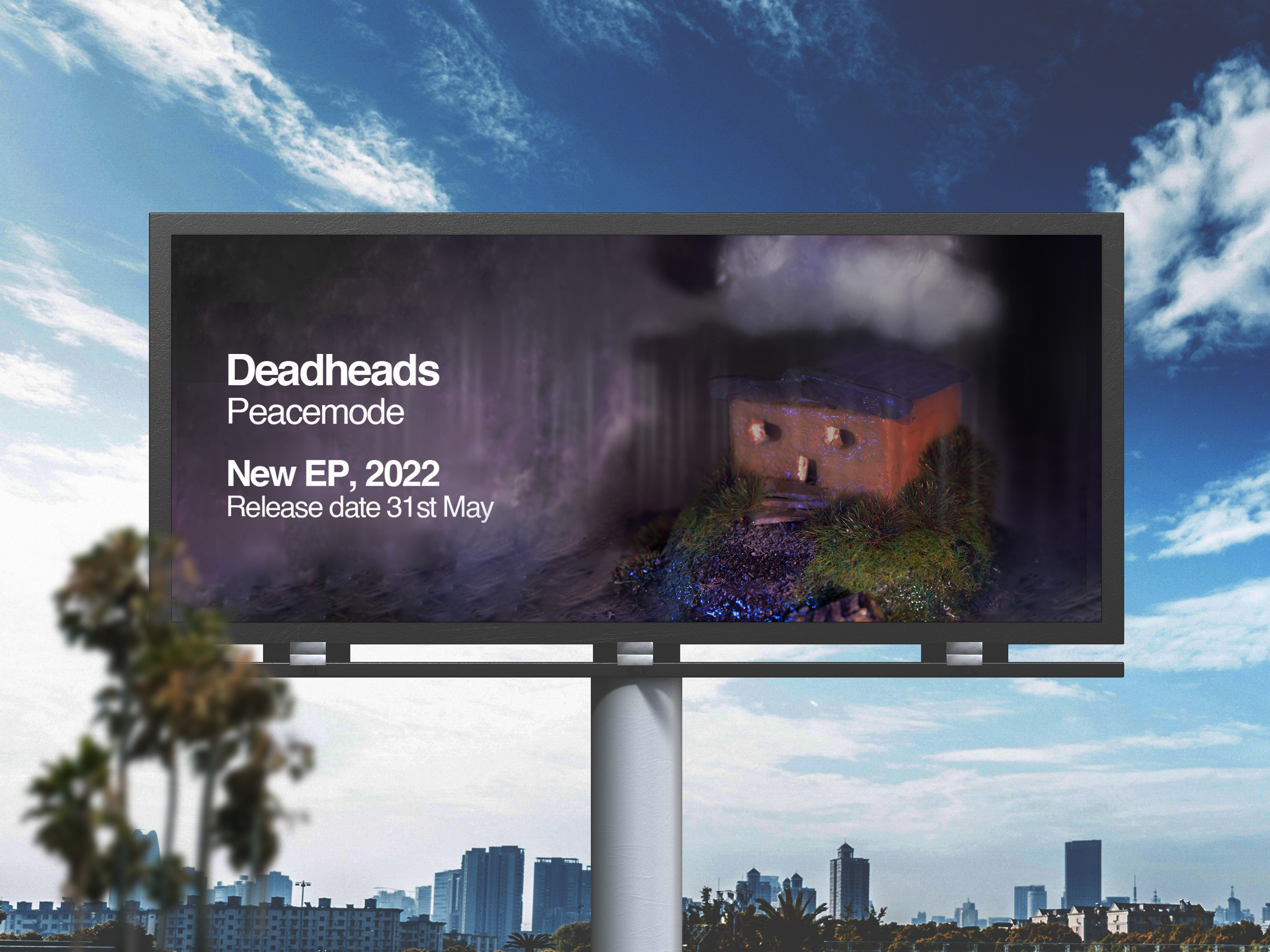
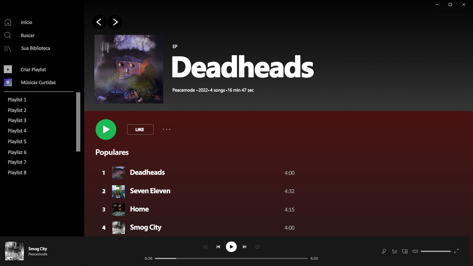
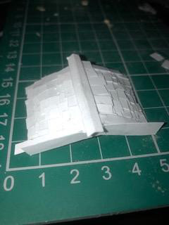
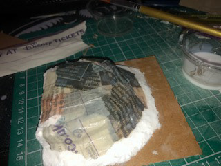
This project was our university-led live Brief for Band Peacemode. The band’s EP is called Deadheads and symbolised the process of cutting away dead ends and leaving room for new growth. This meaning was used in the progression of this project. The band loves the punk style and aesthetic so I followed the ‘out-there’ and unusual traits of punk and created diorama art pieces to lead to the image of the covers. I visited the Small Is Beautiful Exhibition in Kensington London which was a great inspiration for smart ways I could create my 3D models. The collective drive of these covers was an art gallery so art labels were used on the covers.
This project was our university-led live Brief for Band Peacemode. The band’s EP is called Deadheads and symbolised the process of cutting away dead ends and leaving room for new growth. This meaning was used in the progression of this project. The band loves the punk style and aesthetic so I followed the ‘out-there’ and unusual traits of punk and created diorama art pieces to lead to the image of the covers. I visited the Small Is Beautiful Exhibition in Kensington London which was a great inspiration for smart ways I could create my 3D models. The collective drive of these covers was an art gallery so art labels were used on the covers.
EP Cover and Singles Vinyl Mockups

Deadheads EP Merch Mockups

Billboard Mockup
Deadheads EP Spotify Mockups
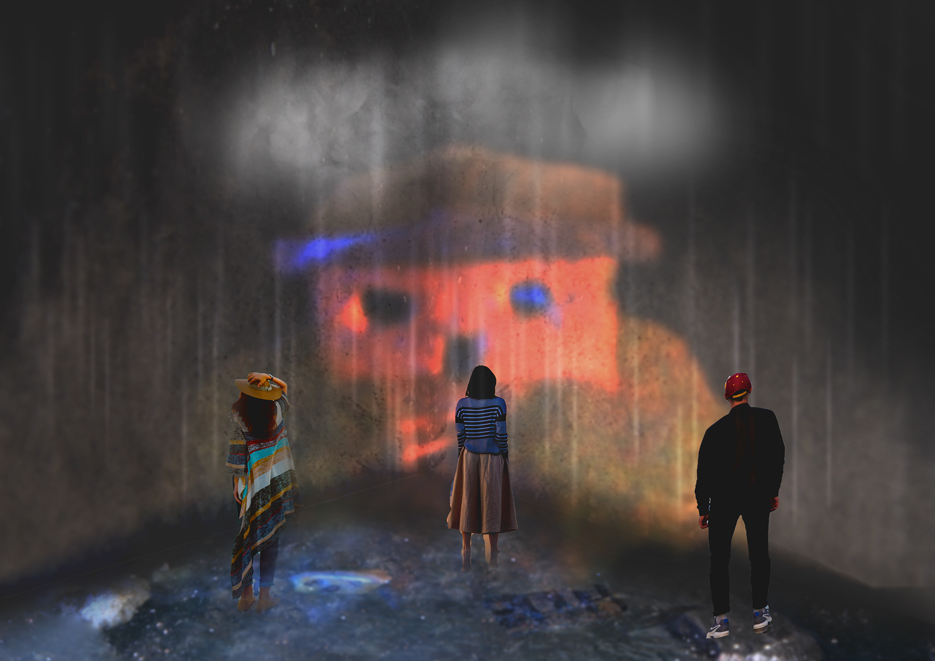
Deadheads Immersive Gallery-Experience Mockup Image
Behind the scenes crafting Process


Overview:
This was a fun project as I got to be more hands-on and mix hand-created art with digital. I also improved my experience with a DLSR camera which I had been longing to do. This was a great project to practise interacting professionally and meeting client deadlines.
This was a fun project as I got to be more hands-on and mix hand-created art with digital. I also improved my experience with a DLSR camera which I had been longing to do. This was a great project to practise interacting professionally and meeting client deadlines.
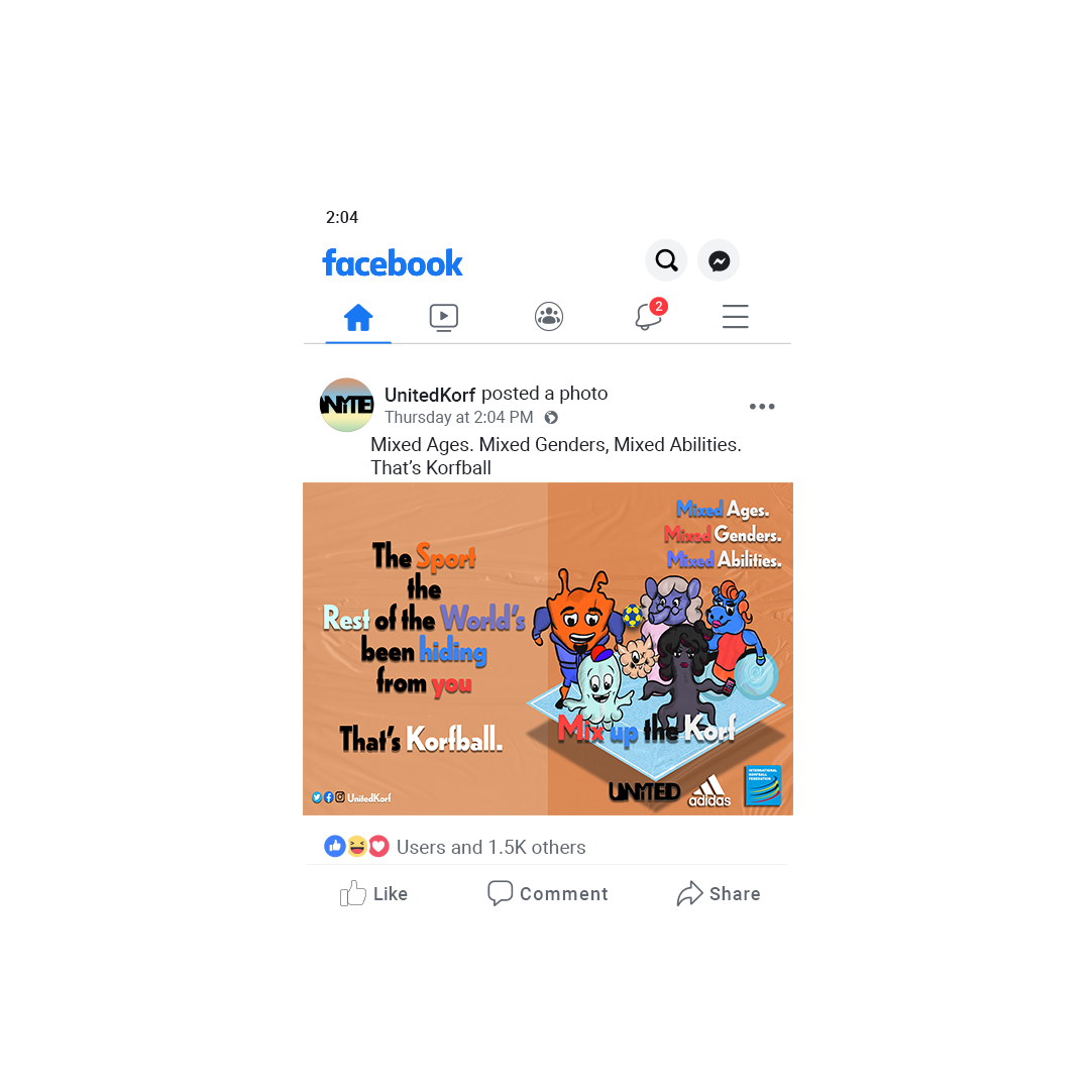
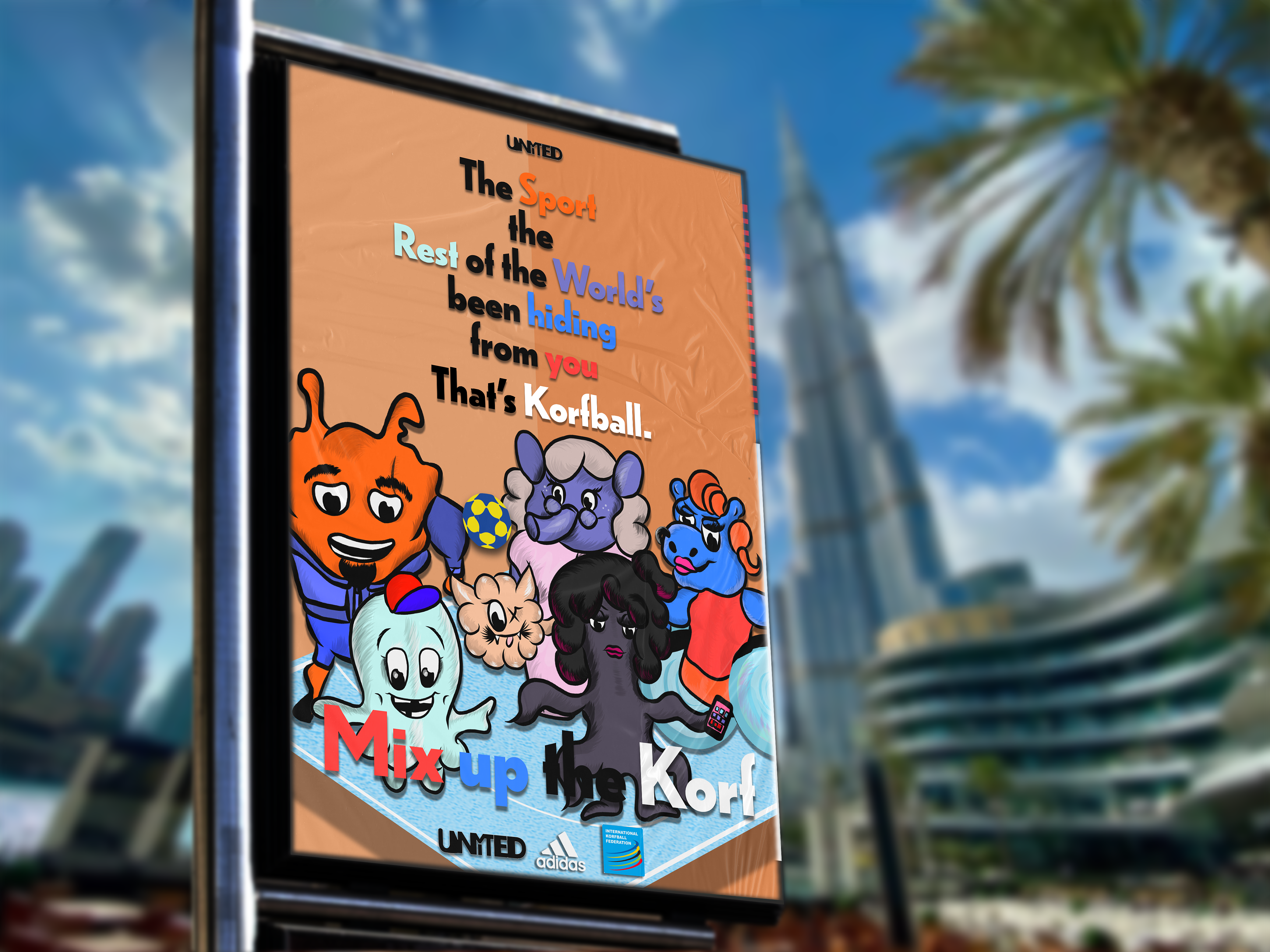
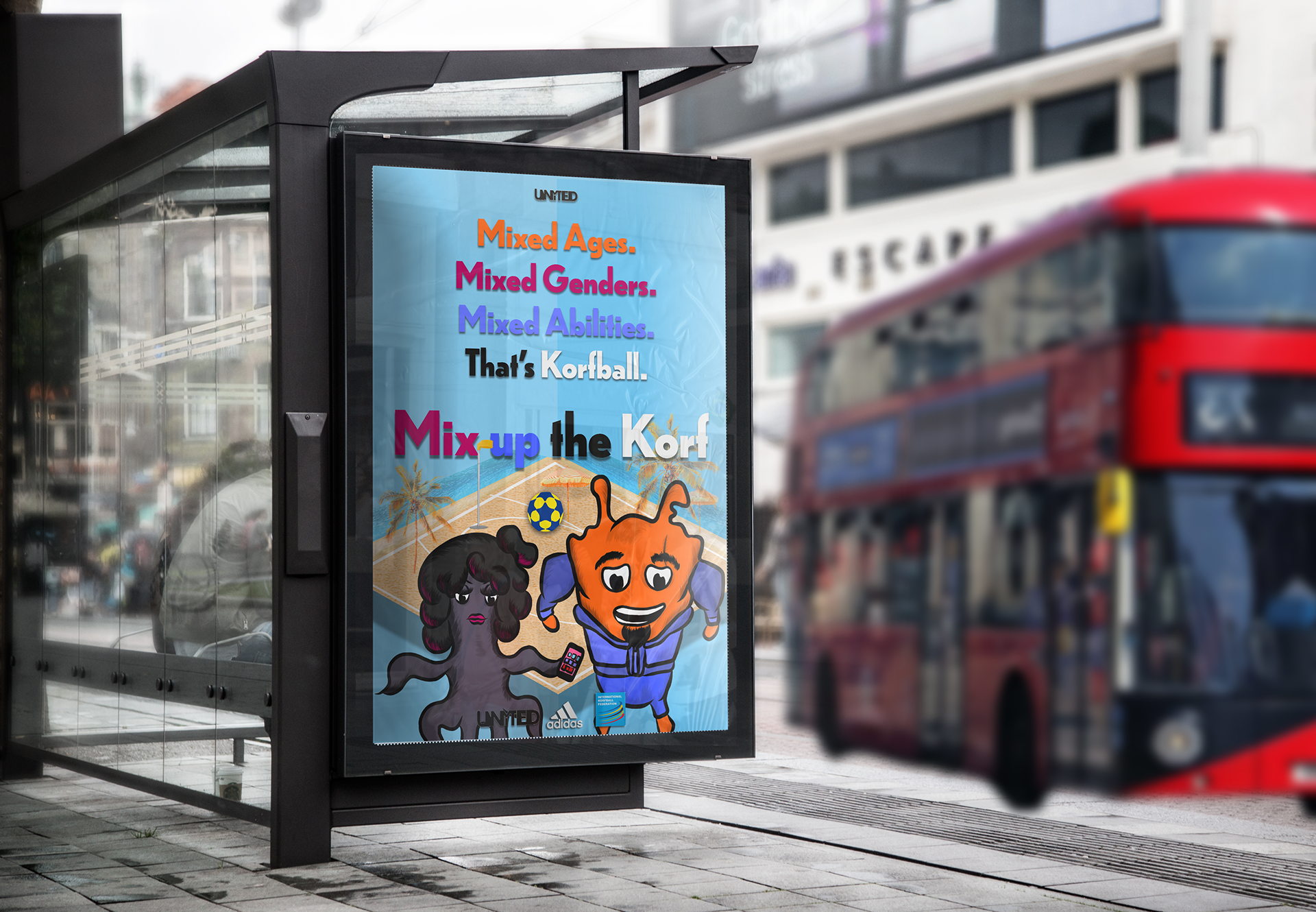
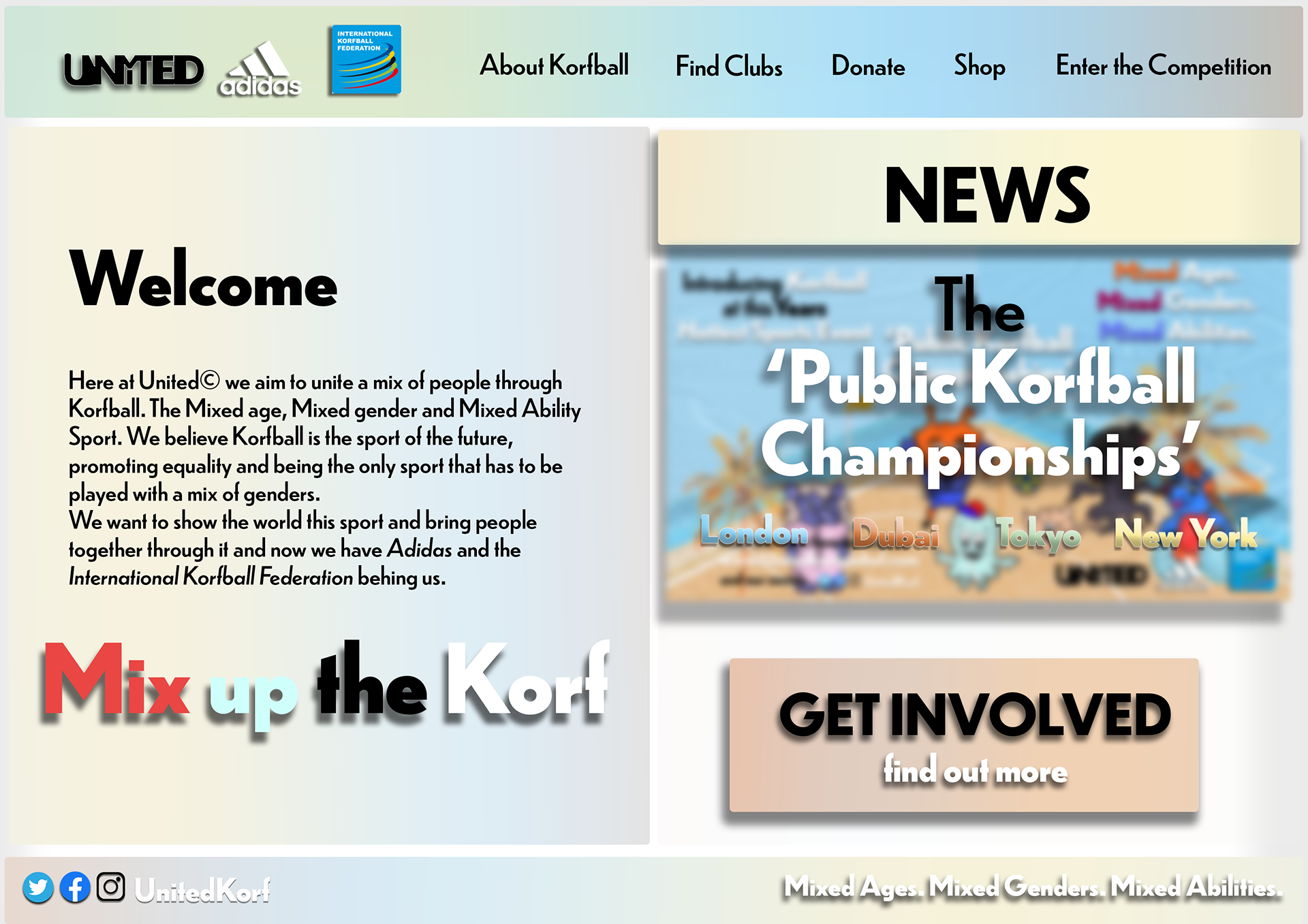
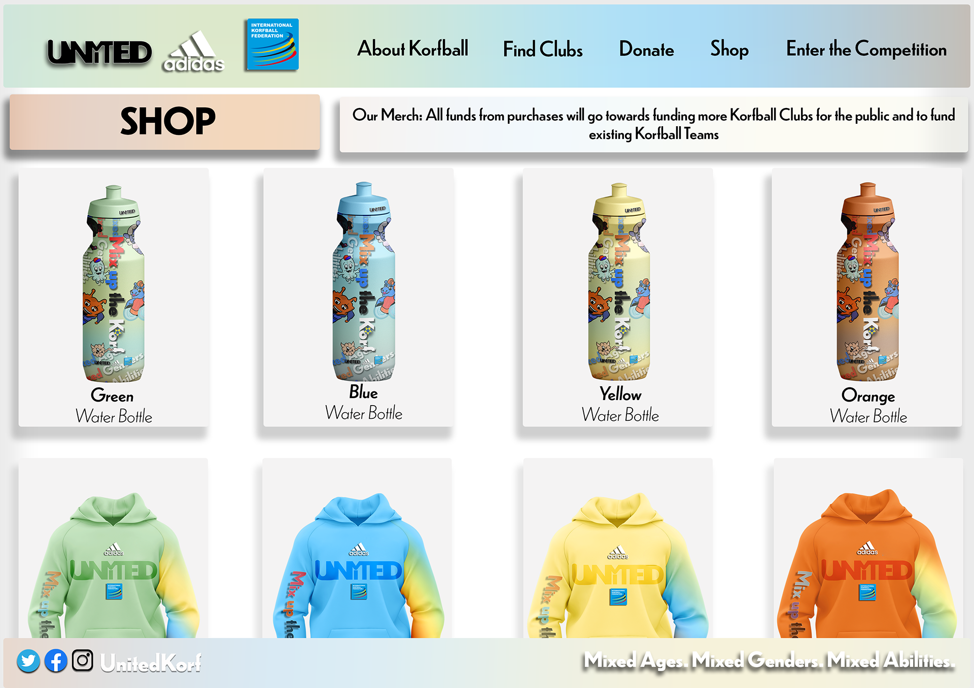
Underground Sports Campaign: KORFBALL
Aim:
to create a sports advertising campaign promoting an underground sport.
Insights:
My given sport for this project was Korfball, one similar to basketball and netball. The similarities between these sports helped me to relate more to them when attempting to find a creative direction. From research, I gathered that korfball was a multi-gender sport unlike a few. This opened up the door for togetherness and also would be a great family and community sport. This is what I used to inspire the creative direction; one that was family-friendly, fun and energetic like the sport.
My given sport for this project was Korfball, one similar to basketball and netball. The similarities between these sports helped me to relate more to them when attempting to find a creative direction. From research, I gathered that korfball was a multi-gender sport unlike a few. This opened up the door for togetherness and also would be a great family and community sport. This is what I used to inspire the creative direction; one that was family-friendly, fun and energetic like the sport.
Campaign Poster Variations
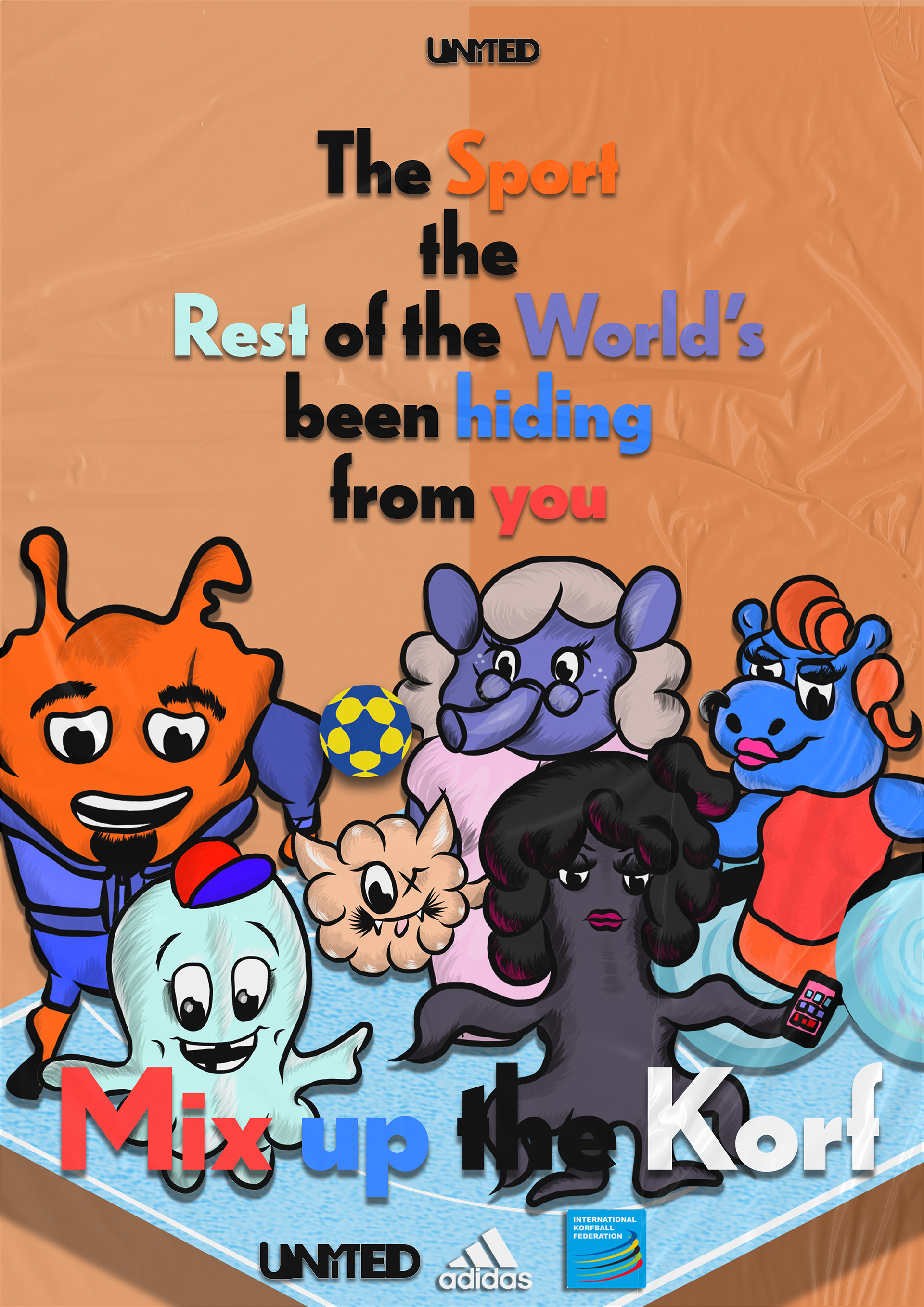
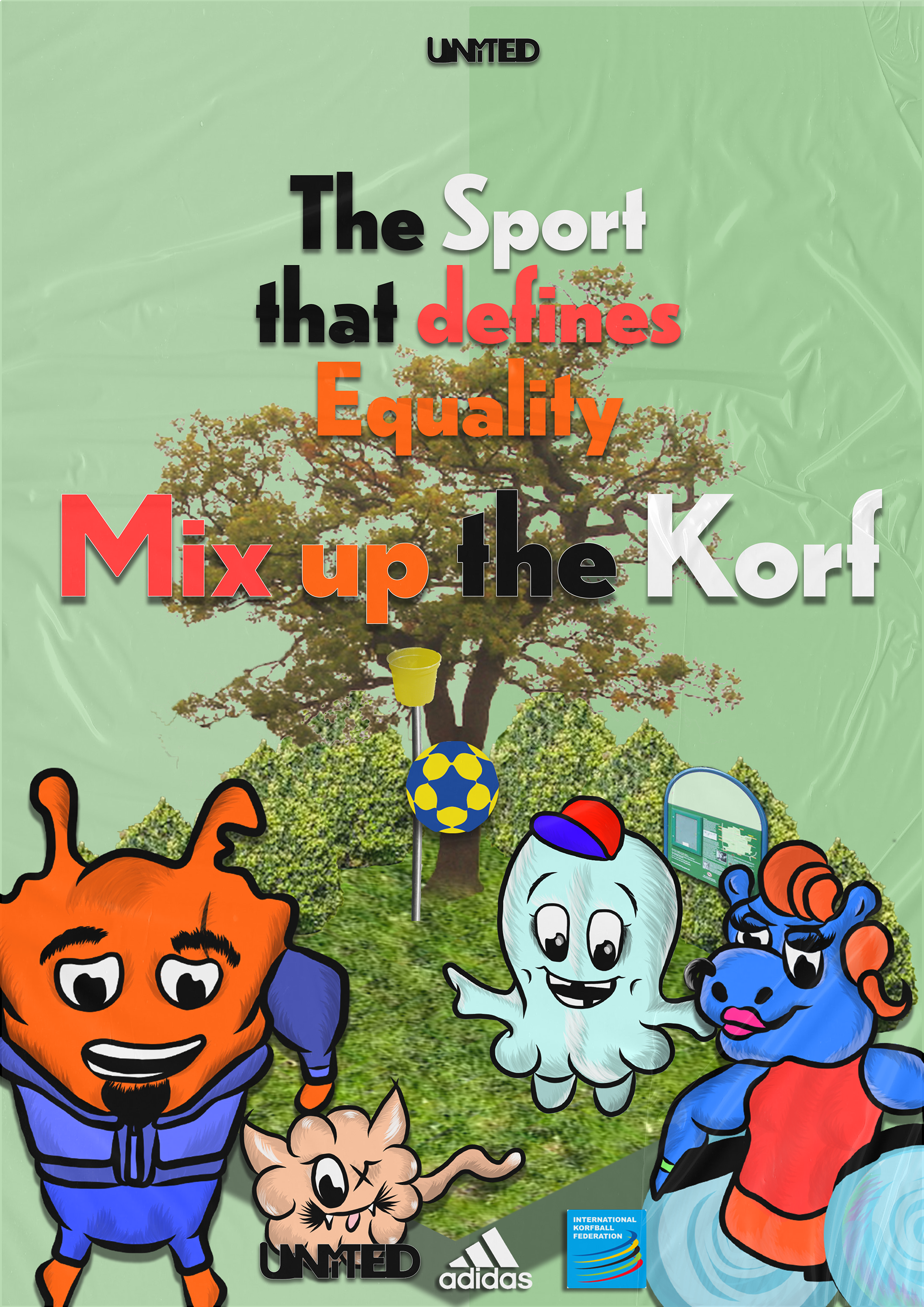
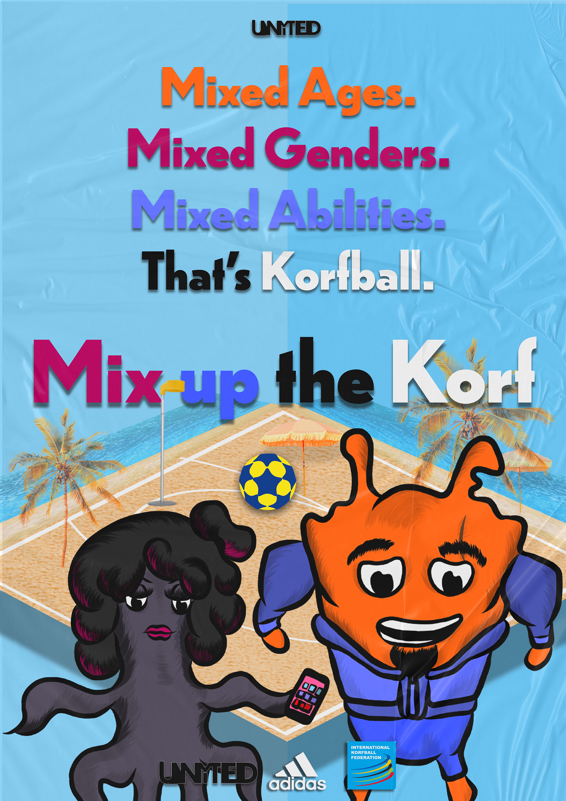
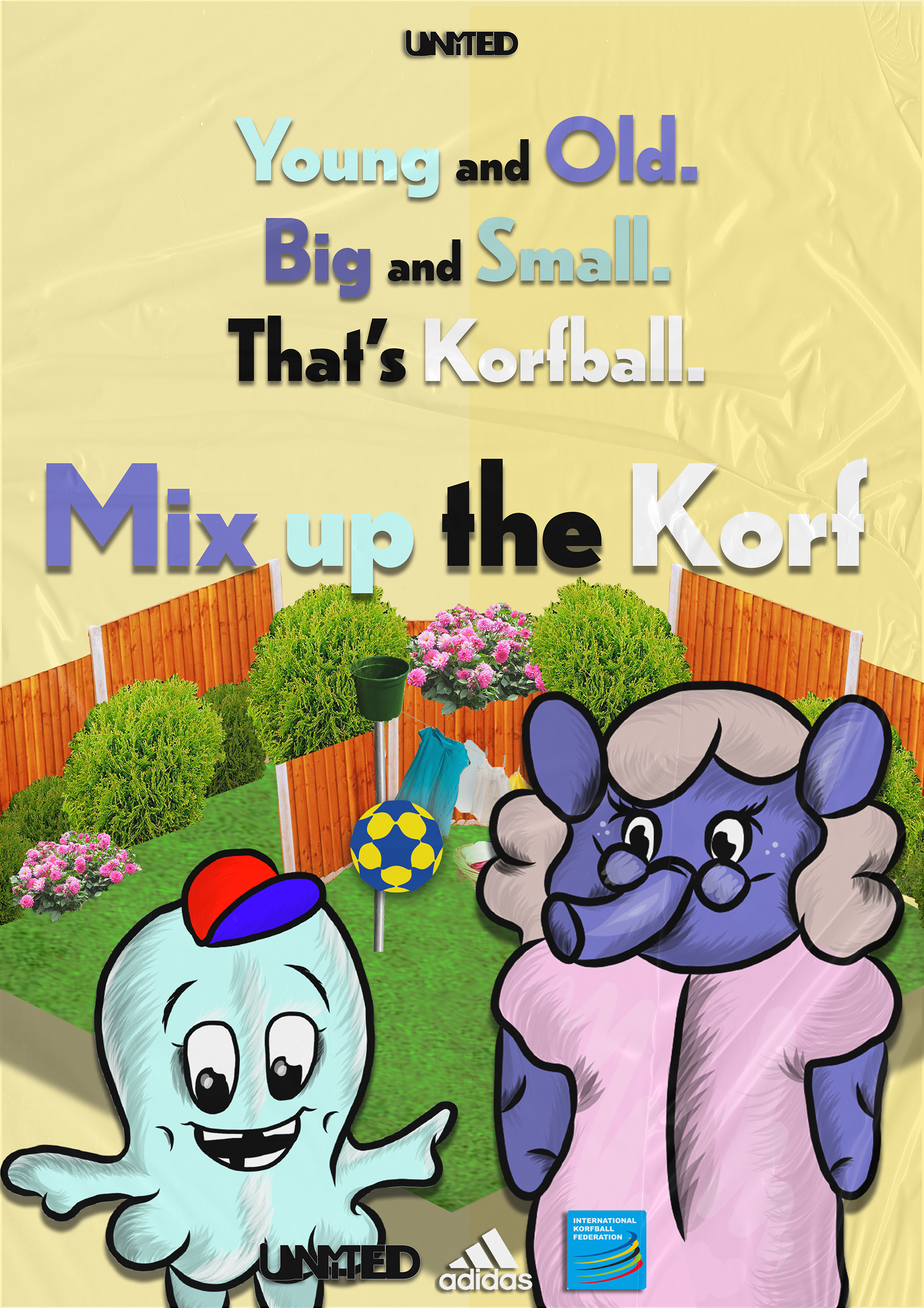
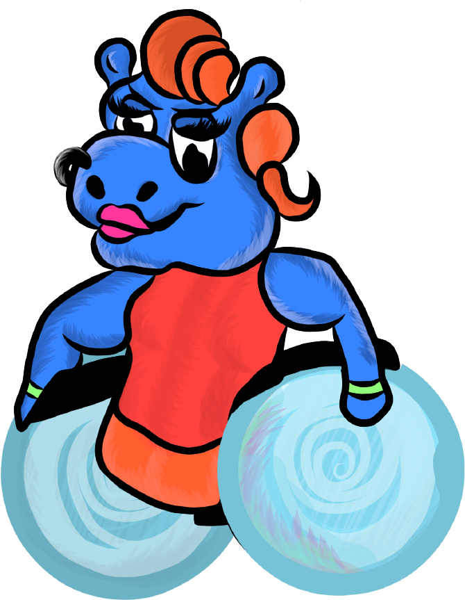
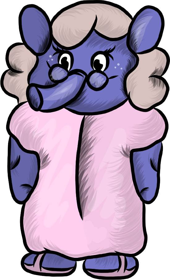
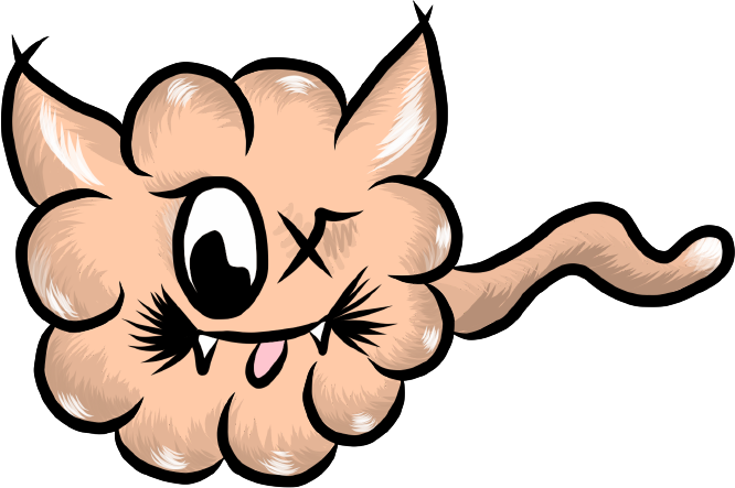
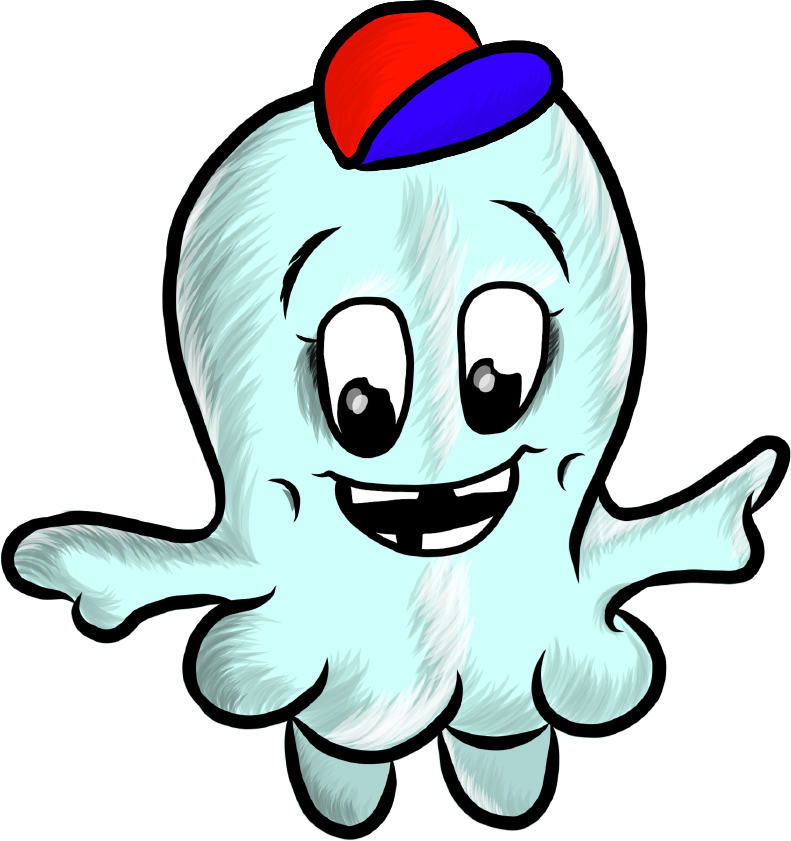
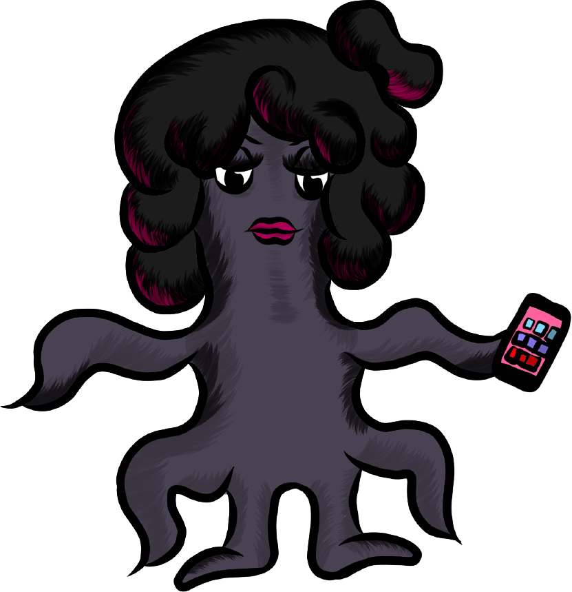
Illustrated Character Icons

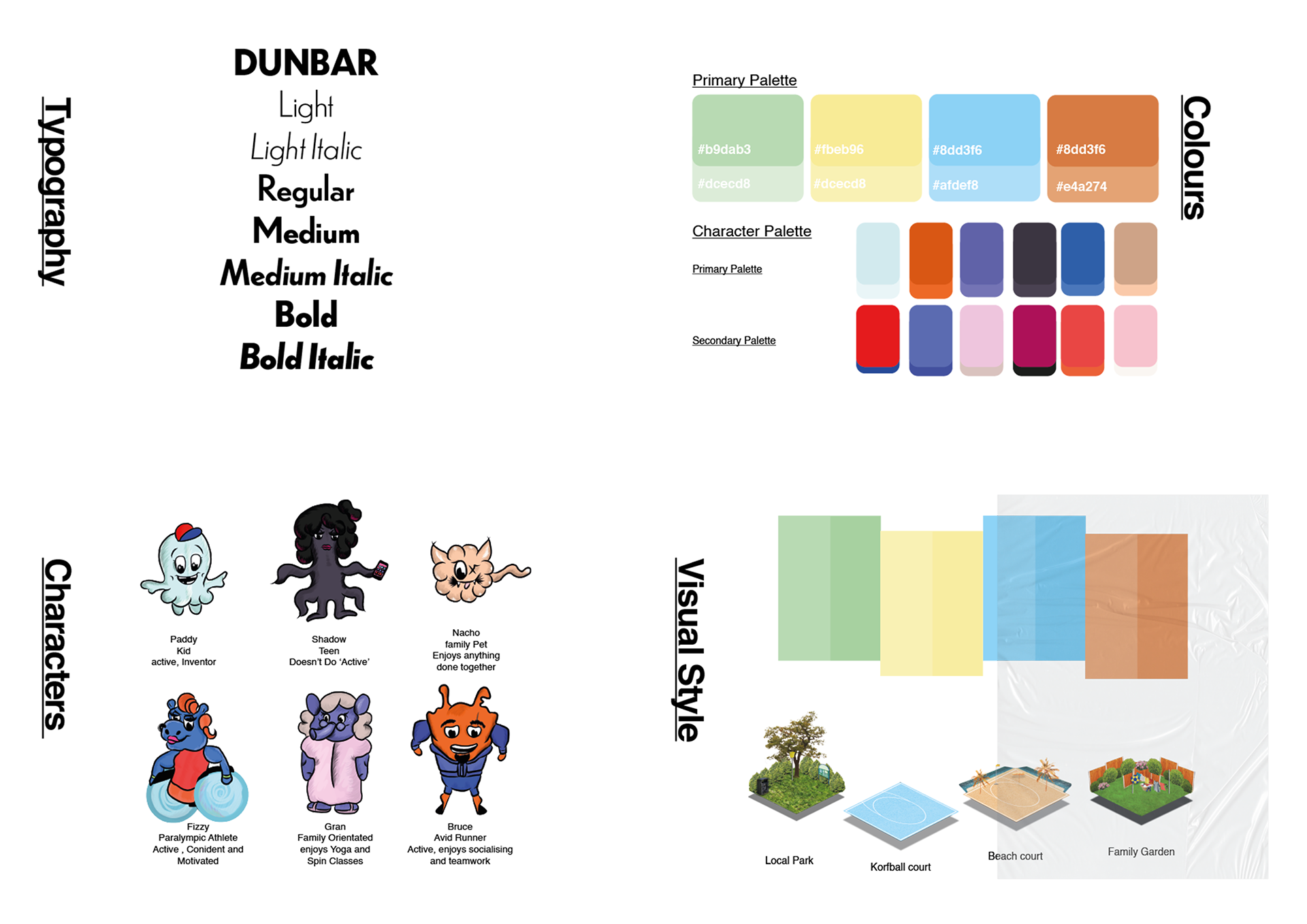
Campaign Stylesheet
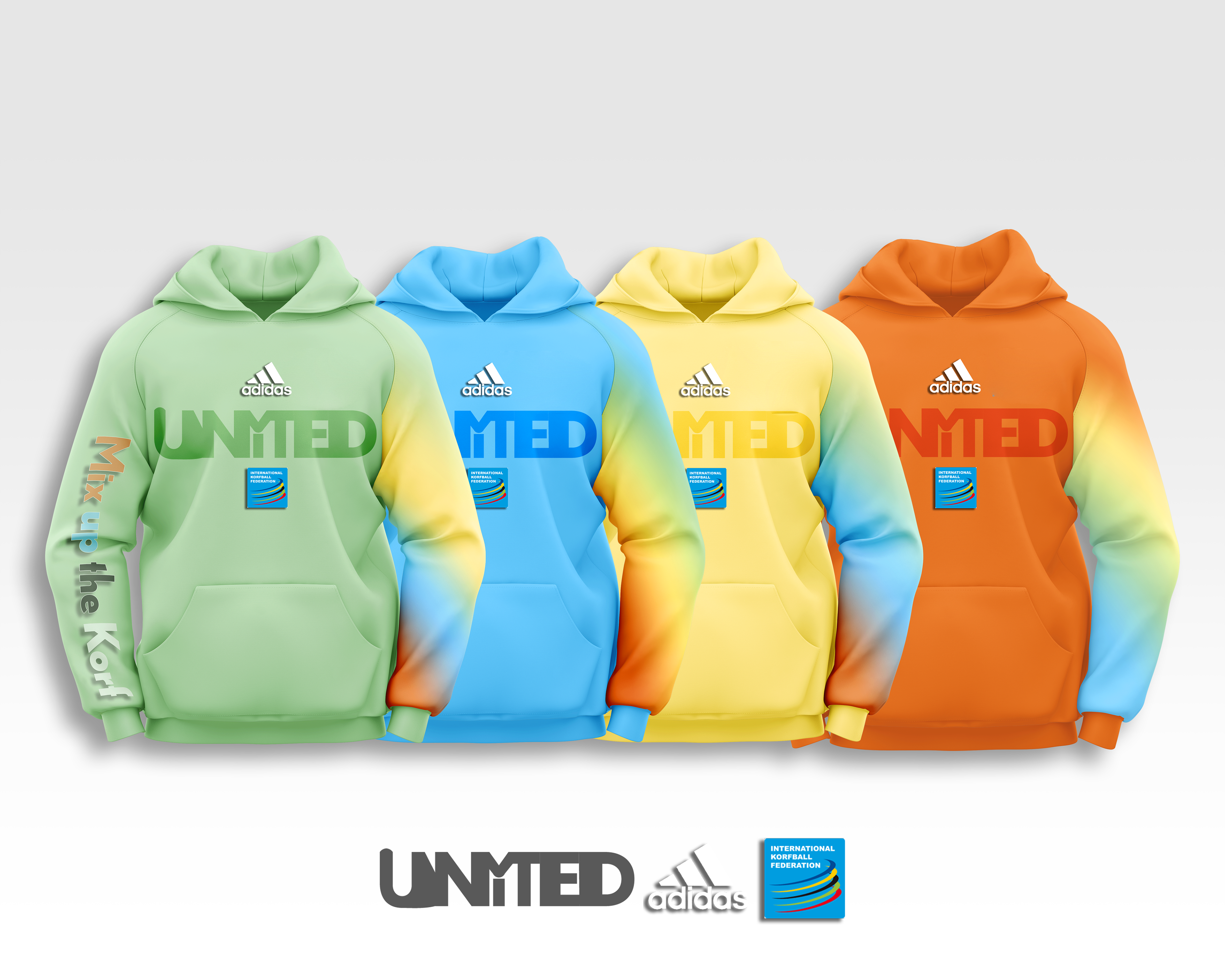
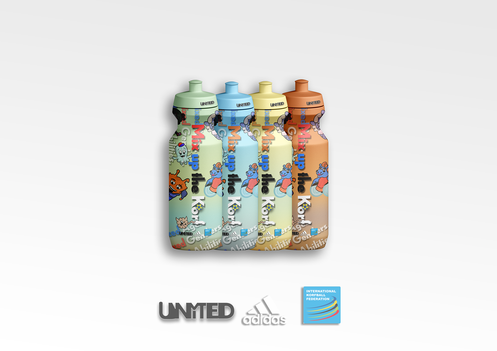
Fundraising Korfball Merch: Hoodies + Water Bottles
Social Media Content Promotion Mockups
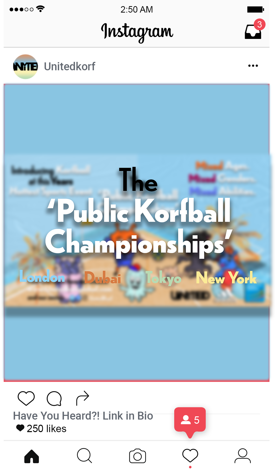
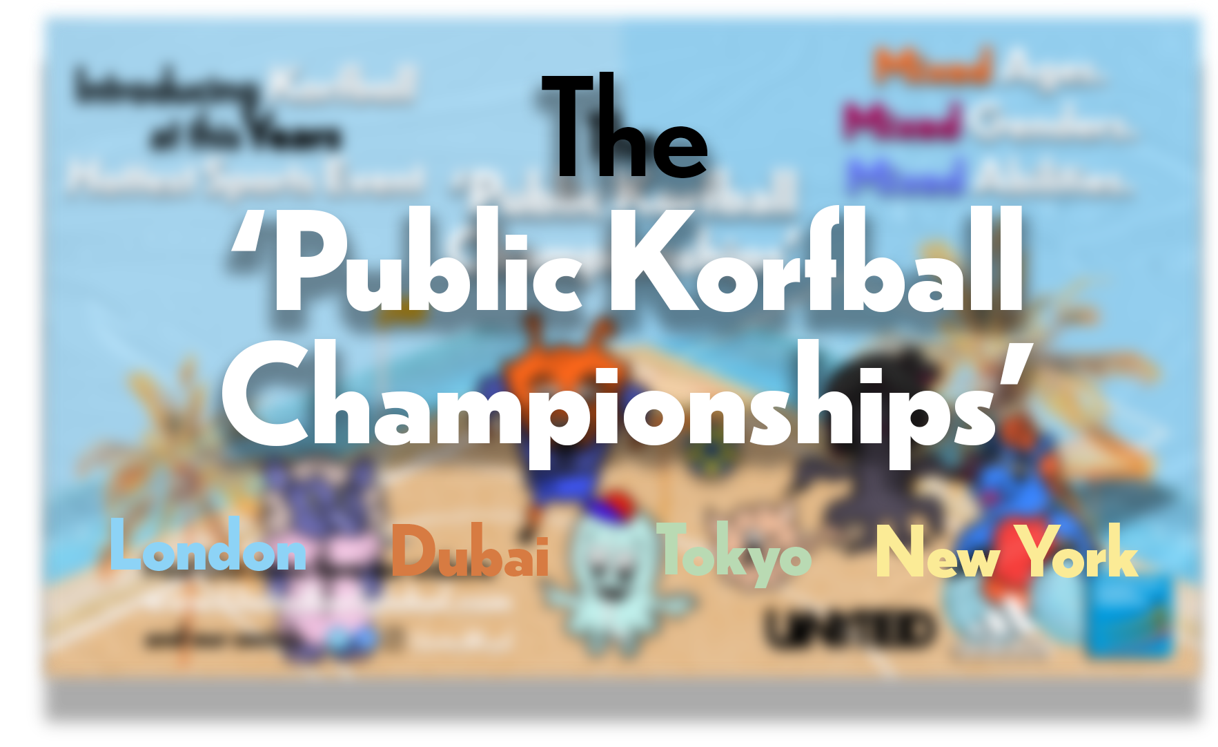
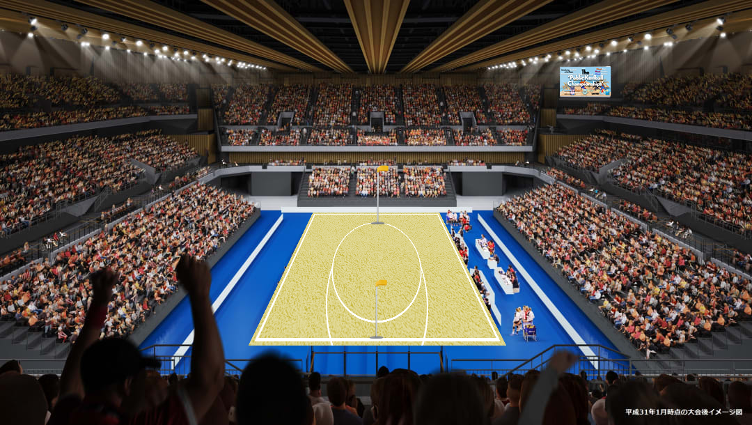
Arena Event Mockups: New York, Dubai, London and Tokyo
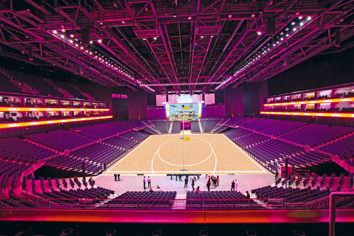
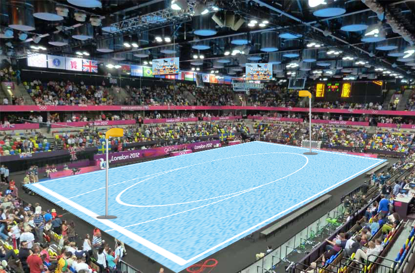
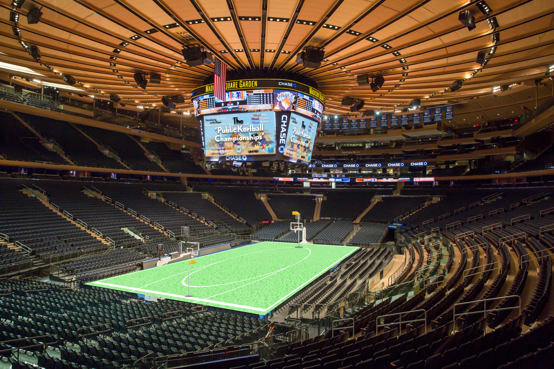
Location-Specific Billboard Mockups: New York, Dubai and London

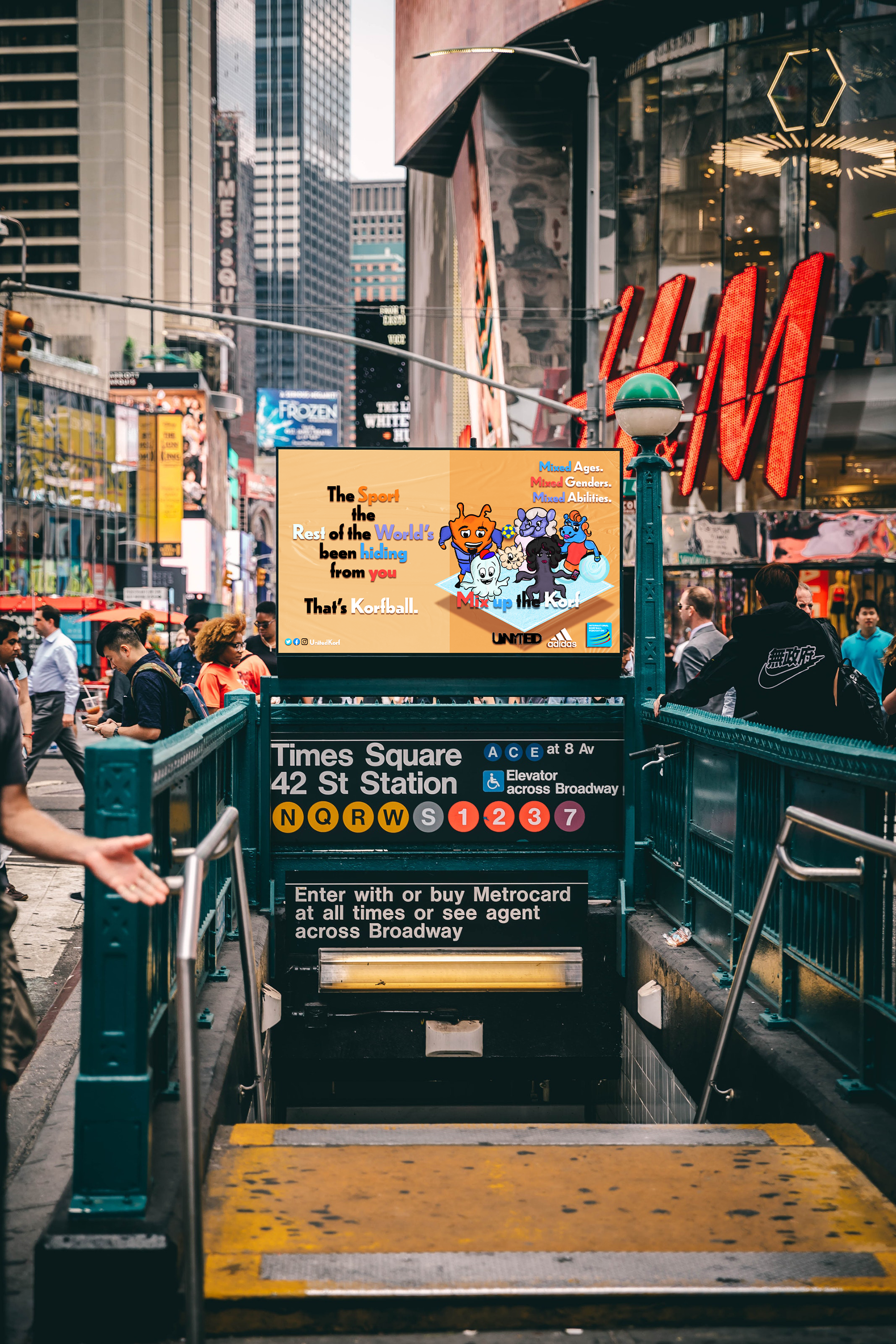
Korfball Campaign Website Mockup
Corresponding Billboard Animations

Overview:
This campaign included quite a lot of development, and feedback and the final design identity was subjective to a few, but I felt that it conveyed the tone of voice I aimed to create. It was great to practice design in another field for this project: sport. It was a great opportunity to practice a few technical and design skills with adobe software, more illustration and a lot more thought into the brand design.
This campaign included quite a lot of development, and feedback and the final design identity was subjective to a few, but I felt that it conveyed the tone of voice I aimed to create. It was great to practice design in another field for this project: sport. It was a great opportunity to practice a few technical and design skills with adobe software, more illustration and a lot more thought into the brand design.
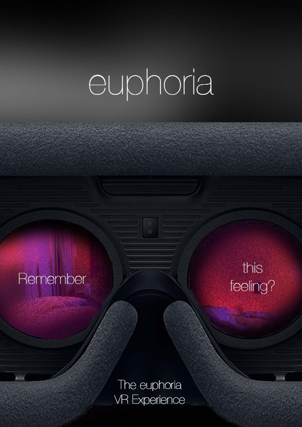
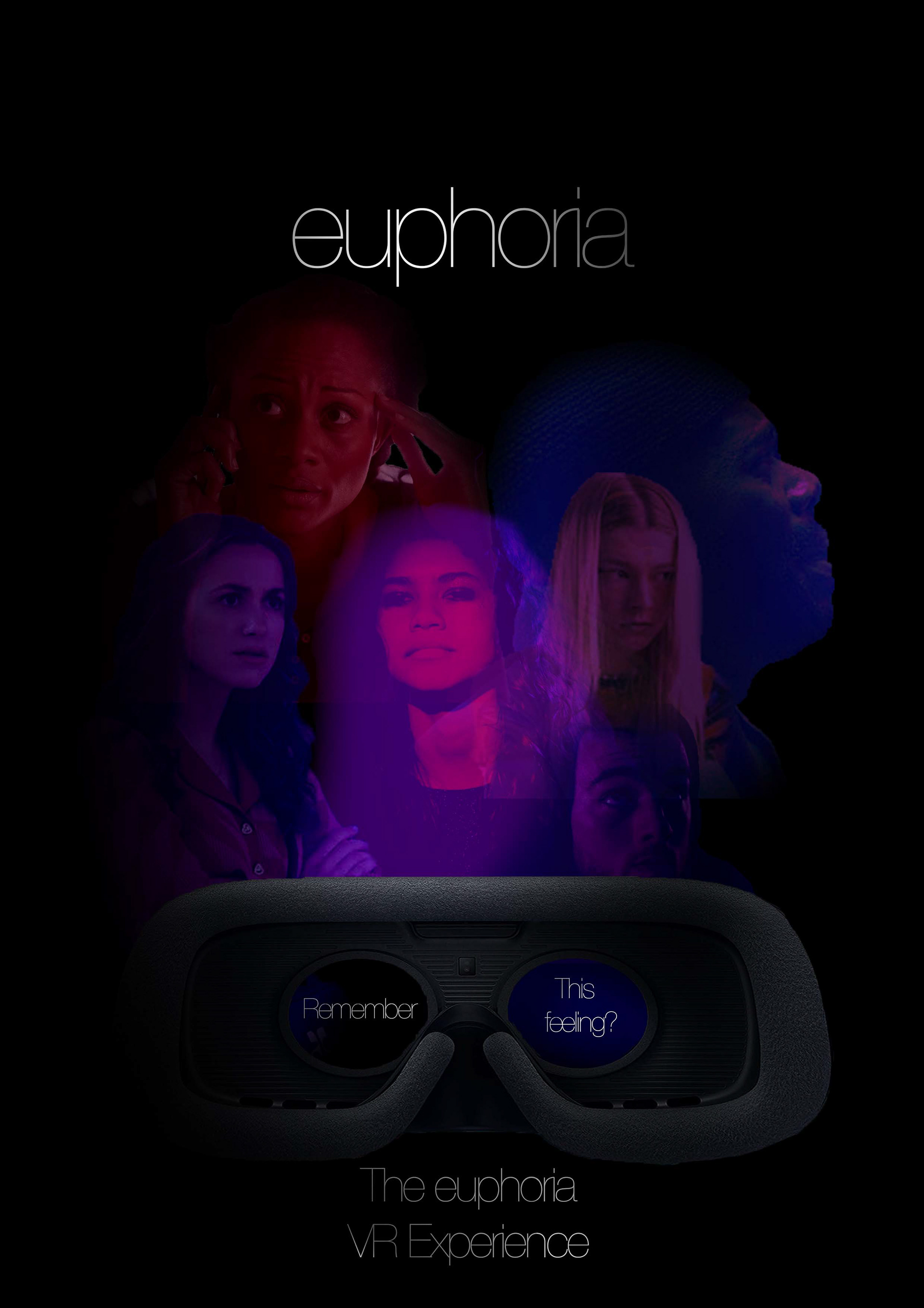
EUPHORIA VR EXPERIENCE Concept Lf.Designs X Maria Torregiani
Aim:
To create an idea and the visuals behind a TV/movie-inspired multi-interactive game or experience.
To create an idea and the visuals behind a TV/movie-inspired multi-interactive game or experience.
Insights:
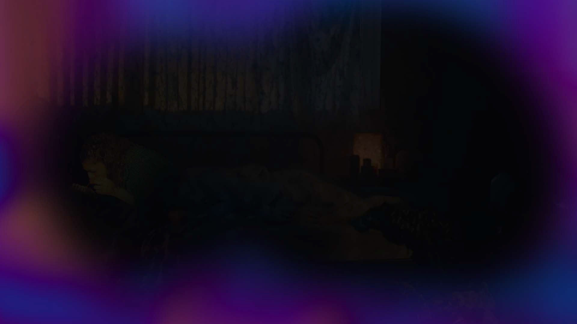
For this team project, we decided on the TV series Euphoria to base our experience. A few outstanding characteristics of the show included the makeup, cinematography, music and relatable stories that collectively helped to immerse watchers into the show as if they were there themselves. We took these elements and visuals and created a VR experience that multiple people could play. With this we thought, not only would the experience immerse us back into the much-loved show, but it could also raise awareness among the viewer demographics of the certain struggles people go through day-to-day and help people to become more empathetic towards each other.
For this team project, we decided on the TV series Euphoria to base our experience. A few outstanding characteristics of the show included the makeup, cinematography, music and relatable stories that collectively helped to immerse watchers into the show as if they were there themselves. We took these elements and visuals and created a VR experience that multiple people could play. With this we thought, not only would the experience immerse us back into the much-loved show, but it could also raise awareness among the viewer demographics of the certain struggles people go through day-to-day and help people to become more empathetic towards each other.
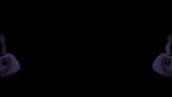
Promotional Posters
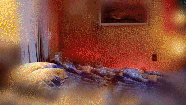
Promotional Animated Gifs and created gameplay footage


Instagram Content Creation
Euphoria VR Experience Instagram Story Taster
In order to estimate the success rate of the experience idea, we created a taster version of the experience for Instagram stories, so followers could interact and feedback could be given. To enter the Instagram Euphoric Experience, click the icon below.
Instagram Story Experience Screenshots


Created Image Captures for Experience


Short and Long versions of the Experience Walk-through
Overview:
This was an interesting project brief and was great to try something new again by creating outcomes for an experience after previously doing sports campaigns, product design and content creation. It was enjoyable to work with and join forces with a fellow design student and friend on this project and was great to merge our ideas. Some of the skills learnt from the previous projects were used which helped with the speed of creative production.
This was an interesting project brief and was great to try something new again by creating outcomes for an experience after previously doing sports campaigns, product design and content creation. It was enjoyable to work with and join forces with a fellow design student and friend on this project and was great to merge our ideas. Some of the skills learnt from the previous projects were used which helped with the speed of creative production.
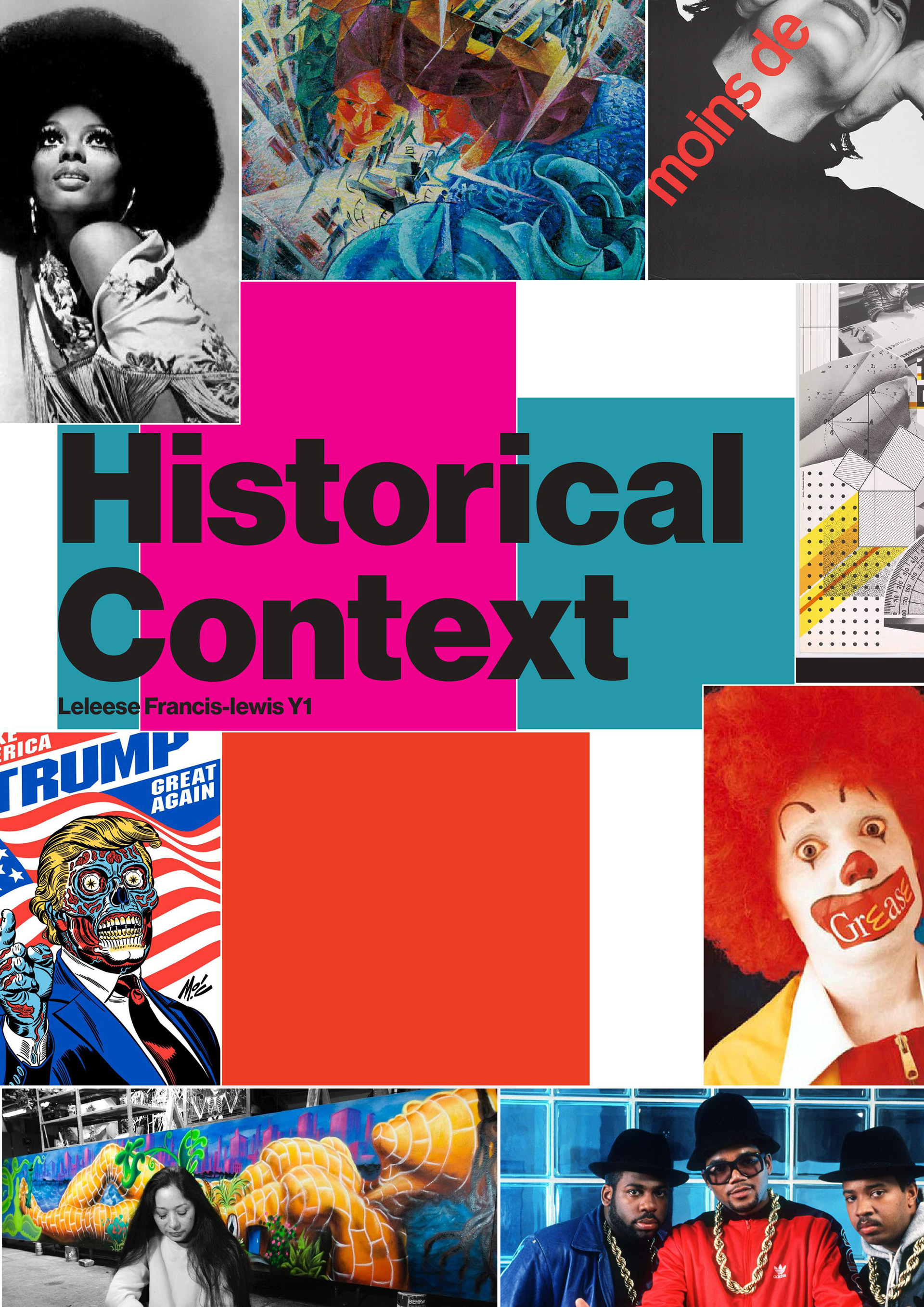
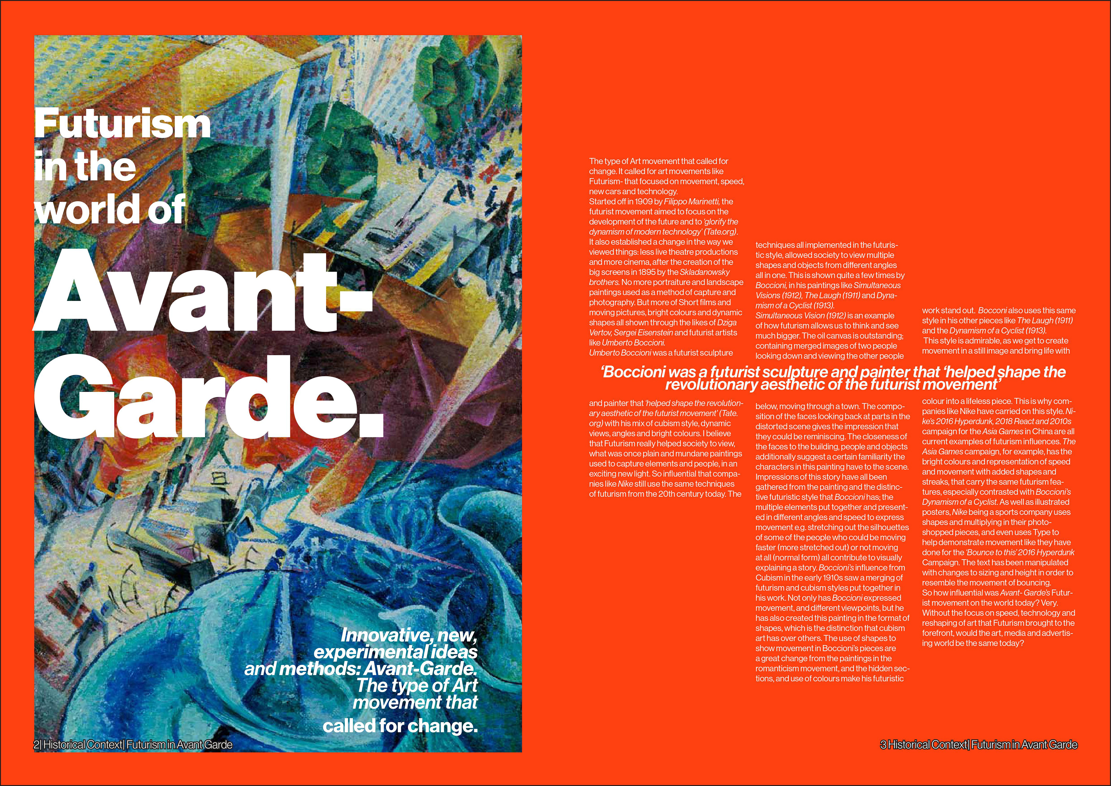
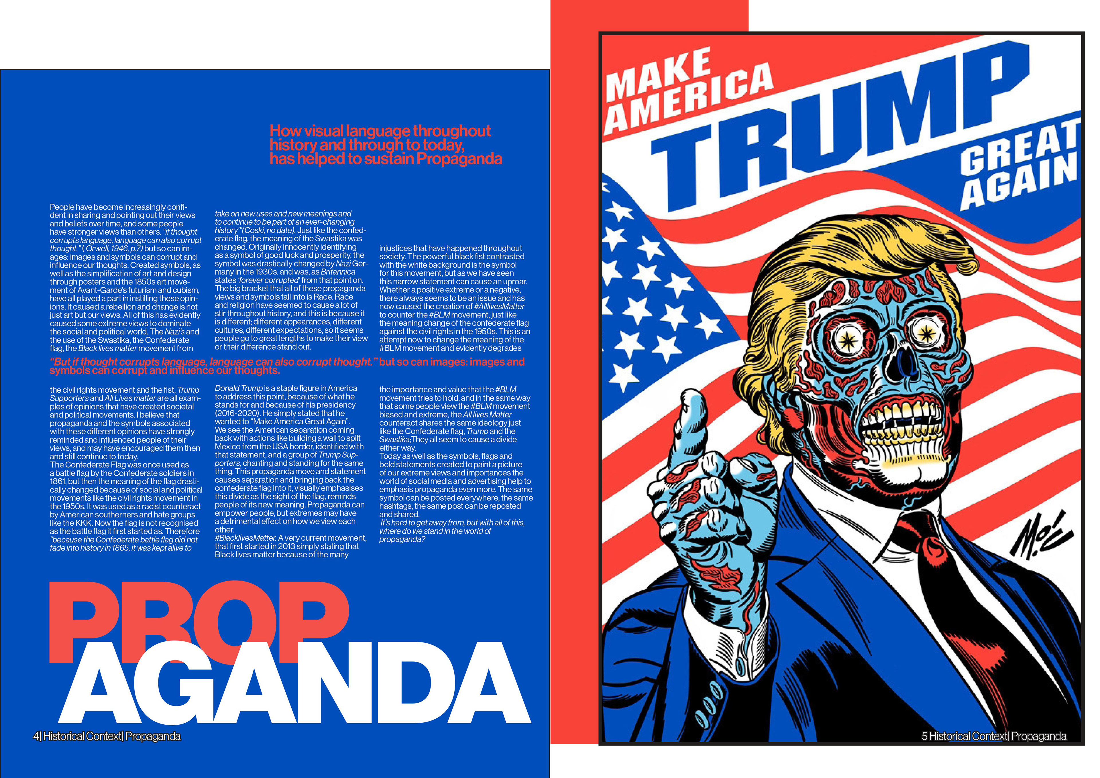
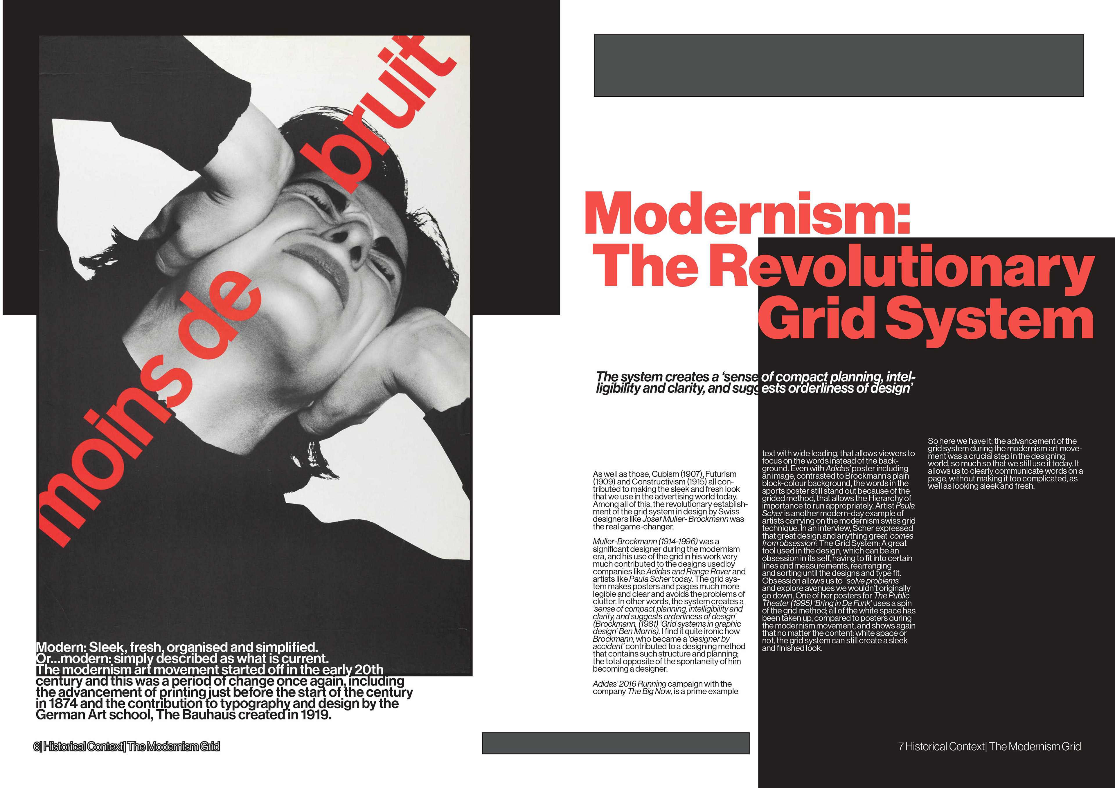
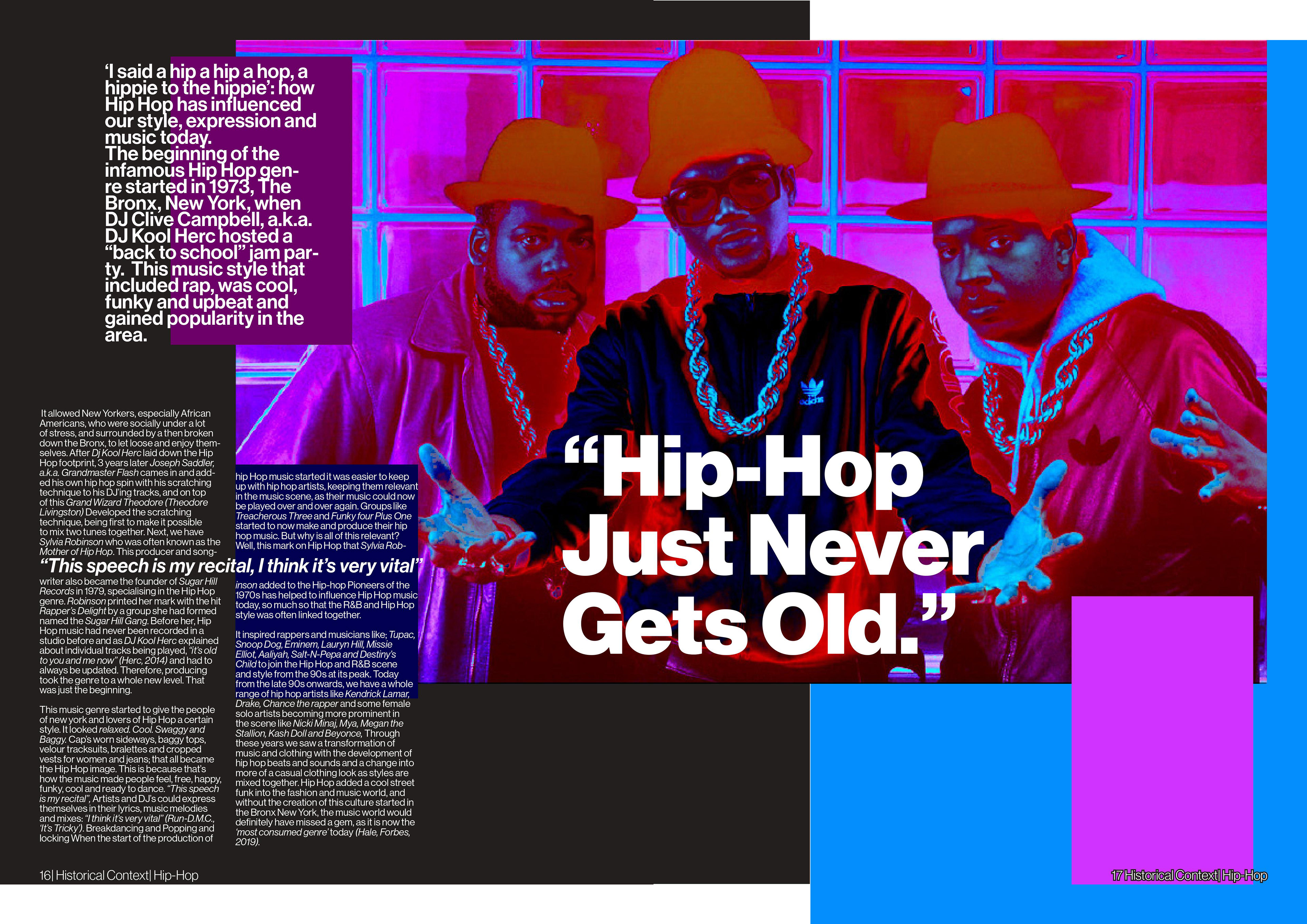
HISTORICAL CONTEXT Essays and PAGE DESIGN
Aim:
To learn about art and design history while using the grid method to produce a thirteen-page essay blog.
To learn about art and design history while using the grid method to produce a thirteen-page essay blog.
Insights:
During this project, we learned of the grid method which was a graphic design tool by Müller-Brockmann. Throughout the page design, we were encouraged to use this method to help us manage text, titles and images in a clean layout.
Overview:
This was one of my first university projects and while learning a bit more background context of art and design, I was able to see that clutter does not always mean exciting. Keeping things clean and simple helps to fit a lot of visual purposes in design.